14. vue 关于 “拉幕式”文字展开动画(宽度从 0 到全宽)
·
“拉幕式”文字展开动画(宽度从 0 到全宽)
“拉幕式”文字展开动画
“拉幕式”文字展开动画(即文字像舞台帷幕拉开一样,从左到右逐步显示)是一种非常酷炫的视觉效果,常用于轮播图、首页标题、电影片头等场景。
一、“拉幕式”动画的本质
效果描述:
一行文字原本不可见 → 然后从左侧开始,逐渐向右展开,直到全部显示出来。
实现原理:
利用 CSS 的 overflow: hidden + width 变化 + transition 过渡,让容器宽度从 0 动态扩展到完整宽度,从而实现“内容被慢慢展示”的效果。
完整动画流程图解
[初始]
 overflow: hidden →文字被隐藏(overflow: hidden)
 opacity: 0 → 完全不可见
 white-space: nowrap →不可换行

[showwords 开始]
  → opacity: 1     (现在可透明看到)
  → width: 0       (仍不可见内容)
  → 强制重排      (锁定这个“起点”)
  → transition    (告诉浏览器:“接下来变宽要有动画”)
  → width: 200px   (终点!浏览器自动插帧 → 拉幕展开)
最终效果就是:文字从左往右“刷”地一下展开!
为什么没有强制重排,transition动画就不出现?

因为浏览器会进行“渲染优化”:如果你连续修改 DOM 样式【如这里的width=0 ——>width= this.titlewidth+"px"】,它会等到最后才计算布局(reflow),导致没有“前后状态差异”,从而跳过动画。
而 clientHeight 这类属性的读取,会强制浏览器提前执行重排(reflow) ,锁定初始状态,让后续变化能被识别为“有动画”。
二 “拉幕式”文字展开动画在图片加载完成后执行
整体思路(核心原理):让文字动画的触发时机,依赖于图片是否加载完成。
监听高清图加载完成 利用 的 @load 事件
三 “复杂背景上文字依然清晰可读”
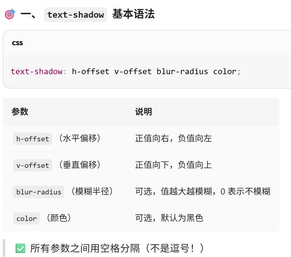
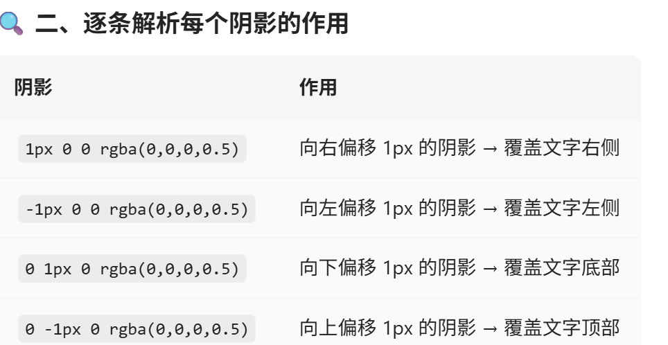
给文字添加“四周描边”(或称为“外轮廓”),让文字在复杂背景上依然清晰可读。作用是:为文字添加一层半透明黑色描边,提升在各种背景下的可读性和视觉层次感。
一、最终效果
这个 text-shadow 实现了:
文字 上下左右四个方向 各加一个微小偏移的黑色半透明阴影
视觉上形成一个 完整的描边(border-like outline)
像“描线”一样包裹住文字主体, 即使文字下方是复杂图片或渐变背景,也能清晰识别文字内容。
<template>
  <div class="Carouselitem-container">
    <div class="carousel-img">   // @load是子组件的抛出事件
      <ImageLoader :src="shuju.bigImg" :placeholder="shuju.midImg" :duration="2000" @load="showwords"></ImageLoader>
    </div>
    <div class="title" ref="title">{{ shuju.title }}</div>
    <div class="description" ref="desc">{{ shuju.description }}</div>
  </div>
</template>

<script>

import ImageLoader from "@/components/ImageLoader/index.vue"

export default {
    data(){
        return{
           titlewidth:0,
           descwidth:0
        }
    },
    components:{
        ImageLoader
    },

    // data(){
    //     return{
    //      shuju: {
    //             id: "1",
    //             midImg: "http://mdrs.yuanjin.tech/img/20201031141507.jpg",
    //             bigImg: "http://mdrs.yuanjin.tech/img/20201031141350.jpg",
    //             title: "凛冬将至",
    //             description: "人唯有恐惧的时候方能勇敢",
    // }
    //     }
    // },

    props:{
        shuju:{
            type: Object,           // 类型是 Object
            required: true,         // 是否必须传入
            default: () => ({})     // 默认是一个空对象(必须用函数返回)
        },
    },


    methods:{
        showwords(){
          //title标题
          this.$refs.title.style.opacity=1  //文字已经显示出来了
          this.$refs.title.style.width=0       //但宽度变为0了
          this.$refs.title.clientHeight//强制让游览器渲染一次。浏览器的默认行为:批量更新(异步重排)
          this.$refs.title.style.transition="2s";
          this.$refs.title.style.width=this.titlewidth+"px"
          //description描述
          this.$refs.desc.style.opacity=1  //文字已经显示出来了
          this.$refs.desc.style.width=0       //但宽度变为0了
          this.$refs.desc.clientHeight//只起强制让游览器渲染一次,解决异步问题
          this.$refs.desc.style.transition="2s 1s";
          this.$refs.desc.style.width=this.descwidth+"px"
        },
        handleLoaded(){
            console.log("抛出事件收到,load事件触发,图片加载完成")}
        },
        mounted(){
             this.titlewidth=this.$refs.title.clientWidth
             this.descwidth=this.$refs.desc.clientWidth
             console.log("获取原文本长度", this.titlewidth, this.descwidth)

            }

}
</script>

<style lang="less" scoped>
@import "~@/styles/var.less";
.Carouselitem-container{
    width: 100%;
    height: 100%;
    background-color: rgb(36, 35, 35);
    color: aliceblue;
    position: relative;

.carousel-img{
    width: 100%;
    height: 100%;
}
.title{
    position: absolute  ;
    top: 40%;
    left: 30px;
    color: #cecdcd;
    z-index: 100;
    font-size: 2em;
    letter-spacing: 3px;
    text-shadow: 1px 0 0 rgba(0,0,0,0.5) ,-1px 0 0 rgba(0,0,0,0.5),0 1px 0 rgba(0,0,0,0.5),0 -1px 0 rgba(0,0,0,0.5);
    white-space: nowrap;
    overflow: hidden;
    opacity: 0;
}

.description{
    position: absolute  ;
    top: 50%;
    left: 30px;
    color:lighten(@success,30%);  //颜色亮度加亮30%
    z-index: 100;
    letter-spacing: 3px;
    font-size: 1.5em;
    white-space: nowrap;
    overflow: hidden;
    opacity: 0;
    text-shadow:
      1px  0 0 #000,
      -1px  0 0 #000,
       0  1px 0 #000,
       0 -1px 0 #000,
       0 0 2px #000;  // 加点模糊增强实感

}

}
</style>

Agent 垂直技术社区,欢迎活跃、内容共建。
更多推荐

 5
5 0
0- 0


 已为社区贡献1条内容

所有评论(0)