使用 Element Plus 和 Vue 3 封装按钮组件
·
✨✨✨下面是如何使用 Element Plus 和 Vue 3 来封装一个可复用的按钮组件。
为什么需要封装组件?
统一样式、减少重复代码、提高可维护性
1.基础按钮组件实现
<!-- MyButton.vue -->
<template>
  <el-button
    :type="type"
    :plain="plain"
    :round="round"
    :circle="circle"
    :icon="icon"
    :disabled="disabled"
    :size="size"
    @click="handleClick"
  >
    <slot></slot>
  </el-button>
</template>

<script setup>
// 定义组件的 props
const props = defineProps({
  type: {
    type: String,
    default: 'primary',
    validator: (value) => {
      return ['primary', 'success', 'warning', 'danger', 'info', 'text'].includes(value)
    }
  },
  plain: {
    type: Boolean,
    default: false
  },
  round: {
    type: Boolean,
    default: false
  },
  circle: {
    type: Boolean,
    default: false
  },
  icon: {
    type: String,
    default: ''
  },
  disabled: {
    type: Boolean,
    default: false
  },
  size: {
    type: String,
    default: 'large',
    validator: (value) => {
      return ['large', 'default', 'small'].includes(value)
    }
  }
})

// 定义组件的 emits
const emits = defineEmits(['click'])

const handleClick = (event) => {
  if (!props.disabled) {
    emits('click', event)
  }
}
</script>

<style scoped>
/* 添加自定义样式 */
</style>
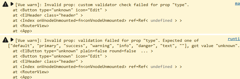
validator: 验证器函数确保传入的属性值只能是所写之一。
**如果传入的值不在这些选项中,Vue会在控制台中输出警告。
警告如下:
2.封装内容
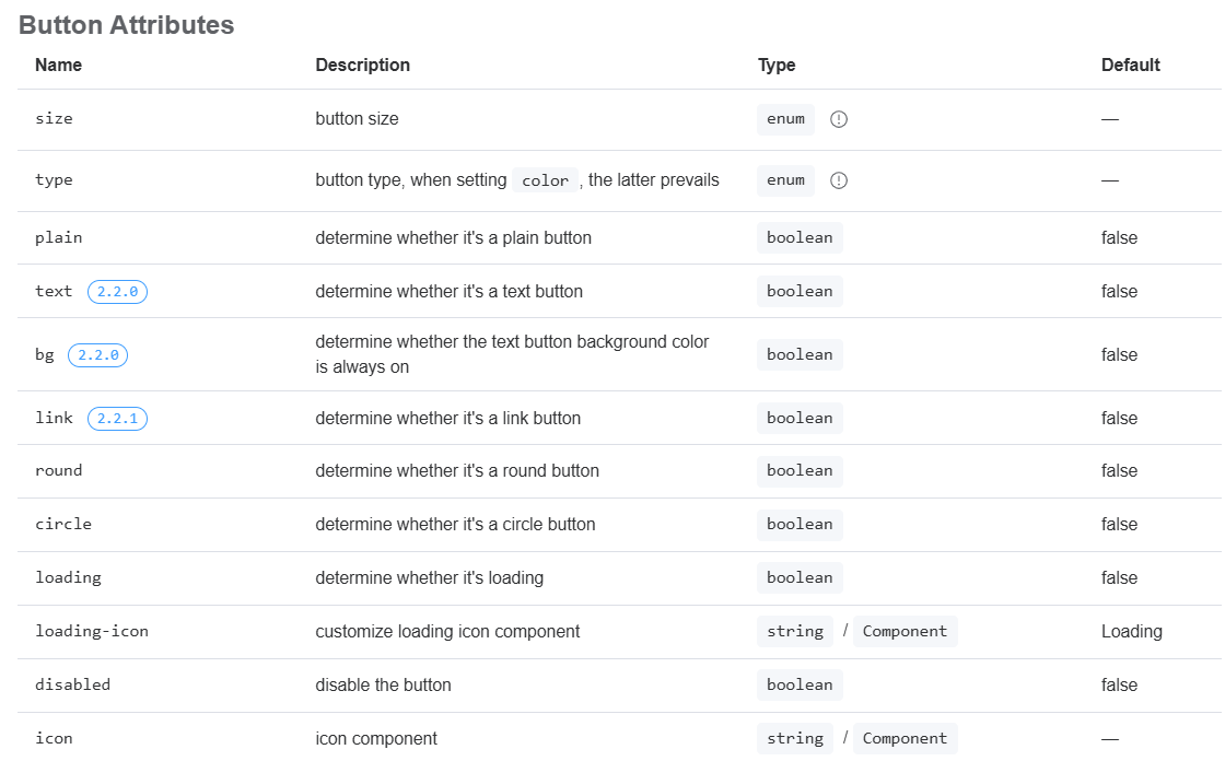
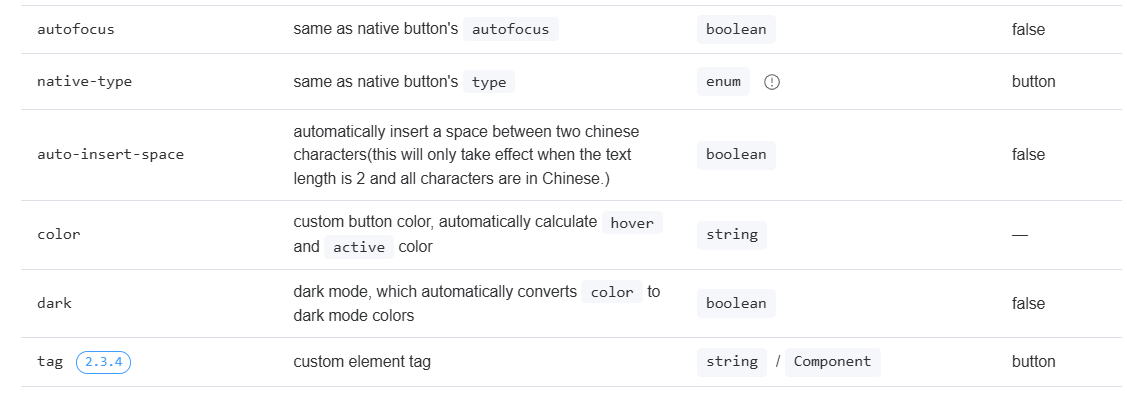
属性:
type: 按钮类型,默认 'primary',支持 Element Plus 的所有按钮类型
plain: 是否为朴素按钮,默认 false
round: 是否为圆角按钮,默认 false
circle: 是否为圆形按钮,默认 false
icon: 图标名称,默认空字符串
disabled: 是否禁用,默认 false
size: 按钮尺寸,默认 'large',支持 'large'/'default'/'small'
Emits 定义:
定义了 'click' 事件,当按钮被点击时触发
添加了禁用状态检查,防止在禁用状态下触发点击事件
插槽使用:
使用 <slot></slot> 允许父组件传递按钮文本或其他内容
额外属性和功能可自行封装大差不差
3.父界面使用
<template>
  <MyButton type="text">编辑</Button>
  <MyButton type="text" :disabled="true">编辑</Button>
  <MyButton type="primary" :round="true" @handleClick="handleClick">编辑</Button>
  <MyButton type="success" :plain="true">编辑</Button>
  <MyButton type="success" :plain="true" size="small">编辑</Button>
  <MyButton type="info" :circle="true">编辑</Button>
  <MyButton type="warning" icon="Edit">编辑</Button>
  <MyButton type="unknown" icon="Edit">编辑</Button>
</template>

<script setup>
import MyButton from '@/components/MyButton.vue'

const handleClick = () => {
  console.log('按钮被点击了')
}
</script>

记录
若文章对你有帮助,点赞❤️、收藏⭐加关注➕吧!

Agent 垂直技术社区,欢迎活跃、内容共建。
更多推荐

 6
6 0
0- 0


 已为社区贡献2条内容

所有评论(0)