Python & MATLAB 绘制箱型散点图,拒绝单调散点图
·
导读
普通散点图的问题:
-
多组数据时,散点要么挤在一起,要么只能分成多张图
-
很难一眼看出中位数、四分位数、离群点等统计特征
而箱型散点图的思路是:
-
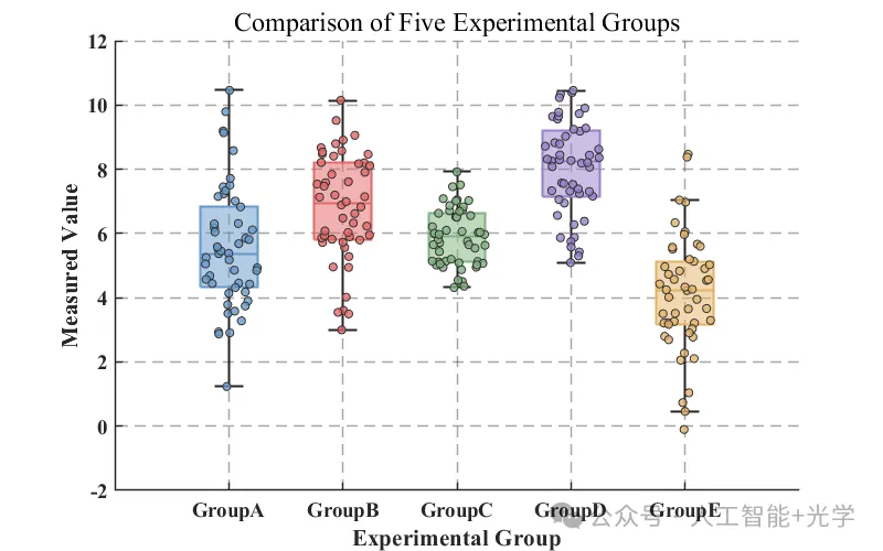
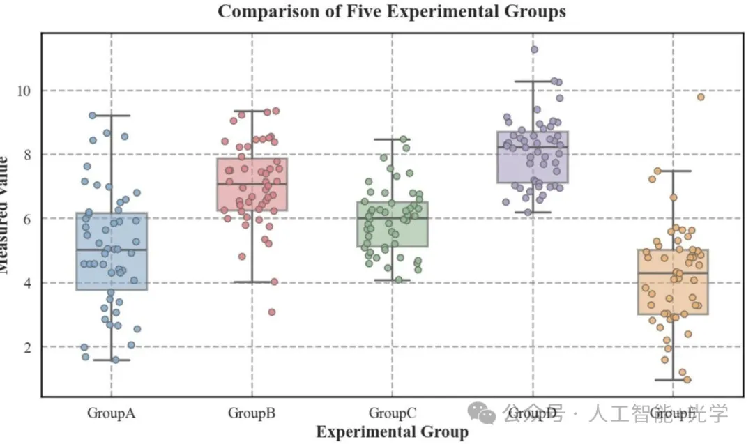
用 箱线图 展示整体分布(中位数、IQR、上下须)
-
用 带抖动的散点 展示每一个样本点的位置
-
半透明箱体 + 彩色散点 + 网格线,既美观又信息量大
适用场景包括:
-
多组实验结果比较(药物组、对照组……)
-
不同算法性能比较
-
不同时间点/条件下的测量值对比
一、Matlab绘制箱型散点图
clc; clear; close all;
rng(42);
group_names = {'GroupA', 'GroupB', 'GroupC', 'GroupD', 'GroupE'};
N = 50;
means = [5.5, 7, 6, 8, 4];
stds = [2, 1.5, 1, 1.2, 1.5];
data_cell = cell(1, 5);
for i = 1:5
    data_cell{i} = means(i) + stds(i) * randn(N, 1);
end
colors = [
    0.4, 0.6, 0.8;  % A Blue
    0.9, 0.4, 0.4;  % B Red
    0.5, 0.7, 0.5;  % C Green
    0.6, 0.5, 0.8;  % D Purple
    0.9, 0.7, 0.4   % E Orange
];
figure('Color', 'w', 'Position', [100, 100, 800, 500]);
hold on;
for i = 1:5
    current_data = data_cell{i};
    x_data = repmat(categorical(group_names(i)), N, 1);
    b = boxchart(x_data, current_data);
    b.BoxFaceColor = colors(i,:);
    b.BoxFaceAlpha = 0.5;
    b.LineWidth = 1.5;
    b.MarkerStyle = 'none';
    s = swarmchart(x_data, current_data, 30, 'Filled');
    s.MarkerFaceColor = colors(i,:);
    s.MarkerFaceAlpha = 0.8;
    s.MarkerEdgeColor = [0.2 0.2 0.2];
    s.XJitterWidth = 0.5;
end
hold off;
ax = gca;
ax.YGrid = 'on';
ax.XGrid = 'on';
ax.GridLineStyle = '--';
ax.GridAlpha = 0.4;
ax.LineWidth = 1.2;
ax.FontSize = 14;
ax.FontName = 'Times New Roman';
ax.FontWeight = 'bold';
ax.XAxis.Categories = group_names;
ylabel('Measured Value', 'FontSize', 16, 'FontWeight', 'bold');
xlabel('Experimental Group', 'FontSize', 16, 'FontWeight', 'bold');
title('Comparison of Five Experimental Groups', 'FontSize', 18);
二、Python绘制箱型散点图
import matplotlib.pyplot as plt
import seaborn as sns
import pandas as pd
import numpy as np
np.random.seed(42)
groups = ['GroupA', 'GroupB', 'GroupC', 'GroupD', 'GroupE']
means = [5.5, 7, 6, 8, 4]
stds = [2, 1.5, 1, 1.2, 1.5]
N = 50
data_list = []
for group, mean, std in zip(groups, means, stds):
    values = np.random.normal(loc=mean, scale=std, size=N)
    for v in values:
        data_list.append({'Group': group, 'Value': v})
df = pd.DataFrame(data_list)
sns.set_theme(style="white", rc={
    "font.family": "serif",
    "font.serif": ["Times New Roman"],
    "axes.linewidth": 1.5,
    "grid.linestyle": "--"
})
my_pal = {"GroupA": "#7FABD3", "GroupB": "#E67F83",
          "GroupC": "#8FBC8F", "GroupD": "#A69AC6", "GroupE": "#F4B16C"}
plt.figure(figsize=(10, 6), dpi=120)
ax = sns.boxplot(x='Group', y='Value', data=df, palette=my_pal,
                 width=0.5, linewidth=2, showfliers=False,
                 boxprops=dict(alpha=0.6))
sns.stripplot(x='Group', y='Value', data=df, palette=my_pal,
              size=6, jitter=0.2, linewidth=1, edgecolor='gray', alpha=0.9)
plt.grid(axis='y', linestyle='--', alpha=0.7, linewidth=1.5, color='gray')
plt.grid(axis='x', linestyle='--', alpha=0.7, linewidth=1.5, color='gray')
plt.title('Comparison of Five Experimental Groups', fontsize=18, fontweight='bold', pad=15)
plt.ylabel('Measured Value', fontsize=16, fontweight='bold')
plt.xlabel('Experimental Group', fontsize=16, fontweight='bold')
plt.tick_params(axis='both', which='major', labelsize=14, width=1.5, length=6)
for spine in ax.spines.values():
    spine.set_edgecolor('black')
    spine.set_linewidth(1.5)
plt.tight_layout()
plt.show()
如果你已经在项目或论文里用上了这种图,不妨也把这种效果分享给更多同事或同学

Agent 垂直技术社区,欢迎活跃、内容共建。
更多推荐


 6
6 0
0- 0


 已为社区贡献12条内容

所有评论(0)