Python & MATLAB 绘制三元图:看懂“三分天下”数据世界
·
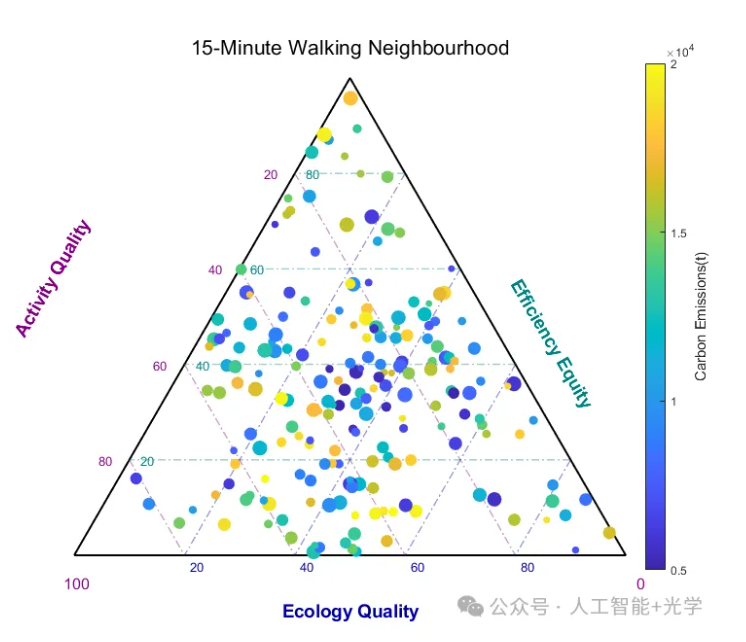
function draw_ternary_plot()
    % 1. 准备数据
    rng(42);
    n = 200;

    % 生成随机数据 (Activity, Ecology, Efficiency)
    % 这里的逻辑稍微有点复杂,为了保证和为100
    raw = rand(n, 3);
    data = 100 * raw ./ sum(raw, 2);

    act = data(:, 1); % Axis Left (Purple)
    eco = data(:, 2); % Axis Bottom (Blue)
    eff = data(:, 3); % Axis Right (Teal)

    % 颜色映射变量 (Emission) 和 大小 (Sequestration)
    emission = linspace(5000, 20000, n)';
    % 打乱顺序让颜色混合
    emission = emission(randperm(n));
    sz = 20 + 100 * rand(n, 1);

    % 2. 坐标转换函数 (Barycentric -> Cartesian)
    % 定义顶点:左下(0,0), 右下(1,0), 顶(0.5, sqrt(3)/2)
    % 对应关系:
    % Activity=100 -> 左下角 (0,0)
    % 顶部点: Activity=0, Ecology=0, Efficiency=100
    % 左下点: Activity=100, Ecology=0, Efficiency=0
    % 右下点: Activity=0, Ecology=100, Efficiency=0

    % 转换公式:
    % P = eff * P_top + act * P_left + eco * P_right
    x = (eff * 0.5 + eco * 1.0 + act * 0.0) / 100;
    y = (eff * sqrt(3)/2 + eco * 0 + act * 0) / 100;

    % 3. 开始绘图
    figure('Color', 'white', 'Position', [100, 100, 800, 700]);
    hold on; axis equal; axis off;

    % 定义颜色
    c_purp = [0.5, 0, 0.5];   % Activity
    c_blue = [0, 0, 0.6];     % Ecology
    c_teal = [0, 0.5, 0.5];   % Efficiency

    % 绘制三角形外框
    plot([0 1 0.5 0], [0 0 sqrt(3)/2 0], 'k-', 'LineWidth', 1.5);

    % 4. 绘制网格线
    grid_vals = 20:20:80;

    for v = grid_vals
        % -- Activity Grid (Purple) --
        % Activity constant lines are parallel to the side opposite to Act corner
        % Activity corner is Left(0,0). Opposite side is Right-Top.
        % Grid lines go from Bottom axis to Left axis? No, look at image.
        % Image: Lines for "Activity" slant downwards to the right.
        % Constant Activity = line parallel to the Eco-Eff side.

        % 计算该值的两个端点
        % Act = v. Eco goes 0 -> 100-v. Eff goes 100-v -> 0.
        [x1, y1] = ternary_coords(v, 0, 100-v);
        [x2, y2] = ternary_coords(v, 100-v, 0);
        plot([x1 x2], [y1 y2], '-.', 'Color', [c_purp, 0.4], 'LineWidth', 1);
        % 添加刻度文字
        text(x1-0.03, y1, num2str(v), 'Color', c_purp, 'FontSize',10, 'HorizontalAlignment','right');
        % -- Ecology Grid (Blue) --
        % Eco corner is Right(1,0).
        [x1, y1] = ternary_coords(0, v, 100-v);
        [x2, y2] = ternary_coords(100-v, v, 0);
        plot([x1 x2], [y1 y2], '-.', 'Color', [c_blue, 0.4], 'LineWidth', 1);
        text(x2+0.01, y2-0.02, num2str(v), 'Color', c_blue, 'FontSize',10);
        % -- Efficiency Grid (Teal) --
        % Eff corner is Top.
        [x1, y1] = ternary_coords(0, 100-v, v);
        [x2, y2] = ternary_coords(100-v, 0, v);
        plot([x1 x2], [y1 y2], '-.', 'Color', [c_teal, 0.4], 'LineWidth', 1);
        text(x2+0.02, y2, num2str(v), 'Color', c_teal, 'FontSize',10);
    end

    % 添加顶点文字 (0和100)
    text(-0.02, -0.05, '100', 'Color', c_purp, 'FontSize',12);
    text(1.02, -0.05, '0', 'Color', c_purp, 'FontSize',12);
    % 5. 绘制散点
    scatter(x, y, sz, emission, 'filled', 'MarkerEdgeColor', 'flat');
    colormap('parula'); % 类似图中的渐变
    c = colorbar;
    c.Label.String = 'Carbon Emissions(t)';
    c.Label.FontSize = 11;

    % 6. 轴标签 (带旋转)
    text(-0.1, 0.4, 'Activity Quality', 'Color', c_purp, 'FontSize', 14, ...
        'Rotation', 60, 'FontWeight', 'bold');
    text(0.5, -0.1, 'Ecology Quality', 'Color', c_blue, 'FontSize', 14, ...
        'HorizontalAlignment', 'center', 'FontWeight', 'bold');
    text(0.8, 0.5, 'Efficiency Equity', 'Color', c_teal, 'FontSize', 14, ...
        'Rotation', -60, 'FontWeight', 'bold');

    title('15-Minute Walking Neighbourhood', 'FontSize', 16);
    hold off;
end
% 辅助函数:将三元值转为XY
function [x, y] = ternary_coords(act, eco, eff)
    % 归一化(防止和不为100)
    total = act + eco + eff;
    act = act ./ total;
    eco = eco ./ total;
    eff = eff ./ total;

    % 顶点定义
    % Left (Act=1): 0, 0
    % Right (Eco=1): 1, 0
    % Top (Eff=1): 0.5, sqrt(3)/2

    x = act * 0 + eco * 1 + eff * 0.5;
    y = act * 0 + eco * 0 + eff * sqrt(3)/2;
end
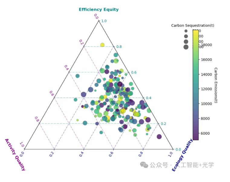
三、Python绘制三元图
import matplotlib.pyplot as plt
import mpltern
import numpy as np
# 1. 生成模拟数据
np.random.seed(42)
n_points = 200
# 调整alpha参数让数据偏向某一侧以模仿原图分布
data = np.random.dirichlet((4, 2, 5), n_points) * 100
efficiency = data[:, 0]
activity = data[:, 1]
ecology = data[:, 2]
# 模拟颜色映射变量 (Carbon Emissions) 和 大小变量 (Sequestration)
carbon_emissions = 5000 + 15000 * np.random.rand(n_points) # 颜色
sequestration = 20 + 200 * np.random.rand(n_points)        # 大小
# 2. 创建图形
fig = plt.figure(figsize=(10, 8))
# projection='ternary' 是 mpltern 提供的核心功能
ax = fig.add_subplot(projection='ternary')
# 3. 绘制散点图
# 顺序参数:t(上), l(左), r(右)
sc = ax.scatter(efficiency, activity, ecology,
                c=carbon_emissions,
                s=sequestration,
                cmap='viridis',
                alpha=0.8,
                edgecolors='grey',
                linewidth=0.5)
# 4. 设置轴标签和标题
# set_tlabel对应上方轴,l对应左侧,r对应右侧
ax.set_tlabel('Efficiency Equity', color='#008080', fontsize=12, fontweight='bold') # Teal
ax.set_llabel('Activity Quality', color='#800080', fontsize=12, fontweight='bold')  # Purple
ax.set_rlabel('Ecology Quality', color='#000080', fontsize=12, fontweight='bold')   # Dark Blue
# 5. 设置网格线 (模仿原图的虚线和颜色)
ax.grid(axis='t', linestyle='-.', color='#008080', alpha=0.6) # 水平线? 不,是对应Top轴的线
ax.grid(axis='l', linestyle='-.', color='#800080', alpha=0.6)
ax.grid(axis='r', linestyle='-.', color='#000080', alpha=0.6)
# 设置刻度颜色以匹配轴颜色
ax.tick_params(axis='t', colors='#008080')
ax.tick_params(axis='l', colors='#800080')
ax.tick_params(axis='r', colors='#000080')
# 6. 添加图例 (Colorbar 和 Size Legend)
# Colorbar
cbar = plt.colorbar(sc, ax=ax, shrink=0.7, pad=0.1)
cbar.set_label('Carbon Emissions(t)', rotation=270, labelpad=15)
# Size Legend
handles, labels = sc.legend_elements(prop="sizes", alpha=0.6, num=4, func=lambda x: (x-20)/200 * 15000)
legend = ax.legend(handles, ['5000', '10000', '15000', '20000'],
                   title="Carbon Sequestration(t)",
                   loc="upper right", bbox_to_anchor=(1.3, 1.0), frameon=False)
plt.title("15-Minute Walking Neighbourhood", fontsize=16, y=1.05, fontweight='bold')
plt.show()

Agent 垂直技术社区,欢迎活跃、内容共建。
更多推荐


 3
3 0
0- 0


 已为社区贡献12条内容

所有评论(0)