(第四章) Vue3 实战:打造现代化登录注册页面【从零到一】
📅 发布日期:2025年
🏷️ 标签:Vue3、实战项目、UI设计、表单验证、动画效果
⏱️ 阅读时长:约145分钟
💡 难度:⭐⭐ (入门实战)
📖 前言
大家好!前面我们学习了 Vue3 的基础知识和组合式 API,但可能有些同学会觉得太理论了。所以这一章,我们来做点真正吸引人的东西——一个超级好看的登录注册页面!
为什么选择登录注册页面作为实战项目?
- ✅ 实用性强 - 几乎每个项目都需要
- ✅ 视觉效果好 - 容易出效果,有成就感
- ✅ 知识点全面 - 表单、验证、动画、状态管理都能学到
- ✅ 可以炫耀 - 做完可以发朋友圈/简历作品集 😎
效果展示:
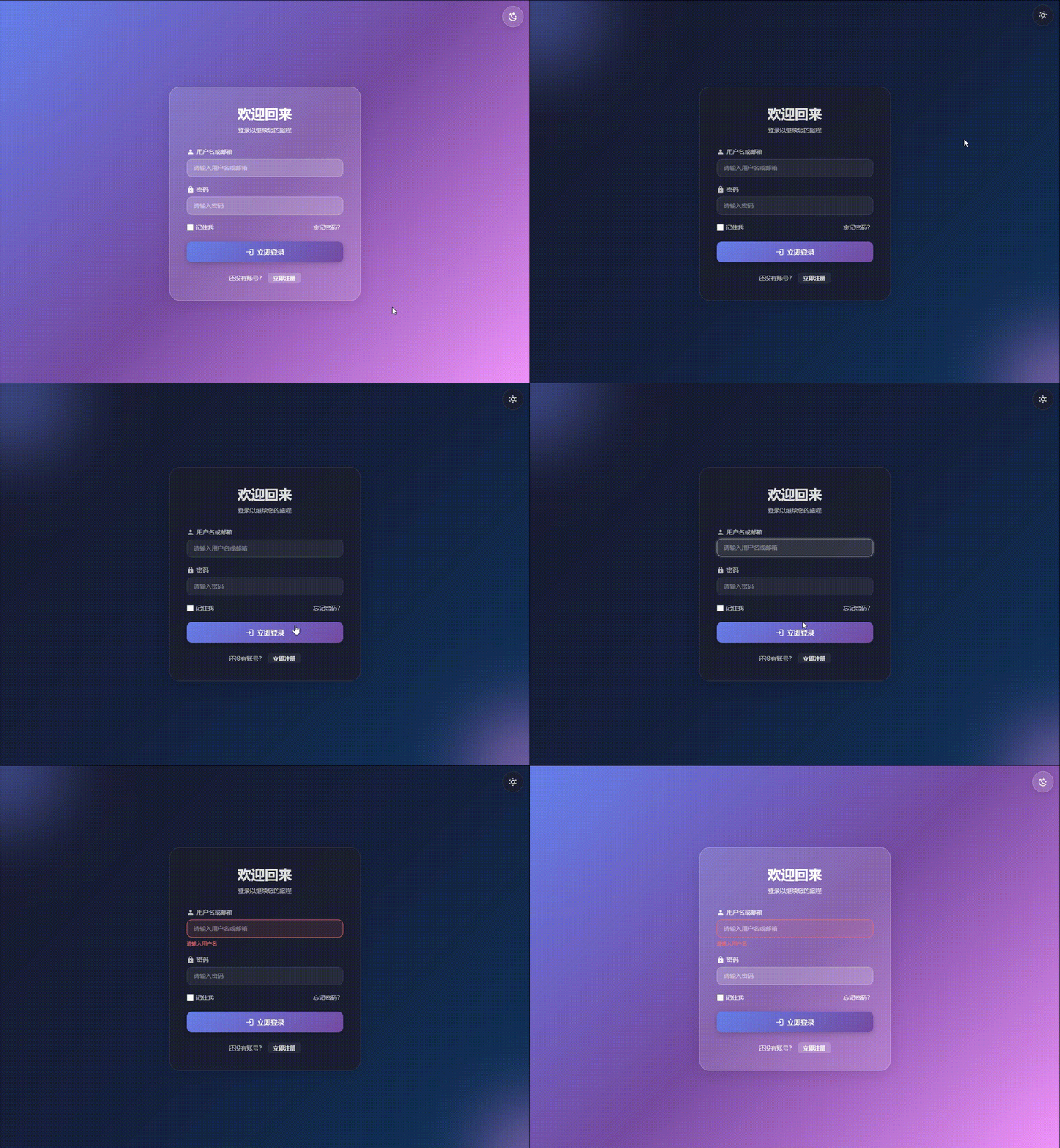
本章你将学到:
- 🎨 玻璃拟态 (Glassmorphism) 设计风格
- ✨ 登录/注册表单的流畅切换动画
- 📝 完整的表单验证逻辑(手机号、邮箱、密码强度)
- 🎭 酷炫的输入框聚焦动效
- 🌙 暗黑模式切换
- 🔐 密码强度实时显示
- ⏱️ 验证码倒计时功能
- 📱 完美的响应式布局
🎯 一、项目效果展示
在开始写代码之前,让我先给你看看我们要做出什么效果:
1.1 核心功能
| 功能 | 描述 | 难度 |
|---|---|---|
| 登录表单 | 用户名/邮箱 + 密码登录 | ⭐ |
| 注册表单 | 完整的注册流程 | ⭐⭐ |
| 表单验证 | 实时验证,友好的错误提示 | ⭐⭐ |
| 切换动画 | 登录/注册平滑切换 | ⭐⭐ |
| 密码强度 | 实时显示密码强度 | ⭐⭐ |
| 验证码倒计时 | 60秒倒计时 | ⭐ |
| 记住密码 | 本地存储功能 | ⭐ |
| 暗黑模式 | 一键切换主题 | ⭐⭐ |
| 响应式布局 | 适配手机/平板/PC | ⭐⭐ |
1.2 设计风格
我们采用现代玻璃拟态风格,主要特点:
- 🌈 渐变背景 - 柔和的紫蓝色渐变
- 💎 半透明磨砂玻璃 - backdrop-filter 实现
- ✨ 微妙的阴影和光效 - 立体感十足
- 🎨 流畅的过渡动画 - 每个交互都有反馈
- 🌙 深色模式支持 - 护眼又酷炫
🚀 二、从零开始创建项目
2.1 创建 Vue3 项目
如果你还没有 Vue3 项目,让我们从头开始创建一个:
# 1. 使用 Vite 创建 Vue3 + TypeScript 项目
npm create vite@latest auth-demo -- --template vue-ts

# 2. 进入项目目录
cd auth-demo

# 3. 安装依赖
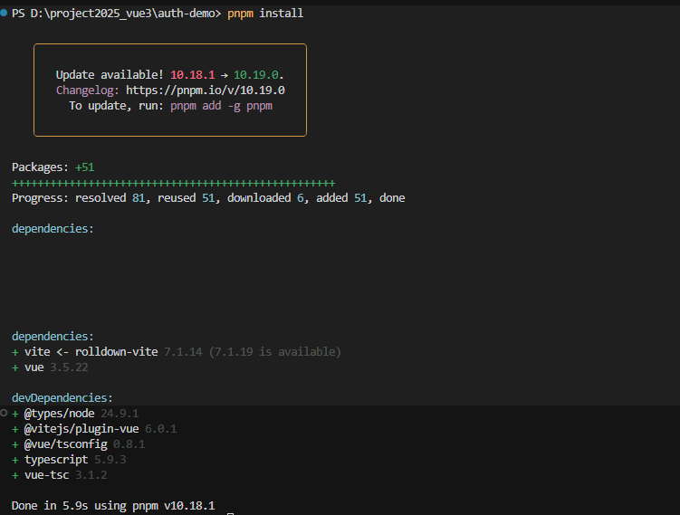
npm install
💡 小知识:
vite是新一代前端构建工具,比 webpack 快很多vue-ts模板表示使用 Vue3 + TypeScript- 项目名
auth-demo可以改成你喜欢的名字
2.2 安装必要的依赖
# 安装图标库(用于显示好看的图标)
npm install @iconify/vue

# 安装 Element Plus(UI 组件库,用于消息提示)
npm install element-plus

# 如果使用 pnpm(推荐,更快)
pnpm add @iconify/vue element-plus
💡 为什么需要这些?
@iconify/vue- 提供海量图标,比如登录图标、锁图标等element-plus- 只用它的消息提示功能(ElMessage)
2.3 创建项目目录结构
在项目的 src 目录下创建以下文件夹:
# 在项目根目录执行(Windows PowerShell)
New-Item -ItemType Directory -Path src/views/auth -Force
New-Item -ItemType Directory -Path src/composables -Force

# 如果是 Mac/Linux,使用:
# mkdir -p src/views/auth
# mkdir -p src/composables
💡 目录说明:
src/views/auth/- 存放登录注册页面src/composables/- 存放可复用的逻辑函数(Vue3 的组合式函数)
完成后的目录结构应该是这样:
auth-demo/
├── src/
│   ├── views/
│   │   └── auth/
│   │       └── LoginRegister.vue  # 我们的登录注册页面
│   ├── composables/
│   │   ├── useValidation.ts       # 表单验证工具
│   │   ├── useCountdown.ts        # 倒计时工具
│   │   └── useTheme.ts            # 主题切换工具
│   ├── App.vue
│   └── main.ts
├── package.json
└── vite.config.ts
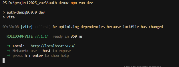
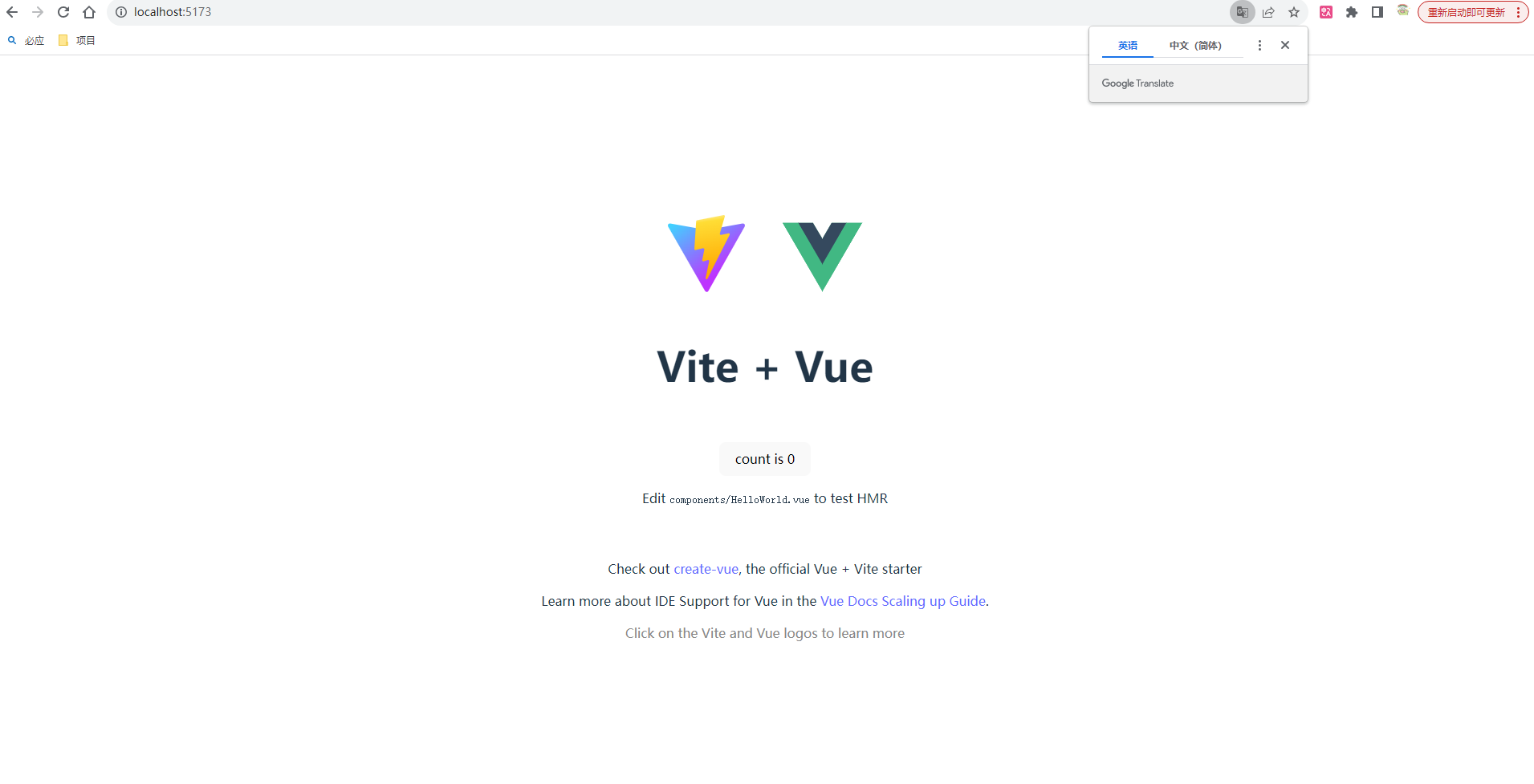
运行项目:
🔧 三、创建工具函数(Composables)
在正式写页面之前,我们先把工具函数准备好。这就像做菜前先把调料准备好一样。
3.1 表单验证工具 - useValidation.ts
创建文件:src/composables/useValidation.ts
/**
 * 表单验证工具
 * 这个文件包含了所有表单验证的逻辑
 * 把验证逻辑单独提取出来,可以在多个页面复用
 */

/**
 * 验证结果的类型定义
 * valid: 是否通过验证
 * message: 错误提示信息
 */
interface ValidationResult {
  valid: boolean
  message: string
}

/**
 * 密码验证结果的类型定义(比普通验证多了一个强度属性)
 */
interface PasswordValidationResult extends ValidationResult {
  strength: 'none' | 'weak' | 'medium' | 'strong'
}

/**
 * 导出验证功能
 * 使用 export function 可以在其他文件中导入使用
 */
export function useValidation() {

  /**
   * 验证邮箱格式
   * @param email - 要验证的邮箱字符串
   * @returns 返回验证结果对象
   */
  const validateEmail = (email: string): ValidationResult => {
    // 如果邮箱为空,返回错误
    if (!email) {
      return { valid: false, message: '请输入邮箱' }
    }

    // 使用正则表达式验证邮箱格式
    // 这个正则的意思是:xxx@xxx.xxx 这样的格式
    const emailPattern = /^[^\s@]+@[^\s@]+\.[^\s@]+$/

    if (!emailPattern.test(email)) {
      return { valid: false, message: '请输入有效的邮箱地址' }
    }

    // 验证通过
    return { valid: true, message: '' }
  }

  /**
   * 验证手机号格式(中国大陆)
   * @param phone - 要验证的手机号字符串
   * @returns 返回验证结果对象
   */
  const validatePhone = (phone: string): ValidationResult => {
    if (!phone) {
      return { valid: false, message: '请输入手机号' }
    }

    // 中国大陆手机号格式:1开头,第二位是3-9,后面9位数字
    // 比如:13812345678, 15912345678
    const phonePattern = /^1[3-9]\d{9}$/

    if (!phonePattern.test(phone)) {
      return { valid: false, message: '请输入有效的手机号' }
    }

    return { valid: true, message: '' }
  }

  /**
   * 验证密码强度
   * @param password - 要验证的密码字符串
   * @returns 返回验证结果对象(包含强度信息)
   *
   * 💡 密码强度计算规则:
   * - 长度 >= 8: +1分
   * - 长度 >= 12: 再+1分
   * - 包含数字: +1分
   * - 包含小写字母: +1分
   * - 包含大写字母: +1分
   * - 包含特殊字符: +1分
   *
   * 总分 >= 5: 强
   * 总分 >= 3: 中
   * 总分 < 3: 弱
   */
  const validatePassword = (password: string): PasswordValidationResult => {
    if (!password) {
      return { valid: false, message: '请输入密码', strength: 'none' }
    }

    if (password.length < 6) {
      return { valid: false, message: '密码至少需要6个字符', strength: 'weak' }
    }

    // 计算密码强度
    let strength: 'weak' | 'medium' | 'strong' = 'weak'
    let score = 0

    // 长度加分
    if (password.length >= 8) score++   // 长度8位以上+1分
    if (password.length >= 12) score++  // 长度12位以上再+1分

    // 包含数字(0-9任意一个)
    if (/\d/.test(password)) score++

    // 包含小写字母(a-z任意一个)
    if (/[a-z]/.test(password)) score++

    // 包含大写字母(A-Z任意一个)
    if (/[A-Z]/.test(password)) score++

    // 包含特殊字符(常见的符号)
    if (/[!@#$%^&*(),.?":{}|<>]/.test(password)) score++

    // 根据得分判断强度
    if (score >= 5) strength = 'strong'      // 5分以上:强
    else if (score >= 3) strength = 'medium' // 3-4分:中
    // 否则就是弱

    return { valid: true, message: '', strength }
  }

  /**
   * 验证用户名
   * @param username - 要验证的用户名字符串
   * @returns 返回验证结果对象
   *
   * 💡 用户名规则:
   * - 长度:3-20个字符
   * - 允许:字母、数字、下划线、中文
   */
  const validateUsername = (username: string): ValidationResult => {
    if (!username) {
      return { valid: false, message: '请输入用户名' }
    }

    if (username.length < 3) {
      return { valid: false, message: '用户名至少需要3个字符' }
    }

    if (username.length > 20) {
      return { valid: false, message: '用户名最多20个字符' }
    }

    // 只允许:字母(a-zA-Z)、数字(0-9)、下划线(_)、中文(\u4e00-\u9fa5)
    if (!/^[a-zA-Z0-9_\u4e00-\u9fa5]+$/.test(username)) {
      return { valid: false, message: '用户名只能包含字母、数字、下划线和中文' }
    }

    return { valid: true, message: '' }
  }

  /**
   * 验证验证码
   * @param code - 要验证的验证码字符串
   * @returns 返回验证结果对象
   *
   * 💡 验证码规则:必须是6位数字
   */
  const validateCode = (code: string): ValidationResult => {
    if (!code) {
      return { valid: false, message: '请输入验证码' }
    }

    // 必须是6位数字
    if (!/^\d{6}$/.test(code)) {
      return { valid: false, message: '请输入6位数字验证码' }
    }

    return { valid: true, message: '' }
  }

  // 把所有验证函数导出,供其他组件使用
  return {
    validateEmail,
    validatePhone,
    validatePassword,
    validateUsername,
    validateCode
  }
}
💡 代码解释:
-
为什么要单独写这个文件?
- 验证逻辑可以在多个页面复用(比如个人信息页也需要邮箱验证)
- 代码更清晰,登录页面不会太长
- 方便测试和维护
-
正则表达式是什么?
- 就是一种匹配文本的规则
/^1[3-9]\d{9}$/表示:以1开头,第二位是3-9,后面9位是数字- 不用深究,直接复制使用即可
-
为什么返回对象?
{ valid: true, message: '' }包含了两个信息valid告诉我们是否通过验证message告诉我们错误原因(方便显示给用户)
3.2 倒计时工具 - useCountdown.ts
创建文件:src/composables/useCountdown.ts
/**
 * 倒计时工具
 * 用于验证码按钮的60秒倒计时功能
 */

import { ref, computed } from 'vue'

/**
 * 倒计时 Composable
 * @param initialSeconds - 初始秒数,默认60秒
 * @returns 倒计时相关的状态和方法
 */
export function useCountdown(initialSeconds: number = 60) {

  // 当前倒计时的秒数
  // ref 是 Vue3 的响应式数据,值改变时页面会自动更新
  const countdown = ref(0)

  // 计算属性:是否正在倒计时
  // 当 countdown > 0 时,表示正在倒计时
  const isCountingDown = computed(() => countdown.value > 0)

  // 定时器的ID,用于清除定时器
  let timer: number | null = null

  /**
   * 开始倒计时
   * 会每秒减1,直到0为止
   */
  const startCountdown = () => {
    // 如果已经在倒计时了,不要重复开始
    if (countdown.value > 0) return

    // 设置初始秒数
    countdown.value = initialSeconds

    // 每1000毫秒(1秒)执行一次
    timer = window.setInterval(() => {
      countdown.value--  // 秒数减1

      // 如果倒计时结束,停止定时器
      if (countdown.value <= 0) {
        stopCountdown()
      }
    }, 1000)
  }

  /**
   * 停止倒计时
   * 清除定时器并重置秒数
   */
  const stopCountdown = () => {
    if (timer) {
      clearInterval(timer)  // 清除定时器
      timer = null
    }
    countdown.value = 0  // 重置秒数
  }

  // 导出状态和方法
  return {
    countdown,        // 当前秒数
    isCountingDown,   // 是否正在倒计时
    startCountdown,   // 开始倒计时的方法
    stopCountdown     // 停止倒计时的方法
  }
}
💡 使用示例:
<script setup>
const { countdown, isCountingDown, startCountdown } = useCountdown(60)

// 点击按钮后开始倒计时
function handleClick() {
  startCountdown()
}
</script>

<template>
  <button :disabled="isCountingDown" @click="handleClick">
    {{ isCountingDown ? `${countdown}秒后重试` : '获取验证码' }}
  </button>
</template>
3.3 主题切换工具 - useTheme.ts
创建文件:src/composables/useTheme.ts
/**
 * 主题切换工具
 * 实现暗黑模式和浅色模式的切换
 */

import { ref, watch } from 'vue'

// 主题类型:只能是 'light' 或 'dark'
export type Theme = 'light' | 'dark'

/**
 * 主题管理 Composable
 * @returns 主题相关的状态和方法
 */
export function useTheme() {

  /**
   * 当前主题
   * 从 localStorage 读取用户之前的选择
   * 如果是第一次访问,默认使用浅色主题
   *
   * 💡 localStorage 是浏览器提供的本地存储
   * 可以永久保存数据(除非用户清除缓存)
   */
  const theme = ref<Theme>(
    (localStorage.getItem('theme') as Theme) || 'light'
  )

  /**
   * 切换主题
   * 在浅色和暗黑之间切换
   */
  const toggleTheme = () => {
    theme.value = theme.value === 'light' ? 'dark' : 'light'
  }

  /**
   * 设置指定主题
   * @param newTheme - 要设置的主题
   */
  const setTheme = (newTheme: Theme) => {
    theme.value = newTheme
  }

  /**
   * 监听主题变化
   * 当主题改变时:
   * 1. 保存到 localStorage(下次访问时记住选择)
   * 2. 更新 HTML 标签的 data-theme 属性(让 CSS 生效)
   *
   * watch 是 Vue3 的监听器,当数据变化时执行回调函数
   * immediate: true 表示立即执行一次(不等数据变化)
   */
  watch(
    theme,
    (newTheme) => {
      // 保存到本地存储
      localStorage.setItem('theme', newTheme)

      // 更新 HTML 的 data-theme 属性
      // CSS 可以通过 [data-theme="dark"] 来应用不同的样式
      document.documentElement.setAttribute('data-theme', newTheme)
    },
    { immediate: true }  // 立即执行一次,确保页面加载时就应用主题
  )

  return {
    theme,         // 当前主题
    toggleTheme,   // 切换主题的方法
    setTheme       // 设置主题的方法
  }
}
💡 原理解释:
-
为什么保存到 localStorage?
- 用户选择暗黑模式后,下次访问也应该是暗黑模式
- localStorage 可以永久保存数据
-
data-theme 属性是怎么工作的?
/* 浅色主题的样式 */
[data-theme="light"] {
  --bg-color: white;
  --text-color: black;
}

/* 暗黑主题的样式 */
[data-theme="dark"] {
  --bg-color: black;
  --text-color: white;
}
🎨 四、创建登录注册页面
现在工具函数都准备好了,让我们开始写页面!我们会分步骤来写,先从最简单的开始。
4.1 第一步:创建基础结构
创建文件:src/views/auth/LoginRegister.vue
<script setup lang="ts">
/**
 * 登录注册页面
 * 这是我们的主页面组件
 */

import { ref } from 'vue'

/**
 * 控制显示登录还是注册
 * true 显示登录表单
 * false 显示注册表单
 */
const isLogin = ref(true)

/**
 * 切换登录/注册模式
 */
const toggleMode = () => {
  isLogin.value = !isLogin.value
}
</script>

<template>
  <!-- 最外层容器:占满整个屏幕 -->
  <div class="auth-container">

    <!-- 卡片容器:白色半透明的玻璃卡片 -->
    <div class="auth-card">

      <!-- 标题:根据模式显示不同文字 -->
      <h1 class="title">
        {{ isLogin ? '欢迎回来' : '创建账号' }}
      </h1>

      <!-- 副标题 -->
      <p class="subtitle">
        {{ isLogin ? '登录以继续您的旅程' : '填写信息开始使用' }}
      </p>

      <!-- 表单内容区域(后面会填充) -->
      <div class="form-content">
        <p style="color: white; text-align: center;">
          {{ isLogin ? '登录表单区域' : '注册表单区域' }}
        </p>
      </div>

      <!-- 底部切换按钮 -->
      <div class="toggle-mode">
        <span>{{ isLogin ? '还没有账号?' : '已有账号?' }}</span>
        <button @click="toggleMode">
          {{ isLogin ? '立即注册' : '立即登录' }}
        </button>
      </div>

    </div>
  </div>
</template>

<style scoped>
/**
 * scoped 表示这些样式只在当前组件生效
 * 不会影响其他组件
 */

/*
 * 最外层容器
 * 占满整个屏幕,内容居中
 */
.auth-container {
  /* 最小高度100vh(vh = viewport height,视口高度) */
  min-height: 100vh;

  /* 使用 flex 布局让内容居中 */
  display: flex;
  justify-content: center;  /* 水平居中 */
  align-items: center;      /* 垂直居中 */

  /* 内边距:防止内容贴边 */
  padding: 20px;

  /*
   * 渐变背景:这是页面的颜值担当!
   * linear-gradient 创建一个渐变背景
   * 135deg 表示从左上到右下的方向
   * 三个颜色值创建紫-蓝-粉的渐变
   */
  background: linear-gradient(
    135deg,
    #667eea 0%,    /* 紫色 */
    #764ba2 50%,   /* 深紫色 */
    #f093fb 100%   /* 粉色 */
  );

  position: relative;
  overflow: hidden;
}

/*
 * 背景装饰球 - 左上角
 * 使用伪元素创建一个模糊的装饰圆球
 */
.auth-container::before {
  content: '';
  position: absolute;
  width: 300px;
  height: 300px;
  border-radius: 50%;  /* 圆形 */

  /* blur(80px) 让圆球边缘非常模糊,产生梦幻效果 */
  filter: blur(80px);
  opacity: 0.5;

  background: #667eea;
  top: -150px;
  left: -150px;

  /* 浮动动画 */
  animation: float 8s ease-in-out infinite;
}

/*
 * 背景装饰球 - 右下角
 */
.auth-container::after {
  content: '';
  position: absolute;
  width: 300px;
  height: 300px;
  border-radius: 50%;
  filter: blur(80px);
  opacity: 0.5;

  background: #f093fb;
  bottom: -150px;
  right: -150px;

  /* 延迟4秒开始动画,让两个球的运动不同步 */
  animation: float 8s ease-in-out infinite;
  animation-delay: 4s;
}

/*
 * 浮动动画
 * 让装饰球缓慢移动,增加动态感
 */
@keyframes float {
  0%, 100% {
    transform: translate(0, 0);
  }
  50% {
    transform: translate(30px, 30px);
  }
}

/*
 * 卡片容器
 * 这是页面的核心 - 玻璃拟态效果!
 */
.auth-card {
  /*
   * 玻璃拟态的关键三要素:
   * 1. 半透明背景
   * 2. backdrop-filter 背景模糊
   * 3. 边框和阴影
   */

  /* rgba 的最后一个值是透明度,0.15 表示85%透明 */
  background: rgba(255, 255, 255, 0.15);

  /*
   * backdrop-filter 是玻璃拟态的核心
   * blur(20px) 让背景模糊,产生磨砂玻璃效果
   * 注意:某些老浏览器可能不支持
   */
  backdrop-filter: blur(20px);

  /* 白色半透明边框,增加立体感 */
  border: 1px solid rgba(255, 255, 255, 0.3);

  /* 阴影让卡片浮起来 */
  box-shadow: 0 8px 32px rgba(0, 0, 0, 0.1);

  /* 内边距 */
  padding: 40px;

  /* 圆角,让卡片更柔和 */
  border-radius: 24px;

  /* 宽度限制 */
  width: 100%;
  max-width: 450px;

  /*
   * z-index: 1 让卡片显示在装饰球上方
   * 必须配合 position 使用
   */
  position: relative;
  z-index: 1;

  /* 过渡动画:所有属性变化时平滑过渡 */
  transition: all 0.3s ease;
}

/*
 * 鼠标悬停效果
 * 让卡片向上浮动一点
 */
.auth-card:hover {
  transform: translateY(-5px);
  box-shadow: 0 12px 48px rgba(0, 0, 0, 0.15);
}

/*
 * 标题样式
 */
.title {
  font-size: 32px;
  font-weight: 700;
  margin-bottom: 8px;
  text-align: center;
  color: #ffffff;

  /* 文字阴影,增加立体感 */
  text-shadow: 0 2px 4px rgba(0, 0, 0, 0.1);
}

/*
 * 副标题样式
 */
.subtitle {
  color: rgba(255, 255, 255, 0.9);
  text-align: center;
  margin-bottom: 32px;
  font-size: 14px;
}

/*
 * 表单内容区域
 */
.form-content {
  margin-bottom: 24px;
}

/*
 * 切换模式区域
 */
.toggle-mode {
  text-align: center;
  margin-top: 24px;
  color: rgba(255, 255, 255, 0.9);
  font-size: 14px;
}

/*
 * 切换按钮
 */
.toggle-mode button {
  color: #ffffff;
  background: rgba(255, 255, 255, 0.2);
  border: none;
  cursor: pointer;
  margin-left: 8px;
  font-weight: 600;
  padding: 4px 12px;
  border-radius: 6px;
  transition: all 0.3s ease;
}

/*
 * 按钮悬停效果
 */
.toggle-mode button:hover {
  background: rgba(255, 255, 255, 0.3);
  transform: translateY(-2px);
}
</style>
App.vue:
<script setup lang="ts">
import LoginRegister from './views/auth/LoginRegister.vue'
</script>

<template>
  <LoginRegister />
</template>

<style>
/* 重置默认样式 */
* {
  margin: 0;
  padding: 0;
  box-sizing: border-box;
}

body {
  font-family: -apple-system, BlinkMacSystemFont, 'Segoe UI', Roboto,
    'Helvetica Neue', Arial, sans-serif;
}
</style>
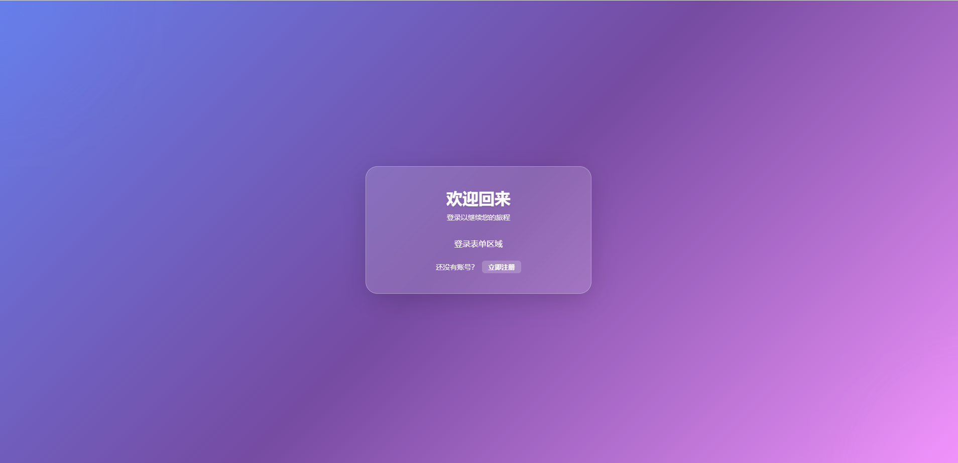
💡 到这一步,你应该能看到:
- 一个漂亮的渐变背景
- 中间有一个半透明的玻璃卡片
- 两个在背景缓慢移动的装饰球
- 点击底部按钮可以切换标题文字
🎯 先保存并运行看看效果!
npm run dev
然后在浏览器打开 http://localhost:5173,你应该能看到一个非常漂亮的卡片了!
4.2 第二步:添加登录表单
现在让我们在卡片里添加真正的登录表单。继续编辑 LoginRegister.vue:
<script setup lang="ts">
import { ref, reactive } from 'vue'
import { Icon } from '@iconify/vue'  // 导入图标组件

/**
 * 控制显示登录还是注册
 */
const isLogin = ref(true)

/**
 * 登录表单数据
 * 使用 reactive 创建响应式对象
 * reactive 适合对象类型的数据
 */
const loginForm = reactive({
  username: '',    // 用户名
  password: '',    // 密码
  remember: false  // 是否记住我
})

/**
 * 切换登录/注册模式
 */
const toggleMode = () => {
  isLogin.value = !isLogin.value
}

/**
 * 处理登录
 * 点击"立即登录"按钮时调用
 */
const handleLogin = () => {
  console.log('登录数据:', loginForm)
  // 后面会添加验证和真实登录逻辑
}
</script>

<template>
  <div class="auth-container">
    <div class="auth-card">
      <h1 class="title">
        {{ isLogin ? '欢迎回来' : '创建账号' }}
      </h1>

      <p class="subtitle">
        {{ isLogin ? '登录以继续您的旅程' : '填写信息开始使用' }}
      </p>

      <!-- 登录表单 -->
      <div v-if="isLogin" class="form-content">

        <!-- 用户名输入框 -->
        <div class="form-item">
          <!-- 标签 -->
          <label class="form-label">
            <Icon icon="mdi:account" class="label-icon" />
            用户名或邮箱
          </label>

          <!-- 输入框 -->
          <input
            v-model="loginForm.username"
            type="text"
            placeholder="请输入用户名或邮箱"
            class="form-input"
          />
        </div>

        <!-- 密码输入框 -->
        <div class="form-item">
          <label class="form-label">
            <Icon icon="mdi:lock" class="label-icon" />
            密码
          </label>

          <input
            v-model="loginForm.password"
            type="password"
            placeholder="请输入密码"
            class="form-input"
          />
        </div>

        <!-- 选项行:记住我 + 忘记密码 -->
        <div class="form-options">
          <!-- 记住我 -->
          <label class="checkbox-label">
            <input
              v-model="loginForm.remember"
              type="checkbox"
              class="checkbox-input"
            />
            <span>记住我</span>
          </label>

          <!-- 忘记密码链接 -->
          <a href="#" class="forgot-link">忘记密码?</a>
        </div>

        <!-- 登录按钮 -->
        <button class="submit-btn" @click="handleLogin">
          <Icon icon="mdi:login" class="btn-icon" />
          立即登录
        </button>

      </div>

      <!-- 注册表单(暂时只显示文字) -->
      <div v-else class="form-content">
        <p style="color: white; text-align: center;">
          注册表单(下一步添加)
        </p>
        </div>

      <div class="toggle-mode">
        <span>{{ isLogin ? '还没有账号?' : '已有账号?' }}</span>
        <button @click="toggleMode">
          {{ isLogin ? '立即注册' : '立即登录' }}
        </button>
      </div>
    </div>
  </div>
</template>

<style scoped>
/* ...前面的样式保持不变,添加以下新样式... */

/*
 * 表单内容动画
 * 当切换登录/注册时有淡入效果
 */
.form-content {
  animation: fadeIn 0.5s ease;
}

@keyframes fadeIn {
  from {
    opacity: 0;
    transform: translateY(10px);
  }
  to {
    opacity: 1;
    transform: translateY(0);
  }
}

/*
 * 表单项(每个输入框的外层容器)
 */
.form-item {
  margin-bottom: 20px;
}

/*
 * 表单标签
 */
.form-label {
  display: flex;
  align-items: center;
  gap: 6px;
  color: rgba(255, 255, 255, 0.95);
  font-size: 14px;
  font-weight: 500;
  margin-bottom: 8px;
}

/*
 * 标签图标
 */
.label-icon {
  font-size: 18px;
}

/*
 * 输入框样式
 * 这是表单的颜值担当!
 */
.form-input {
  /* 宽度占满父容器 */
  width: 100%;

  /* 内边距 */
  padding: 12px 16px;

  /* 半透明白色背景 */
  background: rgba(255, 255, 255, 0.2);

  /* 半透明白色边框 */
  border: 1px solid rgba(255, 255, 255, 0.3);

  /* 圆角 */
  border-radius: 12px;

  /* 文字颜色 */
  color: #ffffff;

  /* 字体大小 */
  font-size: 14px;

  /* 过渡动画 */
  transition: all 0.3s ease;

  /* 确保宽度计算包含 padding 和 border */
  box-sizing: border-box;
}

/*
 * 输入框占位符(placeholder)样式
 */
.form-input::placeholder {
  color: rgba(255, 255, 255, 0.5);
}

/*
 * 输入框聚焦效果
 * 这是最酷炫的部分!
 */
.form-input:focus {
  /* 去掉浏览器默认的蓝色边框 */
  outline: none;

  /* 背景变亮一点 */
  background: rgba(255, 255, 255, 0.25);

  /* 边框变亮 */
  border-color: rgba(255, 255, 255, 0.6);

  /* 外发光效果 */
  box-shadow: 0 0 0 3px rgba(255, 255, 255, 0.1);

  /* 轻微上浮 */
  transform: translateY(-2px);
}

/*
 * 表单选项行
 * 记住我和忘记密码在同一行
 */
.form-options {
  display: flex;
  justify-content: space-between;
  align-items: center;
  margin-bottom: 24px;
  font-size: 14px;
}

/*
 * 复选框标签
 */
.checkbox-label {
  display: flex;
  align-items: center;
  gap: 6px;
  color: rgba(255, 255, 255, 0.9);
  cursor: pointer;
}

/*
 * 复选框
 */
.checkbox-input {
  width: 16px;
  height: 16px;
  cursor: pointer;
}

/*
 * 忘记密码链接
 */
.forgot-link {
  color: rgba(255, 255, 255, 0.9);
  text-decoration: none;
  transition: color 0.3s ease;
}

.forgot-link:hover {
  color: #ffffff;
  text-decoration: underline;
}

/*
 * 提交按钮
 * 超大、超显眼的按钮!
 */
.submit-btn {
  /* 宽度占满 */
  width: 100%;

  /* 内边距 */
  padding: 14px;

  /* 渐变背景 */
  background: linear-gradient(135deg, #667eea 0%, #764ba2 100%);

  /* 无边框 */
  border: none;

  /* 圆角 */
  border-radius: 12px;

  /* 白色文字 */
  color: #ffffff;

  /* 字体 */
  font-size: 16px;
  font-weight: 600;

  /* 鼠标样式 */
  cursor: pointer;

  /* 过渡动画 */
  transition: all 0.3s ease;

  /* 使用 flex 让图标和文字居中 */
  display: flex;
  align-items: center;
  justify-content: center;
  gap: 8px;

  /* 阴影 */
  box-shadow: 0 4px 15px rgba(0, 0, 0, 0.2);
}

/*
 * 按钮悬停效果
 */
.submit-btn:hover {
  transform: translateY(-2px);
  box-shadow: 0 6px 20px rgba(0, 0, 0, 0.3);
}

/*
 * 按钮按下效果
 */
.submit-btn:active {
  transform: translateY(0);
}

/*
 * 按钮图标
 */
.btn-icon {
  font-size: 20px;
}

/* ...前面容器、卡片等样式保持不变... */
</style>
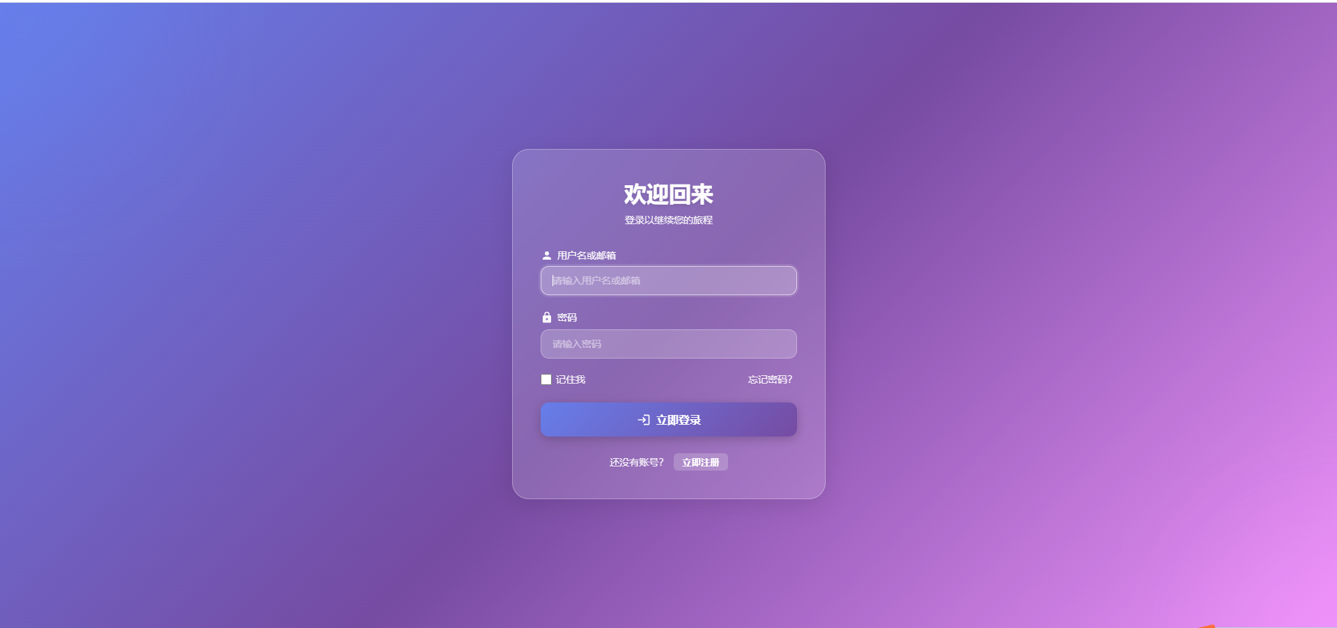
💡 保存后刷新浏览器,你应该能看到:
- 一个完整的登录表单
- 输入框有漂亮的聚焦效果
- 按钮有悬停和按下动画
4.3 第三步:添加注册表单
现在让我们添加注册表单。注册表单比登录表单复杂一些,有更多输入项。
继续编辑 LoginRegister.vue:
<script setup lang="ts">
import { ref, reactive } from 'vue'
import { Icon } from '@iconify/vue'

const isLogin = ref(true)

// 登录表单数据
const loginForm = reactive({
  username: '',
  password: '',
  remember: false
})

/**
 * 注册表单数据
 * 包含更多字段
 */
const registerForm = reactive({
  username: '',         // 用户名
  email: '',            // 邮箱
  phone: '',            // 手机号
  password: '',         // 密码
  confirmPassword: '',  // 确认密码
  code: ''              // 验证码
})

const toggleMode = () => {
  isLogin.value = !isLogin.value
}

const handleLogin = () => {
  console.log('登录数据:', loginForm)
}

/**
 * 处理注册
 * 点击"立即注册"按钮时调用
 */
const handleRegister = () => {
  console.log('注册数据:', registerForm)
  // 后面会添加验证和真实注册逻辑
}

/**
 * 获取验证码
 * 点击"获取验证码"按钮时调用
 */
const handleGetCode = () => {
  console.log('发送验证码到:', registerForm.phone)
  // 后面会添加倒计时和真实发送逻辑
}
</script>

<template>
  <div class="auth-container">
    <div class="auth-card">
      <h1 class="title">
        {{ isLogin ? '欢迎回来' : '创建账号' }}
      </h1>

      <p class="subtitle">
        {{ isLogin ? '登录以继续您的旅程' : '填写信息开始使用' }}
      </p>

      <!-- 登录表单(保持不变) -->
      <div v-if="isLogin" class="form-content">
        <!-- ...登录表单代码不变... -->
      </div>

      <!-- 注册表单 -->
      <div v-else class="form-content">

        <!-- 用户名 -->
        <div class="form-item">
          <label class="form-label">
            <Icon icon="mdi:account" class="label-icon" />
            用户名
          </label>
          <input
            v-model="registerForm.username"
            type="text"
            placeholder="请输入用户名(3-20个字符)"
            class="form-input"
          />
        </div>

        <!-- 邮箱 -->
        <div class="form-item">
          <label class="form-label">
            <Icon icon="mdi:email" class="label-icon" />
            邮箱
          </label>
          <input
            v-model="registerForm.email"
            type="email"
            placeholder="请输入邮箱"
            class="form-input"
          />
        </div>

        <!-- 手机号 + 获取验证码按钮 -->
        <div class="form-item">
          <label class="form-label">
            <Icon icon="mdi:phone" class="label-icon" />
            手机号
          </label>

          <!--
            输入框和按钮在同一行
            使用 input-with-button 容器
          -->
          <div class="input-with-button">
            <input
              v-model="registerForm.phone"
              type="tel"
              placeholder="请输入手机号"
              class="form-input"
            />

            <!-- 获取验证码按钮 -->
            <button class="code-btn" @click="handleGetCode">
              获取验证码
            </button>
          </div>
        </div>

        <!-- 验证码 -->
        <div class="form-item">
          <label class="form-label">
            <Icon icon="mdi:message-text" class="label-icon" />
            验证码
          </label>
          <input
            v-model="registerForm.code"
            type="text"
            placeholder="请输入6位验证码"
            class="form-input"
            maxlength="6"
          />
        </div>

        <!-- 密码 -->
        <div class="form-item">
          <label class="form-label">
            <Icon icon="mdi:lock" class="label-icon" />
            密码
          </label>
          <input
            v-model="registerForm.password"
            type="password"
            placeholder="请输入密码(至少6个字符)"
            class="form-input"
          />
        </div>

        <!-- 确认密码 -->
        <div class="form-item">
          <label class="form-label">
            <Icon icon="mdi:lock-check" class="label-icon" />
            确认密码
          </label>
          <input
            v-model="registerForm.confirmPassword"
            type="password"
            placeholder="请再次输入密码"
            class="form-input"
          />
        </div>

        <!-- 注册按钮 -->
        <button class="submit-btn" @click="handleRegister">
          <Icon icon="mdi:account-plus" class="btn-icon" />
          立即注册
        </button>

      </div>

      <div class="toggle-mode">
        <span>{{ isLogin ? '还没有账号?' : '已有账号?' }}</span>
        <button @click="toggleMode">
          {{ isLogin ? '立即注册' : '立即登录' }}
        </button>
      </div>
    </div>
  </div>
</template>

<style scoped>
/* ...前面的样式保持不变,添加以下新样式... */

/*
 * 带按钮的输入框容器
 * 让输入框和按钮在同一行
 */
.input-with-button {
  display: flex;
  gap: 8px;  /* 输入框和按钮之间的间距 */
}

/*
 * 输入框占据剩余空间
 */
.input-with-button .form-input {
  flex: 1;
}

/*
 * 验证码按钮
 */
.code-btn {
  /* 内边距 */
  padding: 12px 20px;

  /* 半透明白色背景 */
  background: rgba(255, 255, 255, 0.25);

  /* 边框 */
  border: 1px solid rgba(255, 255, 255, 0.3);

  /* 圆角 */
  border-radius: 12px;

  /* 文字颜色 */
  color: #ffffff;

  /* 字体 */
  font-size: 13px;
  font-weight: 500;

  /* 鼠标样式 */
  cursor: pointer;

  /* 过渡动画 */
  transition: all 0.3s ease;

  /* 不换行 */
  white-space: nowrap;
}

/*
 * 验证码按钮悬停效果
 */
.code-btn:hover {
  background: rgba(255, 255, 255, 0.35);
  transform: translateY(-2px);
}

/* ...其他样式保持不变... */
</style>
💡 现在你可以: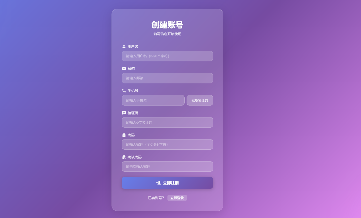
- 点击底部按钮切换登录/注册
- 看到流畅的切换动画
- 注册表单有更多输入项
🎯 五、添加表单验证功能
现在表单能显示了,但还没有验证功能。让我们把前面写好的验证工具用起来!
5.1 在页面中使用验证功能
继续编辑 LoginRegister.vue,添加验证逻辑:
<script setup lang="ts">
import { ref, reactive, computed } from 'vue'
import { Icon } from '@iconify/vue'
import { ElMessage } from 'element-plus'  // Element Plus 的消息提示

// 导入我们前面写好的工具函数
import { useValidation } from '../../composables/useValidation'
import { useCountdown } from '../../composables/useCountdown'

const isLogin = ref(true)

// 使用验证工具
const {
  validateEmail,
  validatePhone,
  validatePassword,
  validateUsername,
  validateCode
} = useValidation()

// 使用倒计时工具(60秒)
const { countdown, isCountingDown, startCountdown } = useCountdown(60)

// 登录表单数据
const loginForm = reactive({
  username: '',
  password: '',
  remember: false
})

/**
 * 登录表单错误信息
 * 用于显示验证错误提示
 */
const loginErrors = reactive({
  username: '',
  password: ''
})

// 注册表单数据
const registerForm = reactive({
  username: '',
  email: '',
  phone: '',
  password: '',
  confirmPassword: '',
  code: ''
})

/**
 * 注册表单错误信息
 */
const registerErrors = reactive({
  username: '',
  email: '',
  phone: '',
  password: '',
  confirmPassword: '',
  code: ''
})

/**
 * 计算密码强度
 * 使用 computed 计算属性,密码改变时自动更新
 */
const passwordStrength = computed(() => {
  if (!registerForm.password) return 'none'
  return validatePassword(registerForm.password).strength
})

/**
 * 密码强度对应的文字
 */
const passwordStrengthText = computed(() => {
  const map = {
    none: '',
    weak: '弱',
    medium: '中',
    strong: '强'
  }
  return map[passwordStrength.value]
})

/**
 * 密码强度对应的颜色
 */
const passwordStrengthColor = computed(() => {
  const map = {
    none: '',
    weak: '#f56c6c',    // 红色
    medium: '#e6a23c',  // 橙色
    strong: '#67c23a'   // 绿色
  }
  return map[passwordStrength.value]
})

const toggleMode = () => {
  isLogin.value = !isLogin.value

  // 切换模式时清空所有错误信息
  Object.keys(loginErrors).forEach(key => loginErrors[key] = '')
  Object.keys(registerErrors).forEach(key => registerErrors[key] = '')
}

/**
 * 验证登录表单
 * @returns 返回是否通过验证
 */
const validateLoginForm = (): boolean => {
  let isValid = true

  // 验证用户名
  const usernameResult = validateUsername(loginForm.username)
  if (!usernameResult.valid) {
    loginErrors.username = usernameResult.message
    isValid = false
  } else {
    loginErrors.username = ''
  }

  // 验证密码
  if (!loginForm.password) {
    loginErrors.password = '请输入密码'
    isValid = false
  } else if (loginForm.password.length < 6) {
    loginErrors.password = '密码至少需要6个字符'
    isValid = false
  } else {
    loginErrors.password = ''
  }

  return isValid
}

/**
 * 处理登录
 */
const handleLogin = () => {
  // 先验证表单
  if (!validateLoginForm()) {
    ElMessage.warning('请检查输入信息')
    return
  }

  console.log('登录数据:', loginForm)
  ElMessage.success('登录成功!')

  // 这里添加真实的登录 API 调用
  // 比如:await loginApi(loginForm)
}

/**
 * 验证注册表单
 * @returns 返回是否通过验证
 */
const validateRegisterForm = (): boolean => {
  let isValid = true

  // 验证用户名
  const usernameResult = validateUsername(registerForm.username)
  registerErrors.username = usernameResult.message
  if (!usernameResult.valid) isValid = false

  // 验证邮箱
  const emailResult = validateEmail(registerForm.email)
  registerErrors.email = emailResult.message
  if (!emailResult.valid) isValid = false

  // 验证手机号
  const phoneResult = validatePhone(registerForm.phone)
  registerErrors.phone = phoneResult.message
  if (!phoneResult.valid) isValid = false

  // 验证验证码
  const codeResult = validateCode(registerForm.code)
  registerErrors.code = codeResult.message
  if (!codeResult.valid) isValid = false

  // 验证密码
  const passwordResult = validatePassword(registerForm.password)
  registerErrors.password = passwordResult.message
  if (!passwordResult.valid) isValid = false

  // 验证确认密码
  if (!registerForm.confirmPassword) {
    registerErrors.confirmPassword = '请确认密码'
    isValid = false
  } else if (registerForm.password !== registerForm.confirmPassword) {
    registerErrors.confirmPassword = '两次输入的密码不一致'
    isValid = false
  } else {
    registerErrors.confirmPassword = ''
  }

  return isValid
}

/**
 * 处理注册
 */
const handleRegister = () => {
  // 先验证表单
  if (!validateRegisterForm()) {
    ElMessage.warning('请检查输入信息')
    return
  }

  console.log('注册数据:', registerForm)
  ElMessage.success('注册成功!')

  // 这里添加真实的注册 API 调用
}

/**
 * 获取验证码
 */
const handleGetCode = () => {
  // 先验证手机号
  const phoneResult = validatePhone(registerForm.phone)
  if (!phoneResult.valid) {
    registerErrors.phone = phoneResult.message
    ElMessage.warning(phoneResult.message)
    return
  }

  // 清空手机号错误
  registerErrors.phone = ''

  // 开始倒计时
  startCountdown()

  ElMessage.success('验证码已发送!')

  // 这里添加真实的发送验证码 API 调用
  // 比如:await sendCodeApi(registerForm.phone)
}

/**
 * 输入框失去焦点时验证
 * 这样用户填完一个输入框,就能立即看到错误提示
 */
const handleBlurUsername = (isLoginMode: boolean) => {
  if (isLoginMode) {
    const result = validateUsername(loginForm.username)
    loginErrors.username = result.message
  } else {
    const result = validateUsername(registerForm.username)
    registerErrors.username = result.message
  }
}

const handleBlurEmail = () => {
  const result = validateEmail(registerForm.email)
  registerErrors.email = result.message
}

const handleBlurPhone = () => {
  const result = validatePhone(registerForm.phone)
  registerErrors.phone = result.message
}
</script>

<template>
  <div class="auth-container">
    <div class="auth-card">
      <h1 class="title">
        {{ isLogin ? '欢迎回来' : '创建账号' }}
      </h1>

      <p class="subtitle">
        {{ isLogin ? '登录以继续您的旅程' : '填写信息开始使用' }}
      </p>

      <!-- 登录表单 -->
      <div v-if="isLogin" class="form-content">

        <div class="form-item">
          <label class="form-label">
            <Icon icon="mdi:account" class="label-icon" />
            用户名或邮箱
          </label>
          <input
            v-model="loginForm.username"
            type="text"
            placeholder="请输入用户名或邮箱"
            class="form-input"
            :class="{ 'input-error': loginErrors.username }"
            @blur="handleBlurUsername(true)"
          />
          <!-- 错误提示 -->
          <div v-if="loginErrors.username" class="error-message">
            {{ loginErrors.username }}
          </div>
        </div>

        <div class="form-item">
          <label class="form-label">
            <Icon icon="mdi:lock" class="label-icon" />
            密码
          </label>
          <input
            v-model="loginForm.password"
            type="password"
            placeholder="请输入密码"
            class="form-input"
            :class="{ 'input-error': loginErrors.password }"
          />
          <div v-if="loginErrors.password" class="error-message">
            {{ loginErrors.password }}
          </div>
        </div>

        <div class="form-options">
          <label class="checkbox-label">
            <input
              v-model="loginForm.remember"
              type="checkbox"
              class="checkbox-input"
            />
            <span>记住我</span>
          </label>
          <a href="#" class="forgot-link">忘记密码?</a>
        </div>

        <button class="submit-btn" @click="handleLogin">
          <Icon icon="mdi:login" class="btn-icon" />
          立即登录
        </button>

      </div>

      <!-- 注册表单 -->
      <div v-else class="form-content">

        <div class="form-item">
          <label class="form-label">
            <Icon icon="mdi:account" class="label-icon" />
            用户名
          </label>
          <input
            v-model="registerForm.username"
            type="text"
            placeholder="请输入用户名(3-20个字符)"
            class="form-input"
            :class="{ 'input-error': registerErrors.username }"
            @blur="handleBlurUsername(false)"
          />
          <div v-if="registerErrors.username" class="error-message">
            {{ registerErrors.username }}
          </div>
        </div>

        <div class="form-item">
          <label class="form-label">
            <Icon icon="mdi:email" class="label-icon" />
            邮箱
          </label>
          <input
            v-model="registerForm.email"
            type="email"
            placeholder="请输入邮箱"
            class="form-input"
            :class="{ 'input-error': registerErrors.email }"
            @blur="handleBlurEmail"
          />
          <div v-if="registerErrors.email" class="error-message">
            {{ registerErrors.email }}
          </div>
        </div>

        <div class="form-item">
          <label class="form-label">
            <Icon icon="mdi:phone" class="label-icon" />
            手机号
          </label>
          <div class="input-with-button">
            <div class="input-wrapper">
              <input
                v-model="registerForm.phone"
                type="tel"
                placeholder="请输入手机号"
                class="form-input"
                :class="{ 'input-error': registerErrors.phone }"
                @blur="handleBlurPhone"
              />
            </div>

            <!--
              :disabled 绑定是否禁用
              倒计时期间按钮禁用
            -->
            <button
              class="code-btn"
              :disabled="isCountingDown"
              @click="handleGetCode"
            >
              {{ isCountingDown ? `${countdown}秒后重试` : '获取验证码' }}
            </button>
          </div>
          <div v-if="registerErrors.phone" class="error-message">
            {{ registerErrors.phone }}
          </div>
        </div>

        <div class="form-item">
          <label class="form-label">
            <Icon icon="mdi:message-text" class="label-icon" />
            验证码
          </label>
          <input
            v-model="registerForm.code"
            type="text"
            placeholder="请输入6位验证码"
            class="form-input"
            :class="{ 'input-error': registerErrors.code }"
            maxlength="6"
          />
          <div v-if="registerErrors.code" class="error-message">
            {{ registerErrors.code }}
          </div>
        </div>

        <div class="form-item">
          <label class="form-label">
            <Icon icon="mdi:lock" class="label-icon" />
            密码

            <!-- 密码强度显示 -->
            <span
              v-if="passwordStrength !== 'none'"
              class="password-strength"
              :style="{ color: passwordStrengthColor }"
            >
              强度:{{ passwordStrengthText }}
            </span>
          </label>

          <input
            v-model="registerForm.password"
            type="password"
            placeholder="请输入密码(至少6个字符)"
            class="form-input"
            :class="{ 'input-error': registerErrors.password }"
          />

          <!-- 密码强度条 -->
          <div v-if="registerForm.password" class="strength-bar">
            <div
              class="strength-fill"
              :class="`strength-${passwordStrength}`"
            ></div>
          </div>

          <div v-if="registerErrors.password" class="error-message">
            {{ registerErrors.password }}
          </div>
        </div>

        <div class="form-item">
          <label class="form-label">
            <Icon icon="mdi:lock-check" class="label-icon" />
            确认密码
          </label>
          <input
            v-model="registerForm.confirmPassword"
            type="password"
            placeholder="请再次输入密码"
            class="form-input"
            :class="{ 'input-error': registerErrors.confirmPassword }"
          />
          <div v-if="registerErrors.confirmPassword" class="error-message">
            {{ registerErrors.confirmPassword }}
          </div>
        </div>

        <button class="submit-btn" @click="handleRegister">
          <Icon icon="mdi:account-plus" class="btn-icon" />
          立即注册
        </button>

      </div>

      <div class="toggle-mode">
        <span>{{ isLogin ? '还没有账号?' : '已有账号?' }}</span>
        <button @click="toggleMode">
          {{ isLogin ? '立即注册' : '立即登录' }}
        </button>
      </div>
    </div>
  </div>
</template>

<style scoped>
/* ...前面的样式保持不变,添加以下新样式... */

/*
 * 输入框错误状态
 */
.input-error {
  border-color: #f56c6c !important;
  background: rgba(245, 108, 108, 0.1) !important;
}

/*
 * 错误提示信息
 */
.error-message {
  color: #f56c6c;
  font-size: 12px;
  margin-top: 6px;
  display: flex;
  align-items: center;
  gap: 4px;

  /* 抖动动画,增加注意力 */
  animation: shake 0.3s ease;
}

/*
 * 抖动动画
 */
@keyframes shake {
  0%, 100% {
    transform: translateX(0);
  }
  25% {
    transform: translateX(-5px);
  }
  75% {
    transform: translateX(5px);
  }
}

/*
 * 密码强度文字
 */
.password-strength {
  margin-left: auto;
  font-size: 12px;
  font-weight: 600;
}

/*
 * 密码强度条容器
 */
.strength-bar {
  width: 100%;
  height: 4px;
  background: rgba(255, 255, 255, 0.2);
  border-radius: 2px;
  margin-top: 8px;
  overflow: hidden;
}

/*
 * 密码强度条填充
 */
.strength-fill {
  height: 100%;
  transition: all 0.3s ease;
  border-radius: 2px;
}

/*
 * 弱密码:红色,宽度33%
 */
.strength-weak {
  width: 33%;
  background: #f56c6c;
}

/*
 * 中等密码:橙色,宽度66%
 */
.strength-medium {
  width: 66%;
  background: #e6a23c;
}

/*
 * 强密码:绿色,宽度100%
 */
.strength-strong {
  width: 100%;
  background: #67c23a;
}

/*
 * 验证码按钮禁用状态
 */
.code-btn:disabled {
  opacity: 0.6;
  cursor: not-allowed;
}

.code-btn:disabled:hover {
  transform: none;
  background: rgba(255, 255, 255, 0.25);
}

/*
 * 输入框包装器
 */
.input-wrapper {
  flex: 1;
}
</style>
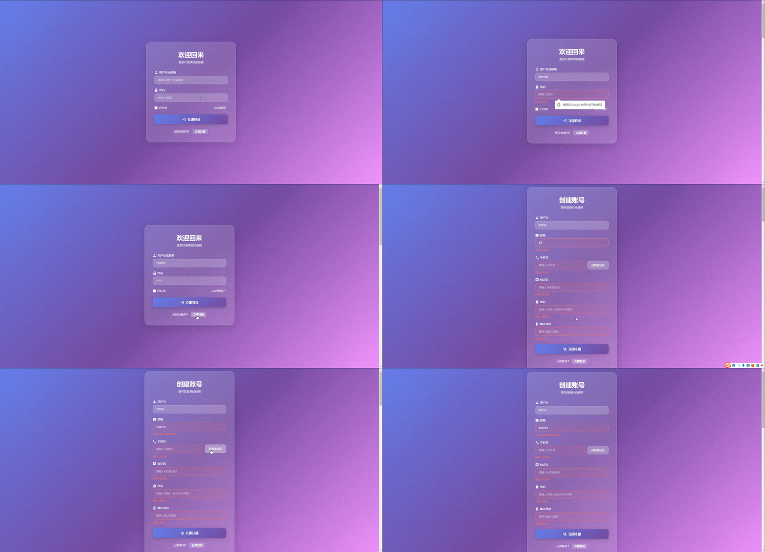
💡 到这一步,你的页面已经有完整的验证功能了!
- ✅ 输入框失去焦点时自动验证
- ✅ 错误信息有红色高亮和抖动动画
- ✅ 密码强度实时显示(弱/中/强)
- ✅ 密码强度条动态变化
- ✅ 验证码按钮有60秒倒计时
🌙 六、添加暗黑模式
现在让我们添加一个酷炫的暗黑模式切换功能!
6.1 在页面中添加主题切换
继续编辑 LoginRegister.vue:
<script setup lang="ts">
// ...前面的导入保持不变...
import { useTheme } from '../../composables/useTheme'  // 添加这行

// ...前面的代码保持不变...

// 使用主题工具
const { theme, toggleTheme } = useTheme()

// ...其他代码保持不变...
</script>

<template>
  <div class="auth-container">

    <!-- 主题切换按钮(右上角) -->
    <button class="theme-toggle" @click="toggleTheme">
      <!-- 根据当前主题显示不同图标 -->
      <Icon
        :icon="theme === 'light' ? 'mdi:weather-night' : 'mdi:weather-sunny'"
        class="theme-icon"
      />
    </button>

    <div class="auth-card">
      <!-- ...表单内容保持不变... -->
    </div>
  </div>
</template>

<style scoped>


/*
 * 主题切换按钮
 * 固定在右上角
 */
.theme-toggle {
  /* 固定定位 */
  position: fixed;
  top: 20px;
  right: 20px;

  /* 圆形按钮 */
  width: 50px;
  height: 50px;
  border-radius: 50%;

  /* 半透明玻璃效果 */
  background: var(--card-bg);
  backdrop-filter: blur(20px);
  border: 1px solid var(--input-border);

  /* 文字颜色 */
  color: var(--text-primary);

  /* 鼠标样式 */
  cursor: pointer;

  /* 过渡动画 */
  transition: all 0.3s ease;

  /* 层级:显示在最上面 */
  z-index: 100;

  /* 使用 flex 让图标居中 */
  display: flex;
  align-items: center;
  justify-content: center;

  /* 阴影 */
  box-shadow: 0 4px 15px rgba(0, 0, 0, 0.1);
}

/*
 * 按钮悬停效果
 * 上浮并旋转
 */
.theme-toggle:hover {
  transform: translateY(-3px) rotate(15deg);
  box-shadow: 0 6px 20px rgba(0, 0, 0, 0.2);
}

/*
 * 主题图标
 */
.theme-icon {
  font-size: 24px;
  transition: transform 0.3s ease;
}

/*
 * 悬停时图标旋转
 */
.theme-toggle:hover .theme-icon {
  transform: rotate(180deg);
}

/*
 * 更新容器背景使用 CSS 变量
 */
.auth-container {
  min-height: 100vh;
  display: flex;
  justify-content: center;
  align-items: center;
  padding: 20px;

  /* 使用 CSS 变量 */
  background: linear-gradient(
    135deg,
    var(--bg-gradient-1) 0%,
    var(--bg-gradient-2) 50%,
    var(--bg-gradient-3) 100%
  );

  position: relative;
  overflow: hidden;

  /* 添加过渡动画 */
  transition: background 0.5s ease;
}

/*
 * 更新卡片背景
 */
.auth-card {
  background: var(--card-bg);
  backdrop-filter: blur(20px);
  border: 1px solid var(--input-border);
  box-shadow: 0 8px 32px rgba(0, 0, 0, 0.1);

  padding: 40px;
  border-radius: 24px;
  width: 100%;
  max-width: 450px;
  position: relative;
  z-index: 1;
  transition: all 0.3s ease;
}

/*
 * 更新文字颜色
 */
.title {
  font-size: 32px;
  font-weight: 700;
  margin-bottom: 8px;
  text-align: center;
  color: var(--text-primary);
  text-shadow: 0 2px 4px rgba(0, 0, 0, 0.1);
}

.subtitle {
  color: var(--text-secondary);
  text-align: center;
  margin-bottom: 32px;
  font-size: 14px;
}

.form-label {
  display: flex;
  align-items: center;
  gap: 6px;
  color: var(--text-secondary);
  font-size: 14px;
  font-weight: 500;
  margin-bottom: 8px;
}

/*
 * 更新输入框样式使用 CSS 变量
 */
.form-input {
  width: 100%;
  padding: 12px 16px;
  background: var(--input-bg);
  border: 1px solid var(--input-border);
  border-radius: 12px;
  color: var(--text-primary);
  font-size: 14px;
  transition: all 0.3s ease;
  box-sizing: border-box;
}

.form-input::placeholder {
  color: var(--text-secondary);
  opacity: 0.6;
}

.form-input:focus {
  outline: none;
  background: var(--input-focus-bg);
  border-color: rgba(255, 255, 255, 0.6);
  box-shadow: 0 0 0 3px rgba(255, 255, 255, 0.1);
  transform: translateY(-2px);
}

.toggle-mode {
  text-align: center;
  margin-top: 24px;
  color: var(--text-secondary);
  font-size: 14px;
}

.toggle-mode button {
  color: var(--text-primary);
  background: var(--input-bg);
  border: none;
  cursor: pointer;
  margin-left: 8px;
  font-weight: 600;
  padding: 4px 12px;
  border-radius: 6px;
  transition: all 0.3s ease;
}

.checkbox-label {
  display: flex;
  align-items: center;
  gap: 6px;
  color: var(--text-secondary);
  cursor: pointer;
}

.forgot-link {
  color: var(--text-secondary);
  text-decoration: none;
  transition: color 0.3s ease;
}

.forgot-link:hover {
  color: var(--text-primary);
  text-decoration: underline;
}

.code-btn {
  padding: 12px 20px;
  background: var(--input-bg);
  border: 1px solid var(--input-border);
  border-radius: 12px;
  color: var(--text-primary);
  font-size: 13px;
  font-weight: 500;
  cursor: pointer;
  transition: all 0.3s ease;
  white-space: nowrap;
}

.code-btn:hover {
  background: var(--input-focus-bg);
  transform: translateY(-2px);
}

/* ...其他样式保持不变(提交按钮、错误提示、密码强度等)... */
</style>
App.vue
<script setup lang="ts">
import LoginRegister from './views/auth/LoginRegister.vue'
</script>

<template>
  <LoginRegister />
</template>

<style>
/* 重置默认样式 */
* {
  margin: 0;
  padding: 0;
  box-sizing: border-box;
}

body {
  font-family: -apple-system, BlinkMacSystemFont, 'Segoe UI', Roboto,
    'Helvetica Neue', Arial, sans-serif;
}

/*
 * ===== 主题 CSS 变量定义 =====
 * 这些变量必须定义在全局样式中,不能在 scoped 样式中
 */

/* 浅色主题变量 */
:root[data-theme="light"] {
  --bg-gradient-1: #667eea;
  --bg-gradient-2: #764ba2;
  --bg-gradient-3: #f093fb;
  --card-bg: rgba(255, 255, 255, 0.15);
  --text-primary: #ffffff;
  --text-secondary: rgba(255, 255, 255, 0.9);
  --input-bg: rgba(255, 255, 255, 0.2);
  --input-border: rgba(255, 255, 255, 0.3);
  --input-focus-bg: rgba(255, 255, 255, 0.25);
  --button-bg: linear-gradient(135deg, #667eea 0%, #764ba2 100%);
}

/* 暗黑主题变量 */
:root[data-theme="dark"] {
  --bg-gradient-1: #1a1a2e;
  --bg-gradient-2: #16213e;
  --bg-gradient-3: #0f3460;
  --card-bg: rgba(30, 30, 46, 0.8);
  --text-primary: #e0e0e0;
  --text-secondary: rgba(224, 224, 224, 0.8);
  --input-bg: rgba(255, 255, 255, 0.05);
  --input-border: rgba(255, 255, 255, 0.1);
  --input-focus-bg: rgba(255, 255, 255, 0.1);
  --button-bg: linear-gradient(135deg, #667eea 0%, #764ba2 100%);
}
</style>
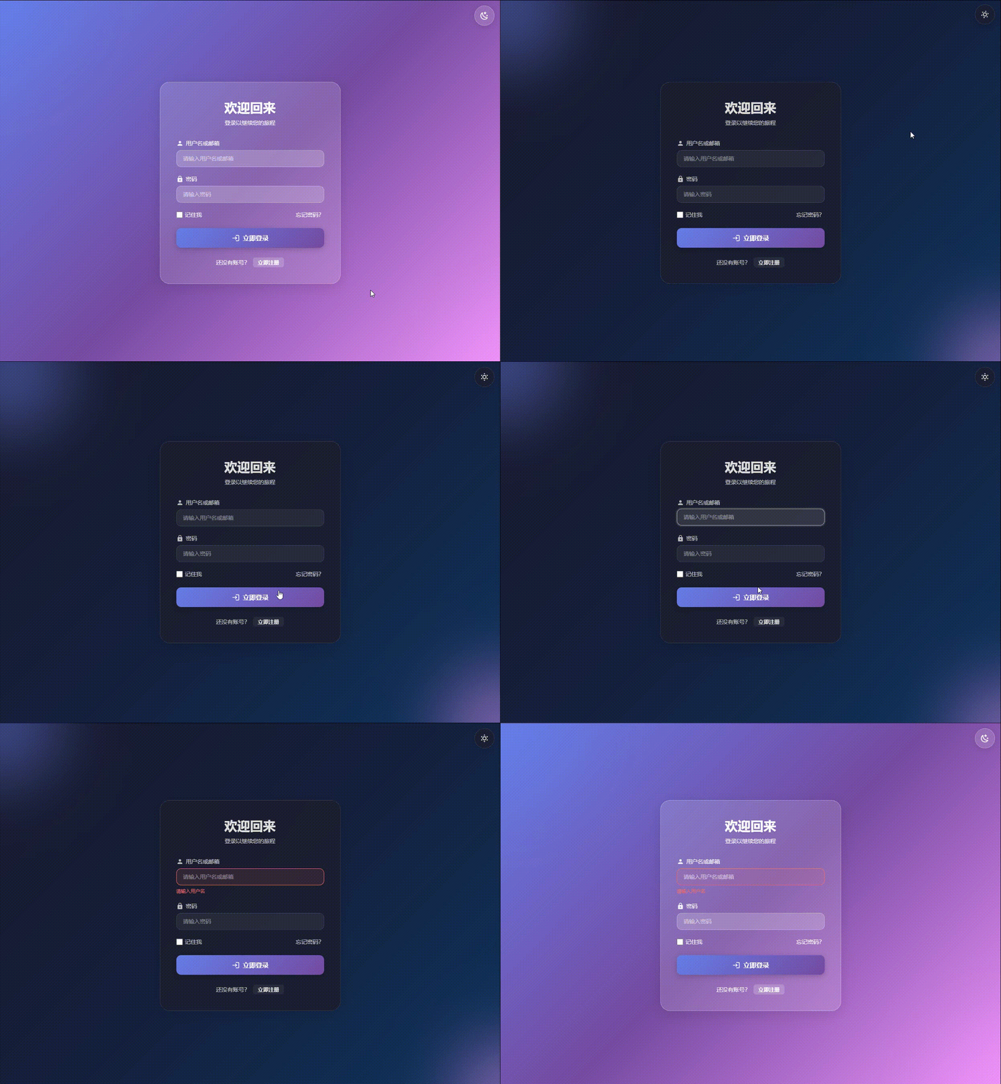
💡 现在你的页面支持暗黑模式了!
- ✅ 点击右上角按钮切换主题
- ✅ 主题选择会保存到 localStorage
- ✅ 下次访问时自动应用上次的主题
- ✅ 所有颜色平滑过渡
📱 七、响应式布局优化
让我们确保页面在手机上也好看。在 <style scoped> 的末尾添加:
/*
 * ======== 响应式布局 ========
 */

/* 平板和手机(屏幕宽度 <= 768px) */
@media (max-width: 768px) {
  .auth-container {
    padding: 16px;
  }

  .auth-card {
    padding: 24px 20px;
    border-radius: 20px;
  }

  .title {
    font-size: 24px;
  }

  .subtitle {
    font-size: 13px;
  }

  .form-input {
    padding: 10px 14px;
    font-size: 14px;
  }

  /* 验证码按钮在小屏幕上独占一行 */
  .input-with-button {
    flex-direction: column;
  }

  .code-btn {
    width: 100%;
    padding: 10px;
  }

  .submit-btn {
    padding: 12px;
    font-size: 15px;
  }

  .theme-toggle {
    width: 44px;
    height: 44px;
    top: 16px;
    right: 16px;
  }

  .theme-icon {
    font-size: 20px;
  }
}

/* 超小屏幕(屏幕宽度 <= 375px) */
@media (max-width: 375px) {
  .auth-card {
    padding: 20px 16px;
  }

  .title {
    font-size: 22px;
  }

  .form-item {
    margin-bottom: 16px;
  }
}
🎨 八、配置 Element Plus
为了让消息提示(ElMessage)正常工作,我们需要在 main.ts 中配置 Element Plus。
编辑 src/main.ts:
import { createApp } from 'vue'
import App from './App.vue'

// 导入 Element Plus
import ElementPlus from 'element-plus'
import 'element-plus/dist/index.css'

const app = createApp(App)

// 使用 Element Plus
app.use(ElementPlus)

app.mount('#app')
🚀 九、配置路由(可选)
如果你想通过路由访问登录页面,可以安装并配置 Vue Router。
9.1 安装 Vue Router
npm install vue-router@4
# 或
pnpm add vue-router@4
9.2 创建路由配置
创建文件:src/router/index.ts
import { createRouter, createWebHistory } from 'vue-router'
import LoginRegister from '@/views/auth/LoginRegister.vue'

const router = createRouter({
  history: createWebHistory(),
  routes: [
    {
      path: '/',
      redirect: '/auth'
    },
    {
      path: '/auth',
      name: 'Auth',
      component: LoginRegister
    }
  ]
})

export default router
9.3 在 main.ts 中使用路由
编辑 src/main.ts:
import { createApp } from 'vue'
import App from './App.vue'
import ElementPlus from 'element-plus'
import 'element-plus/dist/index.css'
import router from './router'  // 添加这行

const app = createApp(App)

app.use(ElementPlus)
app.use(router)  // 添加这行

app.mount('#app')
9.4 更新 App.vue
编辑 src/App.vue:
<script setup lang="ts">
</script>

<template>
  <router-view />
</template>

<style>
/* 重置默认样式 */
* {
  margin: 0;
  padding: 0;
  box-sizing: border-box;
}

body {
  font-family: -apple-system, BlinkMacSystemFont, 'Segoe UI', Roboto,
    'Helvetica Neue', Arial, sans-serif;
}
</style>
✅ 十、运行项目
现在一切都准备好了!让我们运行项目看看效果。
npm run dev
打开浏览器访问 http://localhost:5173,你应该能看到:
✅ 一个超级漂亮的渐变背景
✅ 半透明的玻璃拟态卡片
✅ 完整的登录和注册表单
✅ 实时的表单验证
✅ 密码强度显示
✅ 验证码倒计时
✅ 暗黑模式切换
✅ 响应式布局
💡 十一、知识点总结
通过这个项目,你应该学会了:
11.1 Vue3 核心知识
-
Composition API
ref创建响应式基本类型数据reactive创建响应式对象computed计算属性(自动根据依赖更新)watch监听器(数据变化时执行回调)
-
组件化思想
- 自定义 Composables(可复用的逻辑)
- 逻辑和视图分离
- 关注点分离原则
-
表单处理
v-model双向绑定@blur失去焦点事件- 表单验证逻辑
- 错误提示显示
11.2 CSS 技巧
-
现代 CSS
- CSS 变量(
--variable-name) backdrop-filter毛玻璃效果linear-gradient渐变背景transition和animation动画
- CSS 变量(
-
响应式设计
@media媒体查询- Flexbox 弹性布局
- 移动端适配
-
玻璃拟态设计
- 半透明背景
- 背景模糊
- 边框和阴影
11.3 TypeScript
-
类型定义
interface定义接口- 函数参数类型
- 返回值类型
-
类型推导
- TypeScript 自动推导类型
- 减少类型标注
11.4 用户体验
-
视觉反馈
- 输入框聚焦效果
- 错误提示动画
- 按钮悬停效果
- 加载状态显示
-
交互优化
- 实时验证
- 友好的错误提示
- 流畅的动画
- 倒计时防止重复点击
🚀 十二、下一步优化建议
如果你想继续提升这个页面,可以尝试:
12.1 功能增强
-
第三方登录
<div class="social-login"> <button class="social-btn wechat"> <Icon icon="mdi:wechat" /> 微信登录 </button> <button class="social-btn qq"> <Icon icon="mdi:qqchat" /> QQ登录 </button> </div> -
密码可见性切换
<div class="password-input"> <input :type="passwordVisible ? 'text' : 'password'" /> <button @click="passwordVisible = !passwordVisible"> <Icon :icon="passwordVisible ? 'mdi:eye' : 'mdi:eye-off'" /> </button> </div> -
键盘快捷键
// 按 Enter 键提交表单
const handleKeydown = (e: KeyboardEvent) => {
  if (e.key === 'Enter') {
    isLogin.value ? handleLogin() : handleRegister()
  }
}
12.2 技术进阶
-
连接真实 API
// src/api/auth.ts import request from '@/utils/request' export const login = (data: LoginParams) => { return request.post('/api/auth/login', data) } -
使用 Pinia 管理用户状态
// src/stores/user.ts import { defineStore } from 'pinia' export const useUserStore = defineStore('user', { state: () => ({ token: '', userInfo: null }), actions: { async login(data: LoginParams) { const res = await loginApi(data) this.token = res.token } } }) -
添加加载状态
const loading = ref(false)

const handleLogin = async () => {
  loading.value = true
  try {
    await loginApi(loginForm)
  } finally {
    loading.value = false
  }
}
📚 十三、常见问题解答
Q1: backdrop-filter 在某些浏览器不生效?
A: backdrop-filter 在旧版浏览器可能不支持。解决方案:
.auth-card {
  /* 降级方案:不透明背景 */
  background: rgba(255, 255, 255, 0.9);

  /* 现代浏览器:玻璃拟态效果 */
  @supports (backdrop-filter: blur(20px)) {
    background: rgba(255, 255, 255, 0.15);
    backdrop-filter: blur(20px);
  }
}
Q2: 图标不显示怎么办?
A: 确保正确安装和导入了 @iconify/vue:
npm install @iconify/vue
<script setup>
import { Icon } from '@iconify/vue'
</script>
Q3: ElMessage 提示"找不到"?
A: 确保在 main.ts 中导入了 Element Plus 的 CSS:
import 'element-plus/dist/index.css'
Q4: 密码应该如何加密?
A: 建议使用加密库:
npm install crypto-js
npm install -D @types/crypto-js
import CryptoJS from 'crypto-js'

const encryptPassword = (password: string) => {
  return CryptoJS.SHA256(password).toString()
}
注意: 即使前端加密,后端仍需要再次加密存储(使用 bcrypt)。
Q5: 如何实现"记住我"功能?
A: 使用 localStorage:
// 登录时
if (loginForm.remember) {
  localStorage.setItem('savedUsername', loginForm.username)
}

// 页面加载时
import { onMounted } from 'vue'

onMounted(() => {
  const savedUsername = localStorage.getItem('savedUsername')
  if (savedUsername) {
    loginForm.username = savedUsername
    loginForm.remember = true
  }
})
🎓 结语
恭喜你!你已经完成了一个功能完整、视觉效果出色的登录注册页面。
这个项目不仅可以用在你的实际项目中,还可以作为:
- 💼 求职作品集 - 展示你的前端能力
- 📚 学习案例 - 巩固 Vue3 知识
- 🎨 设计参考 - 作为其他页面的设计基础
接下来的学习建议:
- 继续学习 Pinia 状态管理(下一章内容)
- 学习如何与后端 API 对接
- 尝试添加更多高级功能(第三方登录、邮箱验证等)
- 优化性能和用户体验
📦 完整文件清单
目录结构
auth-demo/
├── src/
│   ├── views/
│   │   └── auth/
│   │       └── LoginRegister.vue      # 登录注册页面
│   ├── composables/
│   │   ├── useValidation.ts           # 表单验证工具
│   │   ├── useCountdown.ts            # 倒计时工具
│   │   └── useTheme.ts                # 主题切换工具
│   ├── router/
│   │   └── index.ts                   # 路由配置
│   ├── App.vue
│   └── main.ts
├── package.json
└── vite.config.ts
核心功能清单
✅ 登录表单
- 用户名/邮箱输入
- 密码输入
- 记住我选项
- 表单验证
✅ 注册表单
- 用户名验证(3-20字符)
- 邮箱验证
- 手机号验证(中国大陆)
- 验证码倒计时(60秒)
- 密码强度显示(弱/中/强)
- 确认密码验证
✅ 交互效果
- 表单切换动画
- 输入框聚焦动效
- 错误提示抖动动画
- 按钮悬停效果
✅ 高级功能
- 暗黑模式切换
- 响应式布局
- 本地存储
- 实时表单验证
📖 相关阅读
如果这篇教程对你有帮助,别忘了点赞收藏!
有问题欢迎在评论区留言,我会及时回复。
下一章我们将学习 Pinia 状态管理,把这个登录页面的用户状态管理得更专业!
💡 彩蛋: 你可以尝试把这个页面改成你喜欢的配色方案,或者添加更多动画效果。发挥你的创意!
作者:代码小库
本文为原创文章,转载请注明出处
最后更新:2025年

Agent 垂直技术社区,欢迎活跃、内容共建。
更多推荐



 21
21 0
0- 0


 已为社区贡献6条内容

所有评论(0)