OpenHarmony Flutter 步骤条组件完整实现
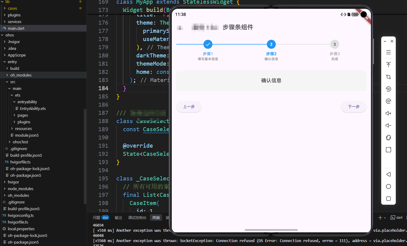
OpenHarmony 是一个开源操作系统,本文介绍如何在 OpenHarmony 平台上使用 Flutter 实现步骤条组件。
概述
步骤条(Stepper)组件是一种用于展示流程进度的UI组件,广泛应用于多步骤表单、订单流程、安装向导等场景。它通过清晰的视觉指示,帮助用户了解当前所处的位置和剩余步骤。在现代应用开发中,步骤条已经成为引导用户完成复杂流程的重要工具。
步骤条组件的设计需要考虑多个方面的因素。首先是步骤指示,组件应该能够清晰地显示所有步骤和当前步骤位置,让用户了解整个流程的结构。其次是步骤内容,组件应该能够根据当前步骤动态显示对应的内容,支持表单输入、信息展示等各种类型的内容。再次是导航控制,组件应该提供上一步和下一步按钮,让用户能够在步骤间自由导航。最后是状态管理,组件应该能够跟踪每个步骤的完成状态,支持步骤验证、步骤跳转等功能。
在Flutter框架中,实现步骤条可以使用自定义Widget来构建步骤指示器,使用条件渲染来显示不同步骤的内容。步骤状态可以使用枚举类型来定义,比如已完成、进行中、未开始等。导航控制可以通过按钮的启用/禁用状态来实现,根据当前步骤位置动态控制按钮状态。
步骤条组件的用户体验是一个重要的考虑因素。当用户从一个步骤切换到另一个步骤时,应该提供平滑的过渡动画,让用户感受到流程的连贯性。同时,步骤条应该支持步骤验证,确保用户完成当前步骤后才能进入下一步。另外,步骤条还应该支持步骤跳转,让用户能够返回到已完成的步骤进行修改。
本文将详细介绍如何在Flutter中实现一个功能完善的步骤条组件,从步骤指示到步骤内容,从导航控制到状态管理,全面解析步骤条组件的实现细节和最佳实践。
核心功能特性
1. 步骤指示
- 功能描述:显示所有步骤和当前步骤位置
- 实现方式:使用圆点和连接线展示步骤
- 状态区分:已完成、进行中、未开始三种状态
2. 步骤内容
- 功能描述:根据当前步骤显示对应内容
- 实现方式:动态切换显示内容
- 交互设计:支持步骤间的导航
3. 导航控制
- 功能描述:提供上一步和下一步按钮
- 实现方式:根据步骤状态启用/禁用按钮
- 边界处理:第一步禁用上一步,最后一步禁用下一步
技术实现详解
数据模型设计
class StepItem {
  final String title;
  final String description;

  StepItem({required this.title, required this.description});
}

final List<StepItem> _steps = [
  StepItem(title: '步骤1', description: '填写基本信息'),
  StepItem(title: '步骤2', description: '确认信息'),
  StepItem(title: '步骤3', description: '完成'),
];

int _currentStep = 0;
设计优势:
- 数据结构清晰,易于扩展
- 标题和描述分离,便于展示
- 当前步骤索引便于状态管理
步骤条实现
Widget _buildSteps() {
  return Row(
    children: List.generate(_steps.length, (index) {
      final step = _steps[index];
      final isActive = index == _currentStep;
      final isCompleted = index < _currentStep;

      return Expanded(
        child: Column(
          children: [
            Row(
              children: [
                Expanded(
                  child: Container(
                    height: 2,
                    color: isCompleted || isActive
                        ? Colors.blue
                        : Colors.grey[300],
                  ),
                ),
                Container(
                  width: 32,
                  height: 32,
                  decoration: BoxDecoration(
                    color: isCompleted
                        ? Colors.blue
                        : isActive
                            ? Colors.blue
                            : Colors.grey[300],
                    shape: BoxShape.circle,
                  ),
                  child: Center(
                    child: isCompleted
                        ? const Icon(Icons.check, color: Colors.white, size: 20)
                        : Text(
                            '${index + 1}',
                            style: TextStyle(
                              color: isActive ? Colors.white : Colors.grey[700],
                              fontWeight: FontWeight.bold,
                            ),
                          ),
                  ),
                ),
                Expanded(
                  child: Container(
                    height: 2,
                    color: index == _steps.length - 1
                        ? Colors.transparent
                        : isCompleted
                            ? Colors.blue
                            : Colors.grey[300],
                  ),
                ),
              ],
            ),
            const SizedBox(height: 8),
            Text(
              step.title,
              style: TextStyle(
                fontWeight: isActive ? FontWeight.bold : FontWeight.normal,
                color: isActive || isCompleted ? Colors.blue : Colors.grey,
              ),
            ),
            Text(
              step.description,
              style: TextStyle(
                fontSize: 12,
                color: Colors.grey[600],
              ),
            ),
          ],
        ),
      );
    }),
  );
}
实现亮点:
- 使用
Row和Expanded实现均匀分布 - 连接线根据状态变色
- 已完成步骤显示对勾图标
- 最后一步的连接线透明处理
步骤内容实现
Widget _buildStepContent() {
  return Container(
    padding: const EdgeInsets.all(24),
    decoration: BoxDecoration(
      color: Colors.grey[100],
      borderRadius: BorderRadius.circular(8),
    ),
    child: Center(
      child: Text(
        _steps[_currentStep].description,
        style: const TextStyle(fontSize: 18),
      ),
    ),
  );
}
设计要点:
- 根据当前步骤动态显示内容
- 使用容器提供视觉层次
- 内容区域可以扩展为复杂表单
导航控制实现
Widget _buildStepControls() {
  return Row(
    mainAxisAlignment: MainAxisAlignment.spaceBetween,
    children: [
      ElevatedButton(
        onPressed: _currentStep > 0
            ? () {
                setState(() {
                  _currentStep--;
                });
              }
            : null,
        child: const Text('上一步'),
      ),
      ElevatedButton(
        onPressed: _currentStep < _steps.length - 1
            ? () {
                setState(() {
                  _currentStep++;
                });
              }
            : null,
        child: const Text('下一步'),
      ),
    ],
  );
}
交互优化:
- 根据步骤位置启用/禁用按钮
- 清晰的按钮布局
- 支持键盘导航
高级功能扩展
1. 步骤验证
final Map<int, bool> _stepValidated = {};

bool _canProceedToNextStep() {
  // 验证当前步骤是否完成
  switch (_currentStep) {
    case 0:
      return _validateStep1();
    case 1:
      return _validateStep2();
    default:
      return true;
  }
}

void _goToNextStep() {
  if (_canProceedToNextStep()) {
    setState(() {
      _stepValidated[_currentStep] = true;
      _currentStep++;
    });
  } else {
    ScaffoldMessenger.of(context).showSnackBar(
      const SnackBar(content: Text('请完成当前步骤')),
    );
  }
}
2. 步骤跳转
void _jumpToStep(int stepIndex) {
  // 只能跳转到已完成的步骤
  if (stepIndex <= _currentStep || _stepValidated[stepIndex] == true) {
    setState(() {
      _currentStep = stepIndex;
    });
  }
}
3. 动画效果
Widget _buildAnimatedSteps() {
  return Row(
    children: List.generate(_steps.length, (index) {
      final isActive = index == _currentStep;
      final isCompleted = index < _currentStep;

      return Expanded(
        child: AnimatedContainer(
          duration: const Duration(milliseconds: 300),
          child: Column(
            children: [
              AnimatedContainer(
                duration: const Duration(milliseconds: 300),
                width: 32,
                height: 32,
                decoration: BoxDecoration(
                  color: isCompleted
                      ? Colors.blue
                      : isActive
                          ? Colors.blue
                          : Colors.grey[300],
                  shape: BoxShape.circle,
                ),
                child: Center(
                  child: isCompleted
                      ? const Icon(Icons.check, color: Colors.white, size: 20)
                      : Text(
                          '${index + 1}',
                          style: TextStyle(
                            color: isActive ? Colors.white : Colors.grey[700],
                            fontWeight: FontWeight.bold,
                          ),
                        ),
                ),
              ),
            ],
          ),
        ),
      );
    }),
  );
}
4. 垂直步骤条
Widget _buildVerticalSteps() {
  return Column(
    children: List.generate(_steps.length, (index) {
      final isActive = index == _currentStep;
      final isCompleted = index < _currentStep;

      return Row(
        crossAxisAlignment: CrossAxisAlignment.start,
        children: [
          Column(
            children: [
              Container(
                width: 32,
                height: 32,
                decoration: BoxDecoration(
                  color: isCompleted || isActive ? Colors.blue : Colors.grey[300],
                  shape: BoxShape.circle,
                ),
                child: Center(
                  child: isCompleted
                      ? const Icon(Icons.check, color: Colors.white, size: 20)
                      : Text(
                          '${index + 1}',
                          style: const TextStyle(color: Colors.white),
                        ),
                ),
              ),
              if (index < _steps.length - 1)
                Container(
                  width: 2,
                  height: 50,
                  color: isCompleted ? Colors.blue : Colors.grey[300],
                ),
            ],
          ),
          const SizedBox(width: 16),
          Expanded(
            child: Column(
              crossAxisAlignment: CrossAxisAlignment.start,
              children: [
                Text(
                  _steps[index].title,
                  style: TextStyle(
                    fontWeight: isActive ? FontWeight.bold : FontWeight.normal,
                    color: isActive || isCompleted ? Colors.blue : Colors.grey,
                  ),
                ),
                Text(
                  _steps[index].description,
                  style: TextStyle(
                    fontSize: 12,
                    color: Colors.grey[600],
                  ),
                ),
              ],
            ),
          ),
        ],
      );
    }),
  );
}
5. 步骤保存
class StepData {
  final Map<int, Map<String, dynamic>> data = {};

  void saveStepData(int stepIndex, Map<String, dynamic> stepData) {
    data[stepIndex] = stepData;
  }

  Map<String, dynamic>? getStepData(int stepIndex) {
    return data[stepIndex];
  }
}

final StepData _stepData = StepData();
使用场景
- 多步骤表单:注册流程、订单流程、申请流程
- 安装向导:应用首次启动引导
- 任务流程:任务创建、任务审核、任务完成
- 审批流程:审批步骤展示
最佳实践
1. 用户体验
- 清晰的步骤指示
- 合理的步骤数量(建议3-5步)
- 提供步骤说明和帮助信息
2. 数据管理
- 保存每步的数据
- 支持返回修改
- 提供数据验证
3. 性能优化
- 使用动画提升体验
- 合理使用setState
- 避免不必要的重建
总结
步骤条组件是一个重要的导航组件,它为用户提供了清晰的流程指引,帮助用户完成复杂的多步骤流程。通过合理的设计和实现,可以引导用户顺利完成各种复杂的操作流程。
在实现步骤条组件时,我们需要考虑多个方面的因素。首先是步骤指示,组件应该能够清晰地显示所有步骤和当前步骤位置,让用户了解整个流程的结构。其次是步骤内容,组件应该能够根据当前步骤动态显示对应的内容,支持表单输入、信息展示等各种类型的内容。再次是导航控制,组件应该提供上一步和下一步按钮,让用户能够在步骤间自由导航。最后是状态管理,组件应该能够跟踪每个步骤的完成状态,支持步骤验证、步骤跳转等功能。
本文提供的实现方案涵盖了步骤指示、内容展示、导航控制等核心功能,可以根据具体需求进行扩展和优化。在实际开发中,我们可以根据应用的具体需求,添加步骤验证、步骤保存、步骤动画等功能。同时,我们还需要考虑数据持久化,确保用户在步骤间切换时不会丢失已输入的数据。
随着应用复杂度的增加,步骤条组件也在不断演进。未来可能会出现更多先进的功能,比如智能步骤推荐、动态步骤调整、步骤协作等。作为开发者,我们需要保持学习的态度,不断探索和尝试新的技术,为用户提供更好的流程引导体验。
欢迎加入开源鸿蒙跨平台社区:https://openharmonycrossplatform.csdn.net

Agent 垂直技术社区,欢迎活跃、内容共建。
更多推荐


 23
23 0
0- 0


 已为社区贡献5条内容

所有评论(0)