Flutter&OpenHarmony商城App步骤指示器组件开发
前言
步骤指示器是商城应用中展示流程进度的重要组件,广泛应用于订单状态跟踪、下单流程引导、退款进度展示等场景。一个设计良好的步骤指示器需要清晰地展示当前所处步骤和整体流程,帮助用户了解进度。本文将详细介绍如何在Flutter和OpenHarmony平台上开发步骤指示器组件。
步骤指示器的设计需要考虑步骤的数量、当前进度的突出显示、以及已完成和未完成步骤的视觉区分。用户应该能够一眼看出当前处于哪个步骤,以及还有多少步骤需要完成。
Flutter步骤指示器基础实现
首先定义步骤数据模型:
class StepItem {
  final String title;
  final String? subtitle;
  final IconData? icon;

  const StepItem({
    required this.title,
    this.subtitle,
    this.icon,
  });
}

enum StepStatus {
  completed,  // 已完成
  current,    // 当前步骤
  pending,    // 待完成
}
StepItem类定义了步骤的基本属性,包括标题、副标题和图标。StepStatus枚举定义了步骤的三种状态:已完成、当前步骤和待完成。这种数据模型的设计支持各种步骤指示器场景。
步骤指示器组件:
class StepIndicator extends StatelessWidget {
final List<StepItem> steps;
final int currentStep;
final Axis direction;
const StepIndicator({
Key? key,
required this.steps,
required this.currentStep,
this.direction = Axis.horizontal,
}) : super(key: key);
Widget build(BuildContext context) {
if (direction == Axis.horizontal) {
return _buildHorizontal();
}
return _buildVertical();
}
StepStatus _getStatus(int index) {
if (index < currentStep) return StepStatus.completed;
if (index == currentStep) return StepStatus.current;
return StepStatus.pending;
}
}
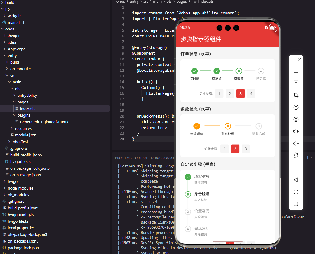
StepIndicator组件接收步骤列表和当前步骤索引。direction参数支持水平和垂直两种布局方向。_getStatus方法根据步骤索引和当前步骤计算步骤状态。这种设计支持不同场景的步骤展示需求。
水平步骤指示器
Widget _buildHorizontal() {
  return Row(
    children: List.generate(steps.length * 2 - 1, (index) {
      if (index.isOdd) {
        return _buildConnector(index ~/ 2);
      }
      return Expanded(
        child: _buildStepItem(index ~/ 2),
      );
    }),
  );
}

Widget _buildConnector(int beforeIndex) {
  final isCompleted = beforeIndex < currentStep;

  return Expanded(
    child: Container(
      height: 2,
      color: isCompleted
        ? const Color(0xFF4CAF50)
        : const Color(0xFFE0E0E0),
    ),
  );
}
水平布局使用Row排列步骤和连接线。List.generate生成步骤和连接线交替的列表,奇数索引是连接线,偶数索引是步骤。连接线根据前一个步骤是否完成显示不同颜色,已完成显示绿色,未完成显示灰色。Expanded使步骤和连接线平均分配空间。
步骤项组件:
Widget _buildStepItem(int index) {
  final step = steps[index];
  final status = _getStatus(index);

  return Column(
    mainAxisSize: MainAxisSize.min,
    children: [
      _buildStepCircle(index, status),
      const SizedBox(height: 8),
      Text(
        step.title,
        style: TextStyle(
          fontSize: 12,
          color: status == StepStatus.pending
            ? const Color(0xFF999999)
            : const Color(0xFF333333),
          fontWeight: status == StepStatus.current
            ? FontWeight.w600
            : FontWeight.normal,
        ),
        textAlign: TextAlign.center,
      ),
      if (step.subtitle != null)
        Text(
          step.subtitle!,
          style: const TextStyle(
            fontSize: 10,
            color: Color(0xFF999999),
          ),
          textAlign: TextAlign.center,
        ),
    ],
  );
}
每个步骤项包含圆形指示器和标题文字。Column垂直排列这些元素,mainAxisSize.min使高度自适应内容。标题根据步骤状态显示不同样式,当前步骤使用粗体,待完成步骤使用灰色。副标题使用更小的灰色字号。
圆形指示器
Widget _buildStepCircle(int index, StepStatus status) {
  Color backgroundColor;
  Color borderColor;
  Widget? child;

  switch (status) {
    case StepStatus.completed:
      backgroundColor = const Color(0xFF4CAF50);
      borderColor = const Color(0xFF4CAF50);
      child = const Icon(Icons.check, size: 14, color: Colors.white);
      break;
    case StepStatus.current:
      backgroundColor = Colors.white;
      borderColor = const Color(0xFF4CAF50);
      child = Container(
        width: 8,
        height: 8,
        decoration: const BoxDecoration(
          color: Color(0xFF4CAF50),
          shape: BoxShape.circle,
        ),
      );
      break;
    case StepStatus.pending:
      backgroundColor = Colors.white;
      borderColor = const Color(0xFFE0E0E0);
      child = Text(
        '${index + 1}',
        style: const TextStyle(
          fontSize: 12,
          color: Color(0xFF999999),
        ),
      );
      break;
  }

  return Container(
    width: 24,
    height: 24,
    decoration: BoxDecoration(
      color: backgroundColor,
      shape: BoxShape.circle,
      border: Border.all(color: borderColor, width: 2),
    ),
    alignment: Alignment.center,
    child: child,
  );
}
圆形指示器根据步骤状态显示不同内容。已完成步骤显示绿色背景和白色对勾,当前步骤显示白色背景、绿色边框和绿色圆点,待完成步骤显示白色背景、灰色边框和步骤序号。这种视觉设计让用户能够快速识别各步骤的状态。
垂直步骤指示器
Widget _buildVertical() {
  return Column(
    children: List.generate(steps.length, (index) {
      return _buildVerticalStepItem(index);
    }),
  );
}

Widget _buildVerticalStepItem(int index) {
  final step = steps[index];
  final status = _getStatus(index);
  final isLast = index == steps.length - 1;

  return IntrinsicHeight(
    child: Row(
      crossAxisAlignment: CrossAxisAlignment.start,
      children: [
        Column(
          children: [
            _buildStepCircle(index, status),
            if (!isLast)
              Expanded(
                child: Container(
                  width: 2,
                  color: index < currentStep
                    ? const Color(0xFF4CAF50)
                    : const Color(0xFFE0E0E0),
                ),
              ),
          ],
        ),
        const SizedBox(width: 12),
        Expanded(
          child: Padding(
            padding: EdgeInsets.only(bottom: isLast ? 0 : 24),
            child: Column(
              crossAxisAlignment: CrossAxisAlignment.start,
              children: [
                Text(
                  step.title,
                  style: TextStyle(
                    fontSize: 14,
                    color: status == StepStatus.pending
                      ? const Color(0xFF999999)
                      : const Color(0xFF333333),
                    fontWeight: status == StepStatus.current
                      ? FontWeight.w600
                      : FontWeight.normal,
                  ),
                ),
                if (step.subtitle != null)
                  Padding(
                    padding: const EdgeInsets.only(top: 4),
                    child: Text(
                      step.subtitle!,
                      style: const TextStyle(
                        fontSize: 12,
                        color: Color(0xFF999999),
                      ),
                    ),
                  ),
              ],
            ),
          ),
        ),
      ],
    ),
  );
}
垂直布局适合展示详细的步骤信息。IntrinsicHeight使Row的高度自适应内容,确保连接线正确延伸。左侧是圆形指示器和连接线,右侧是步骤标题和副标题。最后一个步骤不显示连接线。这种布局适合订单状态跟踪等需要展示详细信息的场景。
OpenHarmony步骤指示器实现
@Component
struct StepIndicator {
  @Prop steps: StepItemInfo[] = []
  @Prop currentStep: number = 0
  @Prop direction: string = 'horizontal'

  build() {
    if (this.direction === 'horizontal') {
      this.HorizontalSteps()
    } else {
      this.VerticalSteps()
    }
  }

  getStatus(index: number): string {
    if (index < this.currentStep) return 'completed'
    if (index === this.currentStep) return 'current'
    return 'pending'
  }
}
OpenHarmony的步骤指示器使用条件渲染显示水平或垂直布局。@Prop装饰的属性从父组件接收配置。getStatus方法根据索引计算步骤状态。这种实现方式与Flutter版本结构一致。
步骤数据接口:
interface StepItemInfo {
  title: string
  subtitle?: string
  icon?: Resource
}
TypeScript接口定义了步骤的数据结构。subtitle和icon使用可选标记,表示这些字段可以不存在。
水平步骤ArkUI实现
@Builder
HorizontalSteps() {
  Row() {
    ForEach(this.steps, (step: StepItemInfo, index: number) => {
      Column() {
        this.StepCircle(index)
        Text(step.title)
          .fontSize(12)
          .fontColor(this.getStatus(index) === 'pending' ? '#999999' : '#333333')
          .fontWeight(this.getStatus(index) === 'current'
            ? FontWeight.Medium
            : FontWeight.Normal)
          .margin({ top: 8 })
          .textAlign(TextAlign.Center)
      }
      .layoutWeight(1)

      if (index < this.steps.length - 1) {
        this.Connector(index)
      }
    })
  }
  .width('100%')
}

@Builder
Connector(beforeIndex: number) {
  Column()
    .height(2)
    .layoutWeight(1)
    .backgroundColor(beforeIndex < this.currentStep ? '#4CAF50' : '#E0E0E0')
    .margin({ top: 11 })
}
水平步骤使用Row排列步骤和连接线。ForEach遍历步骤数组,为每个步骤生成Column和连接线。layoutWeight(1)使步骤和连接线平均分配空间。连接线根据前一个步骤是否完成显示不同颜色。margin设置连接线的垂直位置与圆形指示器对齐。
圆形指示器ArkUI实现
@Builder
StepCircle(index: number) {
  Stack() {
    Circle()
      .width(24)
      .height(24)
      .fill(this.getCircleFill(index))
      .stroke(this.getCircleStroke(index))
      .strokeWidth(2)

    if (this.getStatus(index) === 'completed') {
      Image($r('app.media.check'))
        .width(14)
        .height(14)
    } else if (this.getStatus(index) === 'current') {
      Circle()
        .width(8)
        .height(8)
        .fill('#4CAF50')
    } else {
      Text((index + 1).toString())
        .fontSize(12)
        .fontColor('#999999')
    }
  }
}

getCircleFill(index: number): string {
  if (this.getStatus(index) === 'completed') return '#4CAF50'
  return '#FFFFFF'
}

getCircleStroke(index: number): string {
  if (this.getStatus(index) === 'pending') return '#E0E0E0'
  return '#4CAF50'
}
圆形指示器使用Stack层叠圆形背景和内容。Circle组件绘制圆形,fill设置填充色,stroke设置边框色。根据步骤状态显示不同内容:已完成显示对勾图标,当前步骤显示小圆点,待完成显示序号。这种实现方式与Flutter版本的视觉效果一致。
订单状态步骤指示器
class OrderStatusIndicator extends StatelessWidget {
final int currentStatus;
const OrderStatusIndicator({
Key? key,
required this.currentStatus,
}) : super(key: key);
Widget build(BuildContext context) {
final steps = [
const StepItem(title: '待付款'),
const StepItem(title: '待发货'),
const StepItem(title: '待收货'),
const StepItem(title: '已完成'),
];
return Container(
padding: const EdgeInsets.all(16),
color: Colors.white,
child: StepIndicator(
steps: steps,
currentStep: currentStatus,
),
);
}
}
OrderStatusIndicator组件专门用于订单状态展示。预设了待付款、待发货、待收货、已完成四个步骤。currentStatus对应订单的当前状态。Container设置白色背景和内边距。这种封装方式使订单状态展示更加便捷。
总结
本文详细介绍了Flutter和OpenHarmony平台上步骤指示器组件的开发过程。步骤指示器作为展示流程进度的重要组件,其设计质量直接影响用户对流程的理解。通过水平和垂直两种布局、三种步骤状态的视觉区分,我们为不同场景提供了合适的步骤展示方式。在实际项目中,还可以进一步添加步骤点击交互、动画效果等功能。
欢迎加入开源鸿蒙跨平台社区:https://openharmonycrossplatform.csdn.net

Agent 垂直技术社区,欢迎活跃、内容共建。
更多推荐


 9
9 0
0- 0


 已为社区贡献26条内容

所有评论(0)