Flutter & OpenHarmony OA系统审批流程卡片组件开发指南
前言
审批流程是OA办公自动化系统的核心功能之一,它涵盖了请假申请、报销审批、采购申请、合同审批等多种业务场景。审批流程卡片组件作为展示审批信息的载体,需要清晰地呈现审批标题、申请人、当前状态、审批进度等关键信息。本文将详细介绍如何使用Flutter和OpenHarmony开发一个功能完善、视觉美观的审批流程卡片组件。
组件设计理念
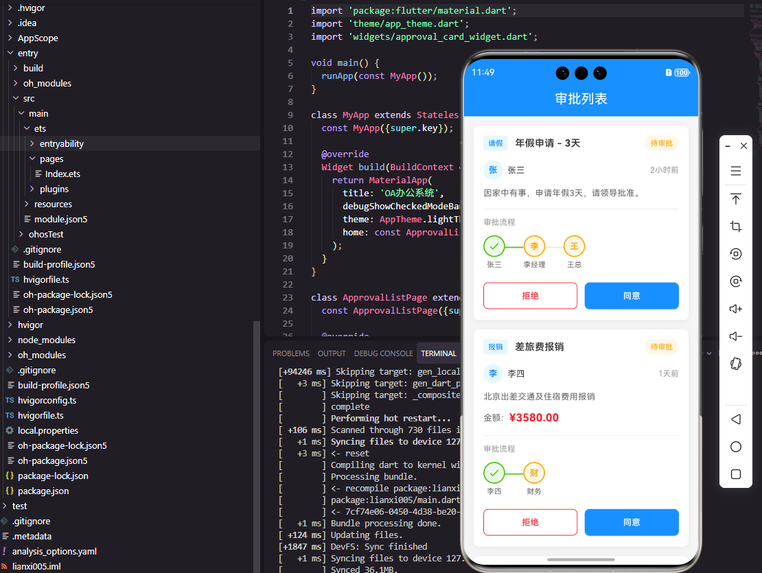
审批流程卡片的设计需要遵循信息层次清晰、状态一目了然的原则。卡片顶部展示审批类型和标题,中间区域显示申请人信息和申请时间,底部展示当前审批状态和操作按钮。不同的审批状态需要用不同的颜色标识,如待审批用橙色、已通过用绿色、已拒绝用红色,让用户能够快速识别。
Flutter端实现
首先定义审批状态枚举和数据模型:
enum ApprovalStatus { pending, approved, rejected, canceled }

class ApprovalItem {
  final String id;
  final String title;
  final String type;
  final String applicant;
  final DateTime applyTime;
  final ApprovalStatus status;

  ApprovalItem({
    required this.id,
    required this.title,
    required this.type,
    required this.applicant,
    required this.applyTime,
    required this.status,
  });
}
使用枚举类型定义审批状态可以避免魔法字符串,提高代码的可维护性和类型安全性。数据模型包含了审批卡片需要展示的所有必要信息,DateTime类型用于存储申请时间,便于后续进行时间格式化和计算。
审批卡片组件的基础结构定义:
class ApprovalCard extends StatelessWidget {
  final ApprovalItem item;
  final VoidCallback? onTap;
  final VoidCallback? onApprove;
  final VoidCallback? onReject;

  const ApprovalCard({
    Key? key,
    required this.item,
    this.onTap,
    this.onApprove,
    this.onReject,
  }) : super(key: key);
}
组件设计为无状态组件,因为卡片本身不需要管理内部状态,所有数据都从外部传入。通过回调函数将点击、审批、拒绝等操作传递给父组件处理,实现了展示与逻辑的分离。可选的回调函数设计使组件可以灵活适应不同场景,比如在列表页只需要点击跳转,而在详情页需要审批操作。
根据审批状态获取对应颜色的方法:
Color _getStatusColor(ApprovalStatus status) {
  switch (status) {
    case ApprovalStatus.pending:
      return Colors.orange;
    case ApprovalStatus.approved:
      return Colors.green;
    case ApprovalStatus.rejected:
      return Colors.red;
    case ApprovalStatus.canceled:
      return Colors.grey;
  }
}
使用switch语句处理枚举类型可以确保所有状态都被处理,如果后续添加新的状态,编译器会提示未处理的情况。颜色的选择遵循了通用的视觉语义,橙色表示等待、绿色表示成功、红色表示失败、灰色表示取消。
卡片主体布局的构建:
Widget build(BuildContext context) {
return Card(
margin: EdgeInsets.symmetric(horizontal: 16, vertical: 8),
elevation: 2,
shape: RoundedRectangleBorder(
borderRadius: BorderRadius.circular(12),
),
child: InkWell(
onTap: onTap,
borderRadius: BorderRadius.circular(12),
child: Padding(
padding: EdgeInsets.all(16),
child: Column(
crossAxisAlignment: CrossAxisAlignment.start,
children: [
_buildHeader(),
SizedBox(height: 12),
_buildContent(),
SizedBox(height: 12),
_buildFooter(),
],
),
),
),
);
}
卡片使用Card组件作为容器,设置了圆角和阴影效果。InkWell包裹整个卡片内容,提供点击水波纹效果。Column组件垂直排列头部、内容、底部三个区域,crossAxisAlignment设置为start使内容左对齐。这种分区域构建的方式使代码结构清晰,便于维护。
OpenHarmony鸿蒙端实现
定义审批状态和数据接口:
type ApprovalStatus = 'pending' | 'approved' | 'rejected' | 'canceled'

interface ApprovalItem {
  id: string
  title: string
  type: string
  applicant: string
  applyTime: number
  status: ApprovalStatus
}
TypeScript使用联合类型定义审批状态,这与Dart的枚举类型功能类似。interface定义数据结构,applyTime使用时间戳格式存储,便于跨平台数据传输和时间计算。
审批卡片组件的基础结构:
@Component
struct ApprovalCard {
  @Prop item: ApprovalItem
  private onCardClick: () => void = () => {}
  private onApprove: () => void = () => {}
  private onReject: () => void = () => {}
}
使用@Prop装饰器声明从父组件传入的审批数据,私有回调函数用于处理各种交互事件。鸿蒙组件的属性声明方式比Flutter更加简洁,不需要构造函数。
获取状态颜色的方法:
private getStatusColor(): ResourceColor {
  switch (this.item.status) {
    case 'pending': return '#FF9800'
    case 'approved': return '#4CAF50'
    case 'rejected': return '#F44336'
    case 'canceled': return '#9E9E9E'
    default: return '#9E9E9E'
  }
}
鸿蒙使用十六进制颜色字符串,ResourceColor类型可以接受字符串或Color枚举。switch语句处理所有可能的状态值,default分支处理意外情况,增强代码的健壮性。
卡片主体布局的构建:
build() {
  Column() {
    this.HeaderSection()
    this.ContentSection()
    this.FooterSection()
  }
  .width('100%')
  .padding(16)
  .backgroundColor(Color.White)
  .borderRadius(12)
  .shadow({ radius: 4, color: '#1A000000', offsetY: 2 })
  .onClick(() => this.onCardClick())
}
鸿蒙使用Column组件垂直排列各个区域,通过链式调用设置样式属性。shadow属性创建阴影效果,参数包括模糊半径、颜色和偏移量。onClick直接绑定在Column上,整个卡片区域都可以响应点击。
头部区域的构建方法:
@Builder
HeaderSection() {
  Row() {
    Text(this.item.type)
      .fontSize(12)
      .fontColor(Color.White)
      .padding({ left: 8, right: 8, top: 4, bottom: 4 })
      .backgroundColor('#1890FF')
      .borderRadius(4)

    Blank()

    Text(this.getStatusText())
      .fontSize(12)
      .fontColor(this.getStatusColor())
  }
  .width('100%')
}
头部区域使用Row水平排列审批类型标签和状态文字。Blank组件是鸿蒙提供的弹性空白组件,会自动填充剩余空间,实现两端对齐效果。审批类型使用蓝色背景的标签样式,状态文字根据状态动态设置颜色。
内容区域展示申请人和时间:
@Builder
ContentSection() {
  Column() {
    Text(this.item.title)
      .fontSize(16)
      .fontWeight(FontWeight.Medium)
      .maxLines(2)
      .textOverflow({ overflow: TextOverflow.Ellipsis })

    Row() {
      Text(`申请人:${this.item.applicant}`)
        .fontSize(14)
        .fontColor('#666666')
      Text(this.formatTime(this.item.applyTime))
        .fontSize(14)
        .fontColor('#999999')
    }
    .width('100%')
    .justifyContent(FlexAlign.SpaceBetween)
    .margin({ top: 8 })
  }
  .alignItems(HorizontalAlign.Start)
  .margin({ top: 12 })
}
内容区域展示审批标题、申请人和申请时间。标题设置了最大行数和文本溢出处理,防止过长的标题破坏布局。justifyContent设置为SpaceBetween使申请人和时间分布在两端,这是常见的列表项信息布局方式。
底部操作按钮区域:
@Builder
FooterSection() {
  if (this.item.status === 'pending') {
    Row() {
      Button('拒绝')
        .type(ButtonType.Normal)
        .backgroundColor('#FFF1F0')
        .fontColor('#F44336')
        .onClick(() => this.onReject())

      Button('同意')
        .type(ButtonType.Normal)
        .backgroundColor('#E6F7FF')
        .fontColor('#1890FF')
        .margin({ left: 12 })
        .onClick(() => this.onApprove())
    }
    .width('100%')
    .justifyContent(FlexAlign.End)
    .margin({ top: 12 })
  }
}
底部区域只在待审批状态下显示操作按钮,使用条件渲染控制显示逻辑。按钮采用浅色背景配合深色文字的设计,视觉上更加柔和。justifyContent设置为End使按钮靠右对齐,符合操作按钮的常见布局习惯。
总结
本文详细介绍了Flutter和OpenHarmony平台上审批流程卡片组件的开发方法。审批卡片作为OA系统中高频使用的组件,其设计质量直接影响用户的审批效率。通过合理的信息层次设计、清晰的状态标识、便捷的操作入口,可以帮助用户快速处理审批任务。两个平台的实现思路相似,都采用了组件化、声明式的开发方式,开发者可以根据项目需求灵活选择。
欢迎加入开源鸿蒙跨平台社区:https://openharmonycrossplatform.csdn.net

Agent 垂直技术社区,欢迎活跃、内容共建。
更多推荐


 13
13 0
0- 0


 已为社区贡献25条内容

所有评论(0)