Flutter & OpenHarmony 社交App点赞动画组件实现技巧
前言
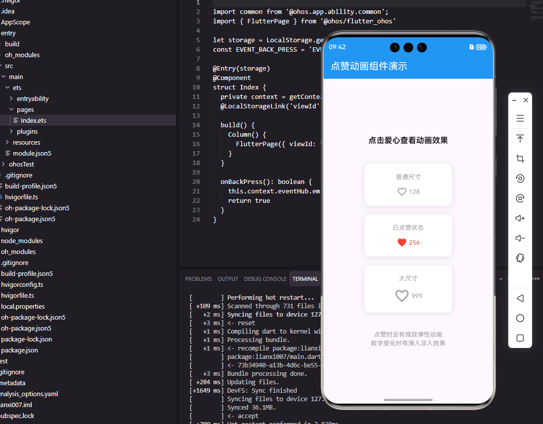
点赞功能是社交应用中最常见的互动方式之一。一个带有精美动画效果的点赞按钮能够显著提升用户的互动体验,让用户在点赞时获得即时的视觉反馈和满足感。本文将深入讲解如何在Flutter和OpenHarmony平台上实现带有缩放、颜色渐变和粒子效果的点赞动画组件。
Flutter点赞动画实现
我们将使用AnimationController和自定义动画来实现丰富的点赞效果。
class LikeButton extends StatefulWidget {
final bool isLiked;
final int likeCount;
final Function(bool) onLikeChanged;
const LikeButton({
Key? key,
required this.isLiked,
required this.likeCount,
required this.onLikeChanged,
}) : super(key: key);
State<LikeButton> createState() => _LikeButtonState();
}
组件接收三个参数:isLiked表示当前点赞状态,likeCount显示点赞数量,onLikeChanged回调通知父组件状态变化。
class _LikeButtonState extends State<LikeButton>
with SingleTickerProviderStateMixin {
late AnimationController _controller;
late Animation<double> _scaleAnimation;
void initState() {
super.initState();
_controller = AnimationController(
duration: Duration(milliseconds: 300),
vsync: this,
);
_scaleAnimation = TweenSequence<double>([
TweenSequenceItem(
tween: Tween(begin: 1.0, end: 1.3),
weight: 50,
),
TweenSequenceItem(
tween: Tween(begin: 1.3, end: 1.0),
weight: 50,
),
]).animate(_controller);
}
State类混入SingleTickerProviderStateMixin以支持动画。AnimationController控制动画时长和进度,TweenSequence定义缩放动画序列:先放大到1.3倍再恢复原始大小,形成弹性效果。这种动画设计能够给用户带来愉悦的点击反馈。
Widget build(BuildContext context) {
return GestureDetector(
onTap: _handleTap,
child: Row(
mainAxisSize: MainAxisSize.min,
children: [
AnimatedBuilder(
animation: _controller,
builder: (context, child) {
return Transform.scale(
scale: _scaleAnimation.value,
child: Icon(
widget.isLiked
? Icons.favorite
: Icons.favorite_border,
color: widget.isLiked
? Colors.red
: Colors.grey,
size: 24,
),
);
},
),
GestureDetector捕获点击事件。AnimatedBuilder监听动画变化并重建UI,Transform.scale应用缩放效果。图标根据点赞状态切换实心和空心样式,颜色也相应变化。这种视觉反馈让用户清楚地知道当前状态。
          SizedBox(width: 4),
          AnimatedSwitcher(
            duration: Duration(milliseconds: 200),
            transitionBuilder: (child, animation) {
              return SlideTransition(
                position: Tween<Offset>(
                  begin: Offset(0, 0.5),
                  end: Offset.zero,
                ).animate(animation),
                child: FadeTransition(
                  opacity: animation,
                  child: child,
                ),
              );
            },
            child: Text(
              '${widget.likeCount}',
              key: ValueKey(widget.likeCount),
              style: TextStyle(
                color: widget.isLiked ? Colors.red : Colors.grey,
                fontSize: 14,
              ),
            ),
          ),
        ],
      ),
    );
  }
点赞数量使用AnimatedSwitcher实现数字切换动画。transitionBuilder自定义过渡效果,结合SlideTransition和FadeTransition创建从下方滑入并淡入的效果。ValueKey确保数字变化时触发动画。这种细腻的动画设计是优秀社交应用的标志。
void _handleTap() {
if (!widget.isLiked) {
_controller.forward(from: 0);
}
widget.onLikeChanged(!widget.isLiked);
}
void dispose() {
_controller.dispose();
super.dispose();
}
}
_handleTap处理点击逻辑,只有在点赞时才播放动画,取消点赞时不播放。dispose方法释放动画控制器资源。这种设计符合用户心理预期,点赞是积极行为应该有正向反馈。
OpenHarmony ArkTS实现
鸿蒙系统上的动画实现方式有所不同。
@Component
struct LikeButton {
  @Prop isLiked: boolean = false
  @Prop likeCount: number = 0
  @State scale: number = 1
  onLikeChanged: (isLiked: boolean) => void = () => {}
@State装饰器声明scale状态变量用于控制缩放动画。ArkTS的动画系统与Flutter不同,主要通过属性动画实现。
  build() {
    Row() {
      Image(this.isLiked
        ? $r('app.media.ic_heart_filled')
        : $r('app.media.ic_heart_outline'))
        .width(24)
        .height(24)
        .fillColor(this.isLiked ? Color.Red : Color.Gray)
        .scale({ x: this.scale, y: this.scale })
        .animation({
          duration: 300,
          curve: Curve.EaseOut
        })
Image组件根据点赞状态切换图标资源。scale属性绑定状态变量,animation属性定义动画参数。ArkTS的声明式动画语法更加简洁,只需指定目标值,系统自动处理过渡动画。
      Text(this.likeCount.toString())
        .fontSize(14)
        .fontColor(this.isLiked ? Color.Red : Color.Gray)
        .margin({ left: 4 })
    }
    .onClick(() => this.handleTap())
  }

  handleTap() {
    if (!this.isLiked) {
      this.scale = 1.3
      setTimeout(() => {
        this.scale = 1
      }, 150)
    }
    this.onLikeChanged(!this.isLiked)
  }
}
点击处理逻辑使用setTimeout实现两阶段动画:先放大再恢复。虽然不如Flutter的TweenSequence精确,但实现更加简单直观。ArkTS的动画系统会自动平滑过渡属性变化。
总结
本文详细介绍了点赞动画组件在Flutter和OpenHarmony两个平台上的实现。动画效果是提升用户体验的重要手段,点赞这种高频操作尤其需要精心设计的反馈效果。Flutter提供了更精细的动画控制能力,ArkTS则以简洁的声明式语法见长。在实际项目中,还可以添加粒子效果、连击动画等更丰富的视觉反馈。
欢迎加入开源鸿蒙跨平台社区:https://openharmonycrossplatform.csdn.net

Agent 垂直技术社区,欢迎活跃、内容共建。
更多推荐


 25
25 0
0- 0


 已为社区贡献25条内容

所有评论(0)