Flutter&OpenHarmony商城App骨架屏组件开发
前言
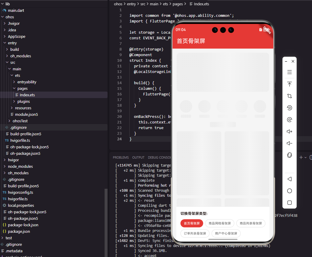
骨架屏是商城应用中优化加载体验的重要技术,在数据加载完成前显示页面的大致结构轮廓,让用户感知到内容即将呈现。相比传统的加载动画,骨架屏能够减少用户的等待焦虑,提供更好的感知性能。本文将详细介绍如何在Flutter和OpenHarmony平台上开发骨架屏组件。
骨架屏的设计需要与实际内容的布局保持一致,让用户能够预期即将看到的内容结构。同时,骨架屏通常会添加闪烁动画,表明内容正在加载中,避免用户误以为页面卡住。
Flutter骨架屏基础组件
首先实现骨架屏的基础占位组件:
class SkeletonBox extends StatelessWidget {
final double? width;
final double? height;
final double borderRadius;
final bool isCircle;
const SkeletonBox({
Key? key,
this.width,
this.height,
this.borderRadius = 4,
this.isCircle = false,
}) : super(key: key);
Widget build(BuildContext context) {
return Container(
width: width,
height: height,
decoration: BoxDecoration(
color: const Color(0xFFEEEEEE),
borderRadius: isCircle
? null
: BorderRadius.circular(borderRadius),
shape: isCircle ? BoxShape.circle : BoxShape.rectangle,
),
);
}
}
SkeletonBox是骨架屏的基础占位组件,用于模拟文字、图片等内容的位置。width和height设置占位块的尺寸,borderRadius设置圆角,isCircle控制是否为圆形。Container使用浅灰色背景,在视觉上表明这是占位内容。这种基础组件可以组合成各种复杂的骨架屏布局。
闪烁动画组件
class ShimmerEffect extends StatefulWidget {
final Widget child;
final Duration duration;
const ShimmerEffect({
Key? key,
required this.child,
this.duration = const Duration(milliseconds: 1500),
}) : super(key: key);
State<ShimmerEffect> createState() => _ShimmerEffectState();
}
class _ShimmerEffectState extends State<ShimmerEffect>
with SingleTickerProviderStateMixin {
late AnimationController _controller;
void initState() {
super.initState();
_controller = AnimationController(
vsync: this,
duration: widget.duration,
)..repeat();
}
void dispose() {
_controller.dispose();
super.dispose();
}
Widget build(BuildContext context) {
return AnimatedBuilder(
animation: _controller,
builder: (context, child) {
return ShaderMask(
shaderCallback: (bounds) {
return LinearGradient(
begin: Alignment.centerLeft,
end: Alignment.centerRight,
colors: const [
Color(0xFFEEEEEE),
Color(0xFFF5F5F5),
Color(0xFFEEEEEE),
],
stops: [
_controller.value - 0.3,
_controller.value,
_controller.value + 0.3,
].map((s) => s.clamp(0.0, 1.0)).toList(),
).createShader(bounds);
},
blendMode: BlendMode.srcATop,
child: child,
);
},
child: widget.child,
);
}
}
ShimmerEffect组件为骨架屏添加闪烁动画效果。AnimationController创建循环动画,repeat方法使动画无限循环。ShaderMask使用线性渐变着色器,渐变位置随动画值变化,产生光泽扫过的效果。stops数组使用clamp确保值在0到1之间。这种闪烁效果让用户知道内容正在加载中。
商品卡片骨架屏
class ProductCardSkeleton extends StatelessWidget {
const ProductCardSkeleton({Key? key}) : super(key: key);
Widget build(BuildContext context) {
return ShimmerEffect(
child: Container(
decoration: BoxDecoration(
color: Colors.white,
borderRadius: BorderRadius.circular(8),
),
child: Column(
crossAxisAlignment: CrossAxisAlignment.start,
children: [
const SkeletonBox(
width: double.infinity,
height: 150,
borderRadius: 8,
),
Padding(
padding: const EdgeInsets.all(12),
child: Column(
crossAxisAlignment: CrossAxisAlignment.start,
children: const [
SkeletonBox(width: double.infinity, height: 14),
SizedBox(height: 8),
SkeletonBox(width: 100, height: 14),
SizedBox(height: 12),
SkeletonBox(width: 80, height: 18),
],
),
),
],
),
),
);
}
}
ProductCardSkeleton模拟商品卡片的骨架结构。顶部是商品图片占位,下方是商品名称和价格占位。布局结构与实际商品卡片保持一致,让用户能够预期即将看到的内容。ShimmerEffect包裹整个骨架屏,添加闪烁动画效果。Container设置白色背景和圆角,与实际卡片样式一致。
商品列表骨架屏
class ProductListSkeleton extends StatelessWidget {
final int itemCount;
final bool isGrid;
const ProductListSkeleton({
Key? key,
this.itemCount = 6,
this.isGrid = true,
}) : super(key: key);
Widget build(BuildContext context) {
if (isGrid) {
return GridView.builder(
shrinkWrap: true,
physics: const NeverScrollableScrollPhysics(),
padding: const EdgeInsets.all(16),
gridDelegate: const SliverGridDelegateWithFixedCrossAxisCount(
crossAxisCount: 2,
mainAxisSpacing: 12,
crossAxisSpacing: 12,
childAspectRatio: 0.7,
),
itemCount: itemCount,
itemBuilder: (context, index) => const ProductCardSkeleton(),
);
}
return ListView.separated(
shrinkWrap: true,
physics: const NeverScrollableScrollPhysics(),
padding: const EdgeInsets.all(16),
itemCount: itemCount,
separatorBuilder: (_, __) => const SizedBox(height: 12),
itemBuilder: (context, index) => const ProductListItemSkeleton(),
);
}
}
ProductListSkeleton根据isGrid参数显示网格或列表形式的骨架屏。itemCount控制显示的骨架项数量。GridView和ListView都设置shrinkWrap和NeverScrollableScrollPhysics,使骨架屏高度自适应且不可滚动。这种设计与实际商品列表的布局保持一致。
列表项骨架屏:
class ProductListItemSkeleton extends StatelessWidget {
const ProductListItemSkeleton({Key? key}) : super(key: key);
Widget build(BuildContext context) {
return ShimmerEffect(
child: Container(
height: 120,
padding: const EdgeInsets.all(12),
decoration: BoxDecoration(
color: Colors.white,
borderRadius: BorderRadius.circular(8),
),
child: Row(
children: [
const SkeletonBox(
width: 96,
height: 96,
borderRadius: 4,
),
const SizedBox(width: 12),
Expanded(
child: Column(
crossAxisAlignment: CrossAxisAlignment.start,
mainAxisAlignment: MainAxisAlignment.center,
children: const [
SkeletonBox(width: double.infinity, height: 14),
SizedBox(height: 8),
SkeletonBox(width: 150, height: 14),
SizedBox(height: 16),
SkeletonBox(width: 80, height: 18),
],
),
),
],
),
),
);
}
}
ProductListItemSkeleton模拟列表形式商品项的骨架结构。Row水平排列图片占位和信息占位,与实际列表项布局一致。左侧是正方形图片占位,右侧是商品名称和价格占位。这种设计让用户在数据加载前就能了解页面的内容结构。
OpenHarmony骨架屏实现
@Component
struct SkeletonBox {
  @Prop width: number | string = '100%'
  @Prop height: number = 14
  @Prop borderRadius: number = 4
  @Prop isCircle: boolean = false

  build() {
    Column()
      .width(this.width)
      .height(this.height)
      .backgroundColor('#EEEEEE')
      .borderRadius(this.isCircle ? this.height / 2 : this.borderRadius)
  }
}
OpenHarmony的骨架屏基础组件使用Column作为占位块。@Prop装饰的属性从父组件接收配置。width支持数字和字符串类型,可以设置具体像素值或百分比。borderRadius根据isCircle参数设置圆形或指定圆角。backgroundColor设置浅灰色背景。
闪烁动画ArkUI实现:
@Component
struct ShimmerEffect {
  @State offset: number = -1
  @BuilderParam content: () => void

  aboutToAppear() {
    this.startAnimation()
  }

  startAnimation() {
    animateTo({
      duration: 1500,
      iterations: -1,
      curve: Curve.Linear
    }, () => {
      this.offset = 2
    })
  }

  build() {
    Stack() {
      this.content()

      Column()
        .width('30%')
        .height('100%')
        .linearGradient({
          direction: GradientDirection.Right,
          colors: [['#00FFFFFF', 0], ['#40FFFFFF', 0.5], ['#00FFFFFF', 1]]
        })
        .position({ x: this.offset * 100 + '%' })
    }
    .clip(true)
  }
}
ShimmerEffect组件使用animateTo创建循环动画。Stack层叠骨架内容和渐变光效。Column作为光效层,使用linearGradient创建透明到半透明的渐变。position根据offset值移动光效位置,产生扫过效果。clip设为true裁剪超出部分。iterations设为-1使动画无限循环。
商品卡片骨架屏ArkUI实现
@Component
struct ProductCardSkeleton {
  build() {
    ShimmerEffect() {
      Column() {
        SkeletonBox({ width: '100%', height: 150, borderRadius: 8 })

        Column() {
          SkeletonBox({ width: '100%', height: 14 })
          SkeletonBox({ width: 100, height: 14 })
            .margin({ top: 8 })
          SkeletonBox({ width: 80, height: 18 })
            .margin({ top: 12 })
        }
        .width('100%')
        .padding(12)
        .alignItems(HorizontalAlign.Start)
      }
      .width('100%')
      .backgroundColor(Color.White)
      .borderRadius(8)
    }
  }
}
商品卡片骨架屏使用Column垂直排列图片占位和信息占位。ShimmerEffect包裹整个骨架屏添加闪烁效果。内部Column设置左对齐,与实际商品卡片布局一致。margin设置各占位块之间的间距。这种实现方式与Flutter版本的视觉效果一致。
页面级骨架屏
class HomePageSkeleton extends StatelessWidget {
const HomePageSkeleton({Key? key}) : super(key: key);
Widget build(BuildContext context) {
return SingleChildScrollView(
child: Column(
children: [
_buildBannerSkeleton(),
const SizedBox(height: 16),
_buildCategorySkeleton(),
const SizedBox(height: 16),
_buildSectionTitle(),
const ProductListSkeleton(itemCount: 4),
],
),
);
}
Widget _buildBannerSkeleton() {
return ShimmerEffect(
child: Container(
margin: const EdgeInsets.all(16),
child: const SkeletonBox(
width: double.infinity,
height: 150,
borderRadius: 12,
),
),
);
}
Widget _buildCategorySkeleton() {
return ShimmerEffect(
child: Padding(
padding: const EdgeInsets.symmetric(horizontal: 16),
child: Row(
mainAxisAlignment: MainAxisAlignment.spaceAround,
children: List.generate(5, (index) {
return Column(
children: const [
SkeletonBox(width: 48, height: 48, isCircle: true),
SizedBox(height: 8),
SkeletonBox(width: 40, height: 12),
],
);
}),
),
),
);
}
Widget _buildSectionTitle() {
return ShimmerEffect(
child: Padding(
padding: const EdgeInsets.symmetric(horizontal: 16),
child: const SkeletonBox(width: 100, height: 20),
),
);
}
}
HomePageSkeleton模拟首页的完整骨架结构,包括轮播图、分类导航、标题和商品列表。SingleChildScrollView使骨架屏可滚动,与实际首页行为一致。各个区域的骨架屏独立定义,组合成完整的页面骨架。这种设计让用户在首页加载时就能看到页面的整体结构。
骨架屏使用示例
class ProductListPage extends StatefulWidget {
State<ProductListPage> createState() => _ProductListPageState();
}
class _ProductListPageState extends State<ProductListPage> {
bool _isLoading = true;
List<Product> _products = [];
void initState() {
super.initState();
_loadData();
}
Future<void> _loadData() async {
await Future.delayed(const Duration(seconds: 2));
setState(() {
_isLoading = false;
_products = [...]; // 加载的数据
});
}
Widget build(BuildContext context) {
if (_isLoading) {
return const ProductListSkeleton();
}
return ProductList(products: _products);
}
}
骨架屏的使用非常简单,在数据加载中时显示骨架屏,加载完成后显示实际内容。_isLoading状态控制显示哪个组件。Future.delayed模拟网络请求延迟。这种模式可以应用于任何需要加载数据的页面,提升用户的等待体验。
总结
本文详细介绍了Flutter和OpenHarmony平台上骨架屏组件的开发过程。骨架屏作为优化加载体验的重要技术,其设计质量直接影响用户对应用性能的感知。通过基础占位组件、闪烁动画、页面级骨架屏等的合理设计,我们为用户提供了更好的加载等待体验。在实际项目中,骨架屏应该与实际内容布局保持一致,让用户能够预期即将看到的内容。
欢迎加入开源鸿蒙跨平台社区:https://openharmonycrossplatform.csdn.net

Agent 垂直技术社区,欢迎活跃、内容共建。
更多推荐


 7
7 0
0- 0


 已为社区贡献26条内容

所有评论(0)