Flutter & OpenHarmony 社交App个人主页组件设计与实现
前言
个人主页是社交应用中展示用户身份和内容的核心页面。一个优秀的个人主页需要包含用户基本信息、统计数据、动态内容列表等模块,同时还要支持关注、私信等社交互动功能。本文将详细讲解如何在Flutter和OpenHarmony平台上构建专业级的个人主页组件。
Flutter个人主页头部实现
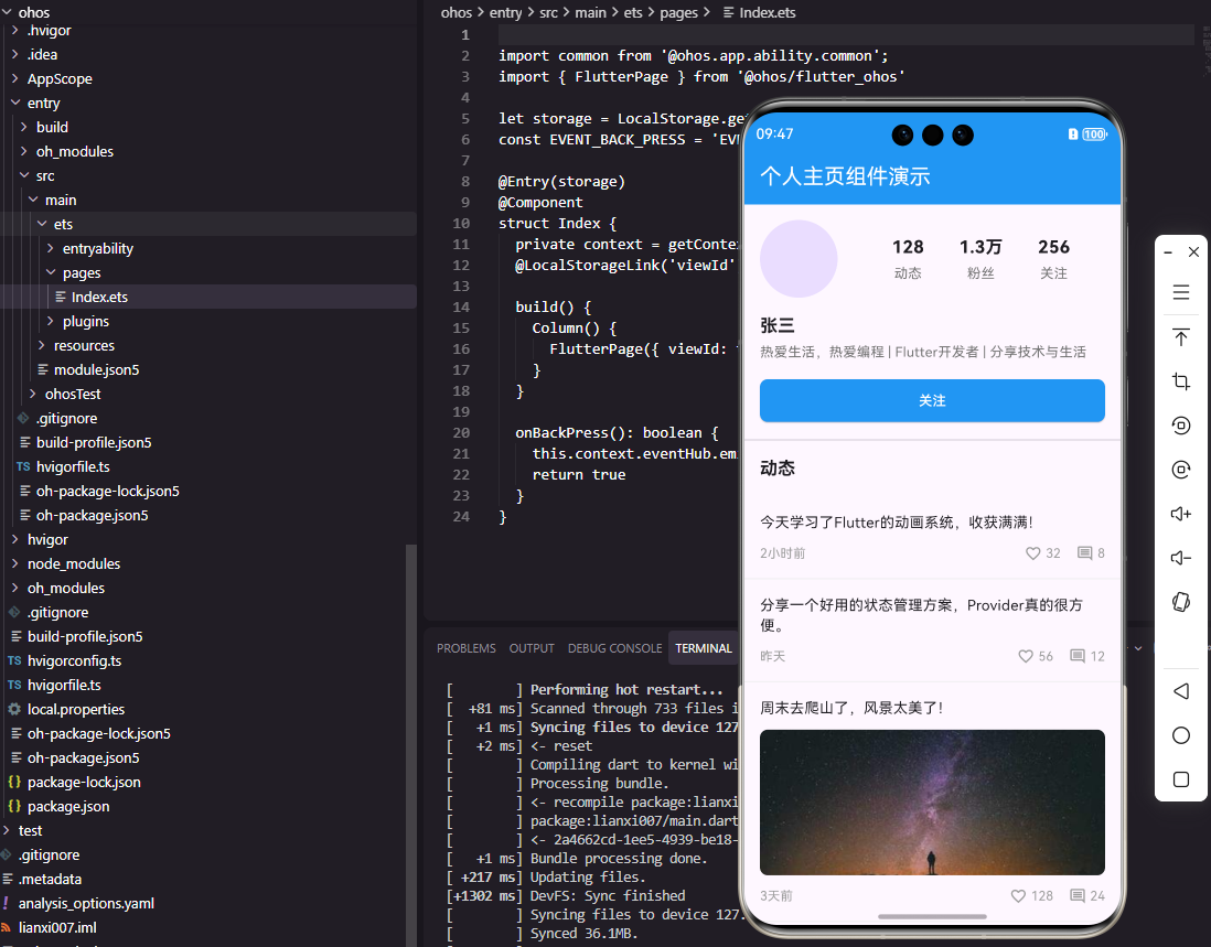
首先实现个人主页的头部区域,包含头像、昵称、简介和统计数据。
class ProfileHeader extends StatelessWidget {
  final String avatar;
  final String name;
  final String bio;
  final int postCount;
  final int followerCount;
  final int followingCount;
  final bool isFollowing;
  final VoidCallback onFollowTap;

  const ProfileHeader({
    Key? key,
    required this.avatar,
    required this.name,
    required this.bio,
    required this.postCount,
    required this.followerCount,
    required this.followingCount,
    required this.isFollowing,
    required this.onFollowTap,
  }) : super(key: key);
ProfileHeader组件接收用户的完整信息,包括头像、昵称、简介、发帖数、粉丝数、关注数以及当前关注状态。onFollowTap回调处理关注按钮点击。
Widget build(BuildContext context) {
return Container(
padding: EdgeInsets.all(16),
child: Column(
children: [
Row(
children: [
CircleAvatar(
radius: 40,
backgroundImage: NetworkImage(avatar),
),
SizedBox(width: 20),
Expanded(
child: Row(
mainAxisAlignment: MainAxisAlignment.spaceEvenly,
children: [
_buildStatItem('动态', postCount),
_buildStatItem('粉丝', followerCount),
_buildStatItem('关注', followingCount),
],
),
),
],
),
头部布局使用Row水平排列头像和统计数据。头像使用CircleAvatar实现圆形效果,radius设置为40像素是社交应用个人主页的标准尺寸。统计数据区域使用Expanded占据剩余空间,spaceEvenly均匀分布三个统计项。
          SizedBox(height: 16),
          Align(
            alignment: Alignment.centerLeft,
            child: Text(
              name,
              style: TextStyle(
                fontSize: 18,
                fontWeight: FontWeight.bold,
              ),
            ),
          ),
          SizedBox(height: 4),
          Align(
            alignment: Alignment.centerLeft,
            child: Text(
              bio,
              style: TextStyle(
                color: Colors.grey[600],
                fontSize: 14,
              ),
            ),
          ),
昵称和简介左对齐显示。昵称使用较大字号和加粗字重突出显示,简介使用灰色字体作为辅助信息。Align组件确保文本左对齐,这是个人主页的标准布局方式。
          SizedBox(height: 16),
          SizedBox(
            width: double.infinity,
            child: ElevatedButton(
              onPressed: onFollowTap,
              style: ElevatedButton.styleFrom(
                backgroundColor: isFollowing
                  ? Colors.grey[200]
                  : Colors.blue,
                foregroundColor: isFollowing
                  ? Colors.black
                  : Colors.white,
                shape: RoundedRectangleBorder(
                  borderRadius: BorderRadius.circular(8),
                ),
              ),
              child: Text(isFollowing ? '已关注' : '关注'),
            ),
          ),
        ],
      ),
    );
  }
关注按钮占据全宽,根据关注状态切换样式和文字。已关注状态使用灰色背景和黑色文字,未关注状态使用蓝色背景和白色文字。这种视觉差异让用户一眼就能识别当前状态。
  Widget _buildStatItem(String label, int count) {
    return Column(
      children: [
        Text(
          _formatCount(count),
          style: TextStyle(
            fontSize: 18,
            fontWeight: FontWeight.bold,
          ),
        ),
        SizedBox(height: 4),
        Text(
          label,
          style: TextStyle(
            color: Colors.grey[600],
            fontSize: 14,
          ),
        ),
      ],
    );
  }

  String _formatCount(int count) {
    if (count >= 10000) return '${(count / 10000).toStringAsFixed(1)}万';
    return count.toString();
  }
}
_buildStatItem方法构建单个统计项,数字在上标签在下。_formatCount方法将大数字格式化为更易读的形式,超过1万显示为"X.X万"。这种格式化在社交应用中非常常见,能够让数据更加直观。
OpenHarmony ArkTS实现
鸿蒙系统上的个人主页头部实现。
@Component
struct ProfileHeader {
  @Prop avatar: string = ''
  @Prop name: string = ''
  @Prop bio: string = ''
  @Prop postCount: number = 0
  @Prop followerCount: number = 0
  @Prop followingCount: number = 0
  @Prop isFollowing: boolean = false
  onFollowTap: () => void = () => {}
组件属性与Flutter版本对应,使用@Prop接收外部数据。
  build() {
    Column() {
      Row() {
        Image(this.avatar)
          .width(80)
          .height(80)
          .borderRadius(40)

        Row() {
          this.StatItem('动态', this.postCount)
          this.StatItem('粉丝', this.followerCount)
          this.StatItem('关注', this.followingCount)
        }
        .layoutWeight(1)
        .justifyContent(FlexAlign.SpaceEvenly)
      }
      .width('100%')
Row布局水平排列头像和统计数据。Image组件设置固定尺寸和圆角。内层Row使用justifyContent均匀分布统计项,layoutWeight(1)占据剩余空间。
      Text(this.name)
        .fontSize(18)
        .fontWeight(FontWeight.Bold)
        .width('100%')
        .margin({ top: 16 })

      Text(this.bio)
        .fontSize(14)
        .fontColor('#8E8E93')
        .width('100%')
        .margin({ top: 4 })
昵称和简介设置width为100%实现左对齐。字体样式与Flutter版本保持一致,确保跨平台视觉统一。
      Button(this.isFollowing ? '已关注' : '关注')
        .width('100%')
        .height(40)
        .backgroundColor(this.isFollowing ? '#E5E5EA' : '#007AFF')
        .fontColor(this.isFollowing ? Color.Black : Color.White)
        .borderRadius(8)
        .margin({ top: 16 })
        .onClick(() => this.onFollowTap())
    }
    .padding(16)
    .width('100%')
  }
Button组件实现关注按钮,样式根据关注状态动态变化。onClick绑定点击事件触发回调。
  @Builder
  StatItem(label: string, count: number) {
    Column() {
      Text(this.formatCount(count))
        .fontSize(18)
        .fontWeight(FontWeight.Bold)

      Text(label)
        .fontSize(14)
        .fontColor('#8E8E93')
        .margin({ top: 4 })
    }
  }

  formatCount(count: number): string {
    if (count >= 10000) {
      return (count / 10000).toFixed(1) + '万'
    }
    return count.toString()
  }
}
@Builder装饰器定义可复用的构建方法。formatCount方法实现数字格式化,逻辑与Flutter版本相同。
总结
本文详细介绍了个人主页头部组件在Flutter和OpenHarmony两个平台上的实现。个人主页是社交应用的核心页面,需要清晰展示用户信息和社交数据。两个平台的实现思路一致,都采用组件化设计和条件样式。在实际项目中,还可以扩展编辑资料、私信、更多操作等功能。
欢迎加入开源鸿蒙跨平台社区:https://openharmonycrossplatform.csdn.net

Agent 垂直技术社区,欢迎活跃、内容共建。
更多推荐

 14
14 0
0- 0


 已为社区贡献25条内容

所有评论(0)