Flutter & OpenHarmony 社交App搜索框组件开发实战
前言
搜索功能是社交应用中帮助用户发现内容和好友的重要工具。一个优秀的搜索框组件需要支持实时搜索建议、搜索历史记录、热门搜索推荐等功能,同时还要具备良好的输入体验和视觉效果。本文将详细讲解如何在Flutter和OpenHarmony平台上构建功能完善的搜索框组件。
Flutter搜索框实现
首先实现基础的搜索框UI组件。
class SearchBar extends StatefulWidget {
final Function(String) onSearch;
final Function(String)? onChanged;
final String? placeholder;
final bool autofocus;
const SearchBar({
Key? key,
required this.onSearch,
this.onChanged,
this.placeholder,
this.autofocus = false,
}) : super(key: key);
State<SearchBar> createState() => _SearchBarState();
}
SearchBar组件定义为StatefulWidget以管理输入状态。onSearch回调在用户提交搜索时触发,onChanged在输入变化时触发用于实时搜索。autofocus控制是否自动获取焦点。
class _SearchBarState extends State<SearchBar> {
final TextEditingController _controller = TextEditingController();
final FocusNode _focusNode = FocusNode();
bool _showClear = false;
void initState() {
super.initState();
_controller.addListener(() {
setState(() {
_showClear = _controller.text.isNotEmpty;
});
widget.onChanged?.call(_controller.text);
});
}
State类管理输入控制器和焦点节点。_showClear状态控制清除按钮的显示。监听器在文本变化时更新状态并触发onChanged回调,实现实时搜索功能。
Widget build(BuildContext context) {
return Container(
height: 44,
padding: EdgeInsets.symmetric(horizontal: 12),
decoration: BoxDecoration(
color: Colors.grey[100],
borderRadius: BorderRadius.circular(22),
),
child: Row(
children: [
Icon(
Icons.search,
color: Colors.grey,
size: 20,
),
SizedBox(width: 8),
Container设置固定高度和圆角背景,形成胶囊形状的搜索框。搜索图标放在左侧,灰色配色与背景协调。
          Expanded(
            child: TextField(
              controller: _controller,
              focusNode: _focusNode,
              autofocus: widget.autofocus,
              decoration: InputDecoration(
                hintText: widget.placeholder ?? '搜索',
                border: InputBorder.none,
                isDense: true,
                contentPadding: EdgeInsets.zero,
              ),
              onSubmitted: widget.onSearch,
            ),
          ),
TextField占据中间区域,移除默认边框和内边距。isDense和contentPadding确保输入框紧凑显示。onSubmitted在用户按下回车时触发搜索。
if (_showClear)
GestureDetector(
onTap: () {
_controller.clear();
widget.onChanged?.call('');
},
child: Icon(
Icons.cancel,
color: Colors.grey,
size: 18,
),
),
],
),
);
}
void dispose() {
_controller.dispose();
_focusNode.dispose();
super.dispose();
}
}
清除按钮在有输入内容时显示,点击后清空输入框并触发回调。dispose方法释放控制器和焦点节点资源。
OpenHarmony ArkTS实现
鸿蒙系统上的搜索框实现。
@Component
struct SearchBar {
  @State inputText: string = ''
  placeholder: string = '搜索'
  onSearch: (text: string) => void = () => {}
  onChanged: (text: string) => void = () => {}

  build() {
    Row() {
      Image($r('app.media.ic_search'))
        .width(20)
        .height(20)
        .fillColor(Color.Gray)
@State管理输入文本状态。Row作为根容器水平排列各元素。搜索图标使用Image组件加载。
      TextInput({ placeholder: this.placeholder, text: this.inputText })
        .layoutWeight(1)
        .backgroundColor(Color.Transparent)
        .padding({ left: 8, right: 8 })
        .onChange((value: string) => {
          this.inputText = value
          this.onChanged(value)
        })
        .onSubmit(() => {
          this.onSearch(this.inputText)
        })
TextInput实现文本输入,layoutWeight(1)占据剩余空间。onChange在输入变化时更新状态并触发回调,onSubmit处理提交事件。
      if (this.inputText.length > 0) {
        Image($r('app.media.ic_clear'))
          .width(18)
          .height(18)
          .fillColor(Color.Gray)
          .onClick(() => {
            this.inputText = ''
            this.onChanged('')
          })
      }
    }
    .height(44)
    .padding({ left: 12, right: 12 })
    .backgroundColor('#F5F5F5')
    .borderRadius(22)
  }
}
清除按钮条件渲染,点击后清空输入。整个Row设置高度、内边距、背景色和圆角,形成胶囊形状。
搜索历史组件
在Flutter中实现搜索历史:
class SearchHistory extends StatelessWidget {
final List<String> history;
final Function(String) onItemTap;
final VoidCallback onClear;
const SearchHistory({
Key? key,
required this.history,
required this.onItemTap,
required this.onClear,
}) : super(key: key);
Widget build(BuildContext context) {
return Column(
crossAxisAlignment: CrossAxisAlignment.start,
children: [
Row(
mainAxisAlignment: MainAxisAlignment.spaceBetween,
children: [
Text('搜索历史', style: TextStyle(fontWeight: FontWeight.bold)),
TextButton(onPressed: onClear, child: Text('清空')),
],
),
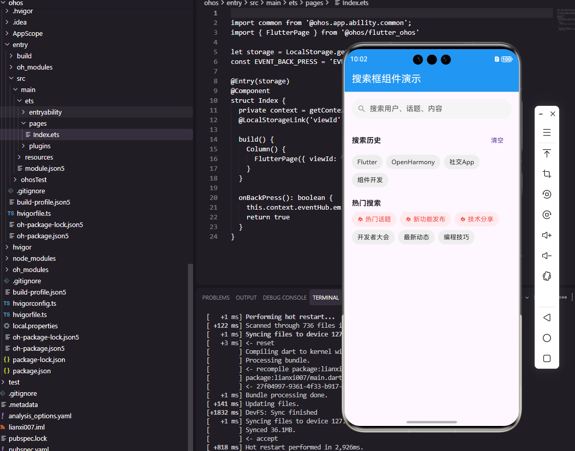
搜索历史组件显示用户的历史搜索记录。头部包含标题和清空按钮,使用spaceBetween分布在两端。
        Wrap(
          spacing: 8,
          runSpacing: 8,
          children: history.map((item) {
            return GestureDetector(
              onTap: () => onItemTap(item),
              child: Container(
                padding: EdgeInsets.symmetric(horizontal: 12, vertical: 6),
                decoration: BoxDecoration(
                  color: Colors.grey[200],
                  borderRadius: BorderRadius.circular(16),
                ),
                child: Text(item, style: TextStyle(fontSize: 14)),
              ),
            );
          }).toList(),
        ),
      ],
    );
  }
}
Wrap组件实现标签流式布局,自动换行。每个历史记录显示为圆角标签,点击后触发搜索。spacing和runSpacing控制标签之间的间距。
总结
本文详细介绍了搜索框组件在Flutter和OpenHarmony两个平台上的实现。搜索功能是社交应用帮助用户发现内容的重要工具,需要支持实时搜索、搜索历史等功能。两个平台的实现都采用了响应式状态管理。在实际项目中,还可以扩展搜索建议、热门搜索、语音搜索等功能。
欢迎加入开源鸿蒙跨平台社区:https://openharmonycrossplatform.csdn.net

Agent 垂直技术社区,欢迎活跃、内容共建。
更多推荐

 5
5 0
0- 0


 已为社区贡献25条内容

所有评论(0)