Python数据分析-数据可视化(pie饼状图+嵌套饼+环)
·
饼图
更多详细的饼图设置见 Matplotlib饼图图例:如何创建和自定义饼图及其图例
labels=data_label, # 数据标签
autopct=“%3.1f%%”, # 扇形块的数据标注格式,保留三位数字,1位小数
explode=(0,0.2,0,0), # 第2个扇区凸出
startangle=30, # 饼图的初始摆放角度,逆时针旋转30度
plt.legend(title=“图例”, loc=“center left”, bbox_to_anchor=(1, 0.5), fancybox=True, shadow=True, ncol=1) # bbox_to_anchor=(1, 0.5)#将图例放置在饼图的右侧中央
fancybox=True来给图例添加圆角,shadow=True来添加阴影效果,ncol=1来设置图例的列数。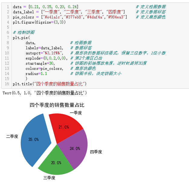
data = [0.21, 0.35, 0.20, 0.24]                           # 定义绘图数据
data_label = ["一季度", "二季度", "三季度", "四季度"]     # 定义数据标签
pie_colors = ["#e41a1c","#377eb8","#4daf4a","#984ea3"]    # 定义扇形颜色
plt.figure(figsize=(3,3))

# 绘制饼图
plt.pie(
      data,                # 绘图数据
      labels=data_label,   # 数据标签
      autopct="%3.1f%%",   # 扇形块的数据标注格式,保留三位数字,1位小数
      explode=(0,0.2,0,0), # 第2个扇区凸出
      startangle=30,       # 饼图的初始摆放角度,逆时针旋转30度
      colors=pie_colors,   # 扇形块颜色
      radius=1.1           # 饼图半径,决定饼图大小
      )
plt.title("四个季度的销售数量占比")
plt.pie(df[‘金额’])# 用Series对象也行
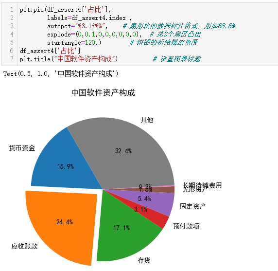
plt.pie(df_assert4['占比'],
        labels=df_assert4.index ,
        autopct="%3.1f%%",    # 扇形块的数据标注格式,形如88.8%
        explode=(0,0.1,0,0,0,0,0,0),  # 第2个扇区凸出
        startangle=120,)        # 饼图的初始摆放角度
df_assert4['占比']
plt.title("中国软件资产构成")          # 设置图表标题
嵌套饼
可以用来显示多层次的数据。
通过调整radius参数,我们可以控制每个饼图的大小。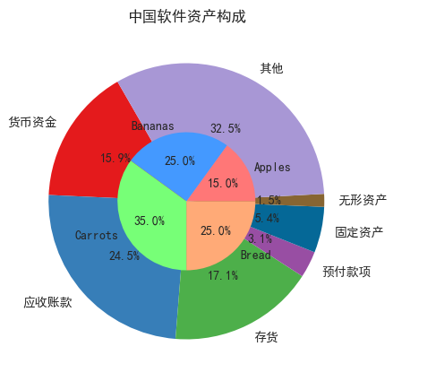
colors = ["#e41a1c","#377eb8","#4daf4a","#984ea3","#056897","#876532","#a897d5","#edfd90"]
plt.figure(figsize=(12,5))
plt.pie(
        df_assert4,
        labels=df_assert4.index ,#由于图上的标签会有重叠,所以改为图例
        autopct="%3.1f%%",    # 扇形块的数据标注格式,形如88.8%
        colors=colors,
        startangle=120,       # 饼图的初始摆放角度
       )
# 画内圈
plt.pie([15, 25, 35, 25],
        labels=['Apples', 'Bananas', 'Carrots', 'Bread'],
        colors=['#ff7777', '#4499ff', '#77ff77', '#ffaa77'],
        autopct="%3.1f%%",
        radius=0.5)


plt.title("中国软件资产构成")
环图
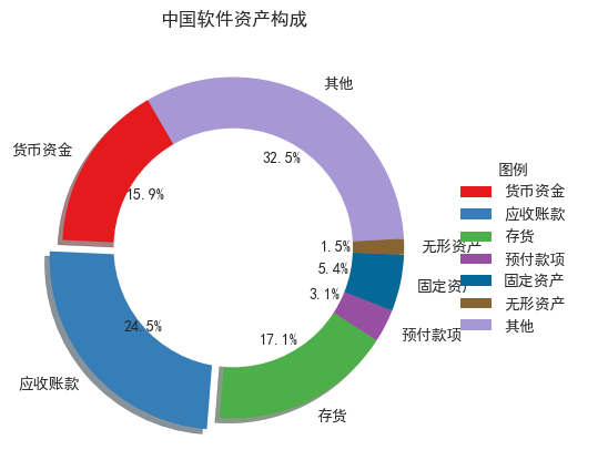
colors = ["#e41a1c","#377eb8","#4daf4a","#984ea3","#056897","#876532","#a897d5","#edfd90"]
plt.figure(figsize=(12,5))
plt.pie(
        df_assert4,
        labels=df_assert4.index ,#由于图上的标签会有重叠,所以改为图例
        autopct="%3.1f%%",    # 扇形块的数据标注格式,形如88.8%
        explode=(0,0.1,0,0,0,0,0),  # 第2个扇区凸出
        colors=colors,
        shadow=True,
        startangle=120,       # 饼图的初始摆放角度
       )


plt.legend(title="图例", loc="center left", bbox_to_anchor=(1, 0.5),fancybox=True, ncol=1,shadow=True)

plt.title("中国软件资产构成")

# 添加一个圆圈来创建环形效果
centre_circle = plt.Circle((0,0),0.70,fc='white')
plt.gca().add_artist(centre_circle)

Agent 垂直技术社区,欢迎活跃、内容共建。
更多推荐



 10
10 0
0- 0


 已为社区贡献3条内容

所有评论(0)