Day 9 Python Study
·
尝试用子图拼接的形式来构建心脏病数据集的图的排版,完成下面5张图
- 单特征的拼接在一起(连续变量一起;离散变量一起)2张图
- 特征与标签关系的在一起(连续变量一起;离散变量一起)2张图
- 热力图调试到满意的样式
图像可以自行探索形态,比如箱线图可以修改为小提琴构图,如修改`sns.boxplot()`为`sns.violinplot(),还有很多其他的形态可以借助AI学习
1.单特征拼接
# 首先走一遍完整的之前的流程
# 读取数据
import warnings
warnings.filterwarnings('ignore')
import pandas as pd
data  = pd.read_csv(r'E:\PyStudy\heart.csv')
# 查看数据
data.info()

import numpy as np
import matplotlib.pyplot as plt
import pandas as pd
import seaborn as sns
##通用设置
# 设置中文字体
plt.rcParams['font.sans-serif'] = ['SimHei']  # 用来正常显示中文标签
plt.rcParams['axes.unicode_minus'] = False  # 用来正常显示负号

#数据处理
# 划分特征类型
# 连续特征
numerical_features = ['age', 'trestbps', 'chol', 'thalach', 'oldpeak']

# 离散特征
categorical_features = ['sex', 'cp', 'fbs', 'restecg', 'exang', 'slope', 'ca', 'thal']

# 目标变量
target_feature = ['target']

# 创建图形和子图
n_features = len(numerical_features)
fig, axes = plt.subplots(1, n_features, figsize=(20, 6))

# 设置总标题
fig.suptitle('心脏病数据集-连续特征分布', fontsize=16, fontweight='bold', y=1.02)

# 为每个数值特征绘制箱线图
for i, feature in enumerate(numerical_features):
    # 绘制箱线图
    sns.boxplot(data=data, y=feature, ax=axes[i], color='lightblue')

    # 设置子图标题
    axes[i].set_title(f'{feature}的分布', fontsize=12, fontweight='bold')
    # 设置y轴标签
    axes[i].set_ylabel(feature, fontsize=10)
    # 设置x轴标签(可选,因为只有一个箱线图)
    axes[i].set_xlabel('')

# 调整布局
plt.tight_layout()
plt.show()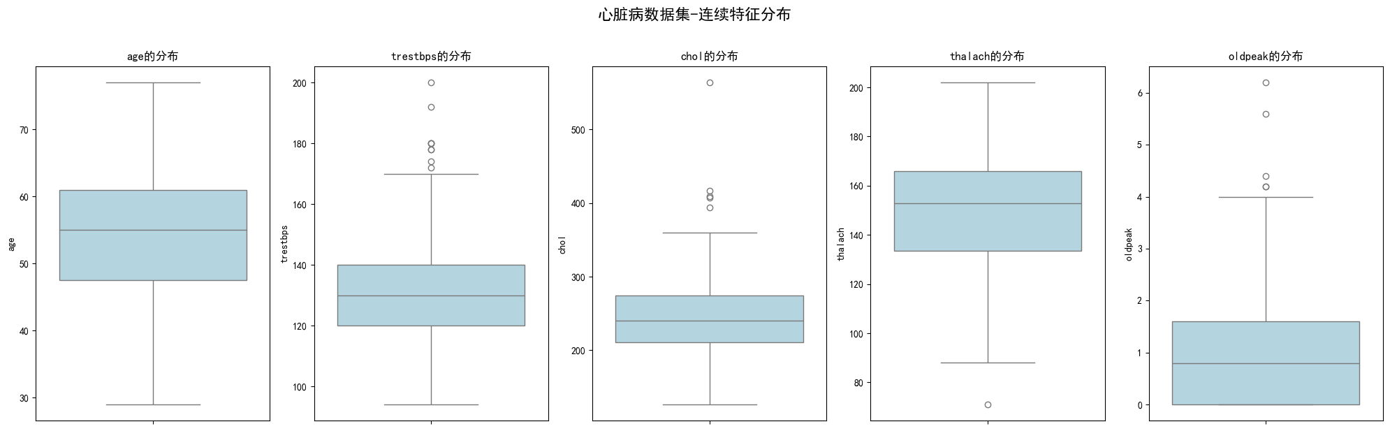
import matplotlib.pyplot as plt
import seaborn as sns
import numpy as np

# 创建图形
fig = plt.figure(figsize=(20, 12))

# 创建GridSpec:第一行用于总标题,下面两行用于子图
gs = plt.GridSpec(3, 4, height_ratios=[0.1, 0.45, 0.45], hspace=0.4, wspace=0.3)

# 总标题单独放在第一行,跨越所有列
title_ax = fig.add_subplot(gs[0, :])  # 第0行,所有列
title_ax.axis('off')
title_ax.text(0.5, 0.5, '心脏病数据集-离散特征分布',
             transform=title_ax.transAxes,
             ha='center', va='center',
             fontsize=20, fontweight='bold')

# 离散特征的含义映射
feature_labels = {
    'sex': {0: '女性', 1: '男性'},
    'cp': {0: '典型心绞痛', 1: '非典型心绞痛', 2: '非心绞痛', 3: '无症状'},
    'fbs': {0: '血糖正常', 1: '血糖偏高'},
    'restecg': {0: '正常', 1: 'ST-T异常', 2: '左室肥大'},
    'exang': {0: '无', 1: '有'},
    'slope': {0: '下斜', 1: '平坦', 2: '上斜'},
    'ca': {0: '0支', 1: '1支', 2: '2支', 3: '3支', 4: '4支'},
    'thal': {1: '正常', 2: '固定缺陷', 3: '可逆缺陷'}
}

# 为每个离散特征绘制直方图
for i, feature in enumerate(categorical_features):
    # 计算行和列的位置
    row = 1 + i // 4  # 第1行或第2行
    col = i % 4       # 0-3列

    ax = fig.add_subplot(gs[row, col])

    # 计算频次
    value_counts = data[feature].value_counts().sort_index()
    colors = plt.cm.Set3(np.linspace(0, 1, len(value_counts)))
    x_pos = np.arange(len(value_counts))

    # 绘制柱状图
    bars = ax.bar(x_pos, value_counts.values, color=colors, alpha=0.8, edgecolor='black', linewidth=0.5)

    # 设置子图标题
    ax.set_title(f'{feature}特征', fontsize=14, fontweight='bold', pad=10)

    # 设置横轴标签
    if feature in feature_labels:
        labels = [feature_labels[feature].get(x, str(x)) for x in value_counts.index]
    else:
        labels = [str(x) for x in value_counts.index]

    ax.set_xticks(x_pos)
    ax.set_xticklabels(labels, rotation=45, ha='right', fontsize=10)

    # 在柱子上方显示数值
    y_max = value_counts.max()
    ax.set_ylim(0, y_max * 1.15)

    for j, (bar, count) in enumerate(zip(bars, value_counts.values)):
        height = bar.get_height()
        percentage = (count / len(data)) * 100
        ax.text(bar.get_x() + bar.get_width()/2., height + y_max * 0.02,
                f'{count}\n({percentage:.1f}%)',
                ha='center', va='bottom', fontsize=9, fontweight='bold')

# 调整布局
plt.tight_layout()
plt.show()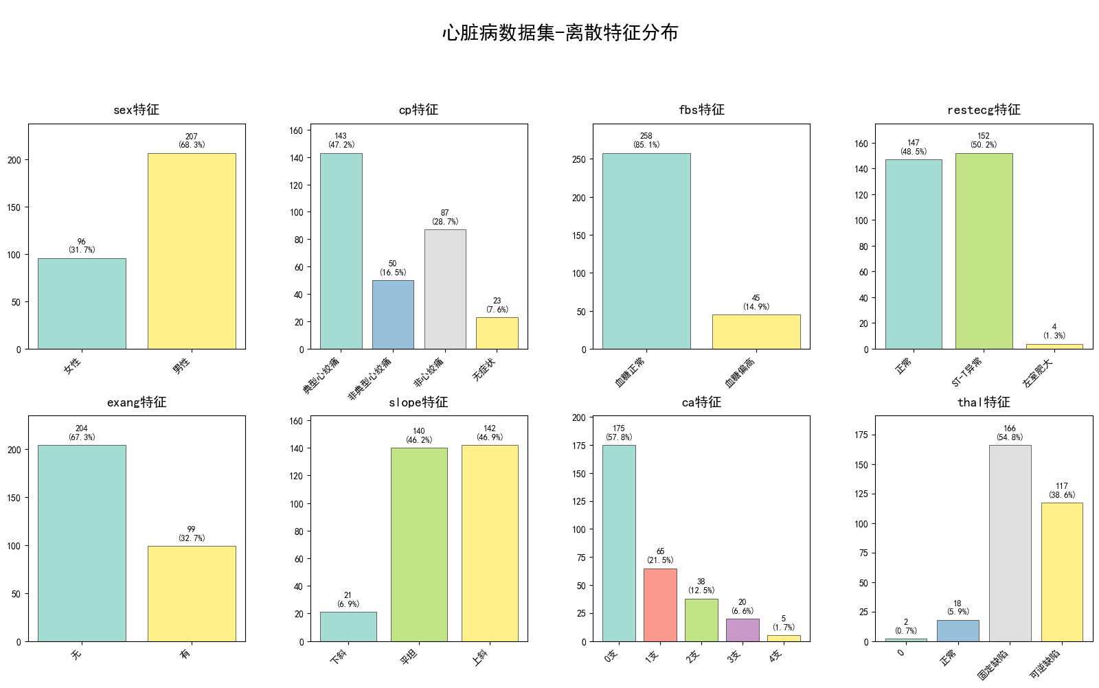
2.特征+标签
# 创建1行n列的子图
n_features = len(numerical_features)
fig, axes = plt.subplots(1, n_features, figsize=(20, 6))

# 设置总标题
fig.suptitle('心脏病数据集-连续特征分布(按标签分组)', fontsize=16, fontweight='bold', y=1.02)

# 为每个连续特征绘制分组箱线图
for i, feature in enumerate(numerical_features):
    # 创建分组数据
    data_0 = data[data['target'] == 0][feature]
    data_1 = data[data['target'] == 1][feature]

    # 手动绘制箱线图
    box_data = [data_0, data_1]
    box_plot = axes[i].boxplot(box_data,
                             patch_artist=True,
                             labels=['无心脏病', '有心脏病'],
                             widths=0.6)

    # 设置颜色
    colors = ['lightcoral', 'lightblue']
    for patch, color in zip(box_plot['boxes'], colors):
        patch.set_facecolor(color)
        patch.set_alpha(0.7)

    # 设置子图标题
    axes[i].set_title(f'{feature}特征', fontsize=12, fontweight='bold')
    axes[i].set_ylabel(feature)
    axes[i].set_xlabel('诊断结果')

    # 添加样本数标注
    axes[i].text(0.5, -0.15, f'n={len(data_0)} | n={len(data_1)}',
                transform=axes[i].transAxes, ha='center', va='top', fontsize=9)

# 调整布局
plt.tight_layout()
plt.show()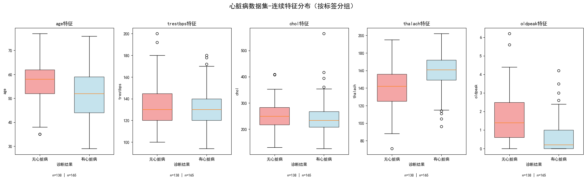
# 创建图形
fig = plt.figure(figsize=(20, 12))

# 创建GridSpec:第一行用于总标题,下面两行用于子图
gs = plt.GridSpec(3, 4, height_ratios=[0.08, 0.46, 0.46], hspace=0.4, wspace=0.3)

# 总标题单独放在第一行,跨越所有列
title_ax = fig.add_subplot(gs[0, :])
title_ax.axis('off')
title_ax.text(0.5, 0.5, '心脏病数据集-离散特征分布(按标签分组)',
             transform=title_ax.transAxes,
             ha='center', va='center',
             fontsize=20, fontweight='bold')

# 离散特征的含义映射
feature_labels = {
    'sex': {0: '女性', 1: '男性'},
    'cp': {0: '典型心绞痛', 1: '非典型心绞痛', 2: '非心绞痛', 3: '无症状'},
    'fbs': {0: '血糖正常', 1: '血糖偏高'},
    'restecg': {0: '正常', 1: 'ST-T异常', 2: '左室肥大'},
    'exang': {0: '无', 1: '有'},
    'slope': {0: '下斜', 1: '平坦', 2: '上斜'},
    'ca': {0: '0支', 1: '1支', 2: '2支', 3: '3支'},
    'thal': {1: '正常', 2: '固定缺陷', 3: '可逆缺陷'}
}

# 目标变量标签
target_labels = {0: '无心脏病', 1: '有心脏病'}
colors = ['#FF6B6B', '#4ECDC4']  # 红色表示无心脏病,青色表示有心脏病

# 为每个离散特征绘制分组直方图
for i, feature in enumerate(categorical_features):
    # 计算行和列的位置
    row = 1 + i // 4  # 第1行或第2行
    col = i % 4       # 0-3列

    ax = fig.add_subplot(gs[row, col])

    # 计算每个特征在不同标签下的频次
    cross_tab = pd.crosstab(data[feature], data['target'])
    cross_tab = cross_tab.reindex(sorted(cross_tab.index))  # 按索引排序

    # 设置柱状图的位置
    x_pos = np.arange(len(cross_tab))
    width = 0.35  # 柱状图宽度

    # 绘制分组柱状图
    bars0 = ax.bar(x_pos - width/2, cross_tab[0], width,
                  label=target_labels[0], color=colors[0], alpha=0.8, edgecolor='black')
    bars1 = ax.bar(x_pos + width/2, cross_tab[1], width,
                  label=target_labels[1], color=colors[1], alpha=0.8, edgecolor='black')

    # 设置子图标题
    ax.set_title(f'{feature}特征分布', fontsize=14, fontweight='bold', pad=10)

    # 设置横轴标签
    if feature in feature_labels:
        labels = [feature_labels[feature].get(x, str(x)) for x in cross_tab.index]
    else:
        labels = [str(x) for x in cross_tab.index]

    ax.set_xticks(x_pos)
    ax.set_xticklabels(labels, rotation=45, ha='right', fontsize=10)

    # 添加图例(只在第一行第一个子图添加)
    if i == 0:
        ax.legend(fontsize=10, loc='upper right')

    # 在柱子上方显示数值
    y_max = max(cross_tab[0].max(), cross_tab[1].max())
    ax.set_ylim(0, y_max * 1.2)

    # 为无心脏病组添加数值标注
    for bar, count in zip(bars0, cross_tab[0]):
        if count > 0:  # 只在有数据的柱子上显示
            height = bar.get_height()
            ax.text(bar.get_x() + bar.get_width()/2., height + y_max * 0.01,
                    f'{count}', ha='center', va='bottom', fontsize=8, fontweight='bold')

    # 为有心脏病组添加数值标注
    for bar, count in zip(bars1, cross_tab[1]):
        if count > 0:  # 只在有数据的柱子上显示
            height = bar.get_height()
            ax.text(bar.get_x() + bar.get_width()/2., height + y_max * 0.01,
                    f'{count}', ha='center', va='bottom', fontsize=8, fontweight='bold')

# 调整布局
plt.tight_layout()
plt.show()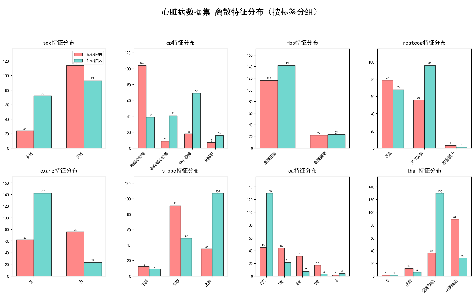
3.热力图
# 基础热力图 - 使用coolwarm配色
import pandas as pd
import seaborn as sns
import matplotlib.pyplot as plt

# 提取连续值特征
numerical_features = ['age', 'trestbps', 'chol', 'thalach', 'oldpeak']

# 计算相关系数矩阵
correlation_matrix = data[numerical_features].corr()

# 设置图片清晰度
plt.rcParams['figure.dpi'] = 300

# 绘制热力图
plt.figure(figsize=(12, 10))
sns.heatmap(correlation_matrix, annot=True, cmap='coolwarm', vmin=-1, vmax=1,
            fmt='.2f', linewidths=0.5)
plt.title('连续特征相关系数热力图 (coolwarm配色)')
plt.tight_layout()
plt.show()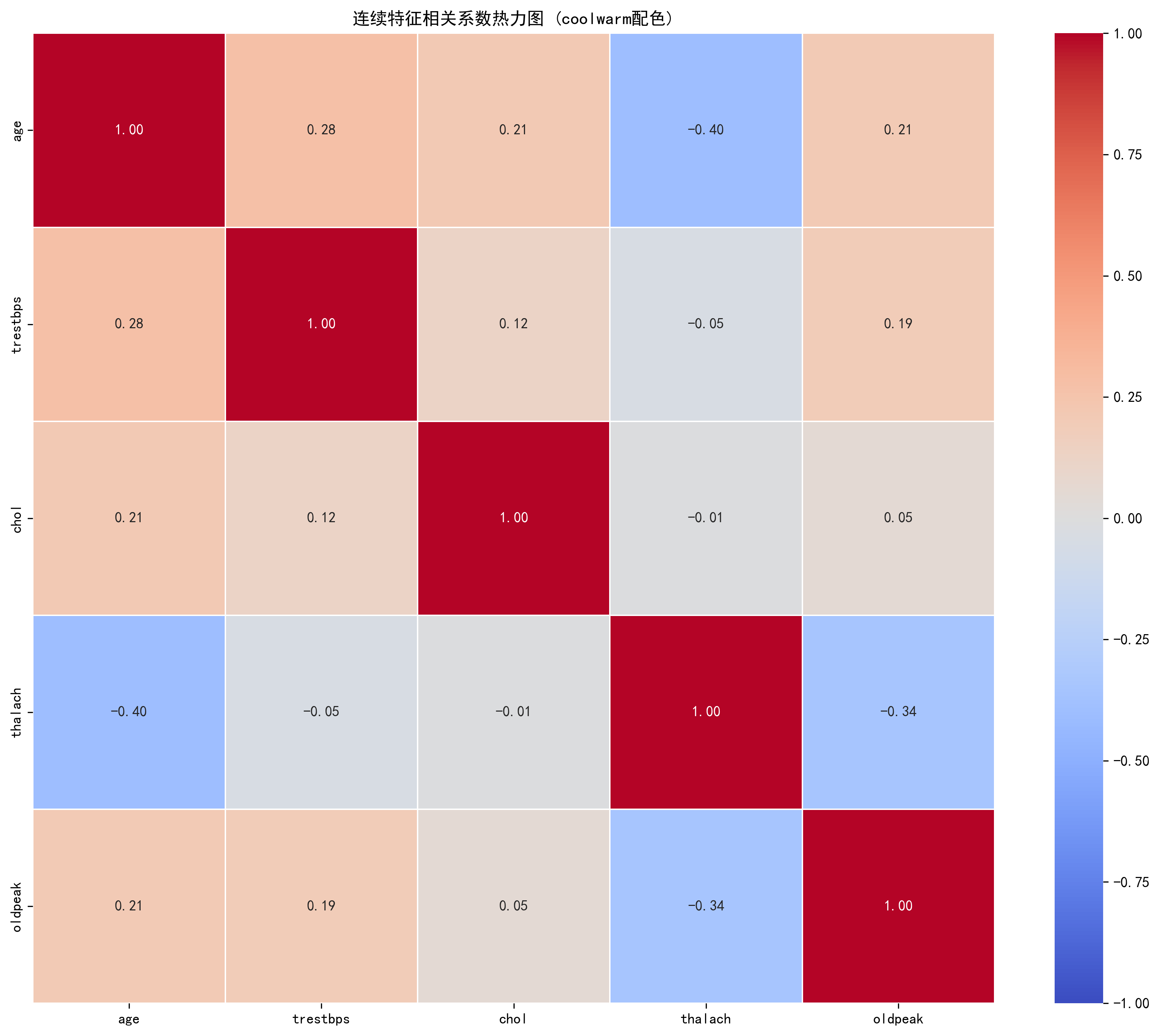

Agent 垂直技术社区,欢迎活跃、内容共建。
更多推荐
 2
2 0
0- 0


 已为社区贡献13条内容

所有评论(0)