Vue3 ECharts 使用柱状图实现渐变色的尖峰状 - 附完整示例
·
ECharts:一个基于 JavaScript 的开源可视化图表库。
目录
https://echarts.apache.org/zh/option.html#series-pictorialBar.type
效果
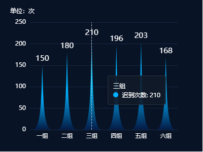
一、介绍
1、官方文档:Apache ECharts
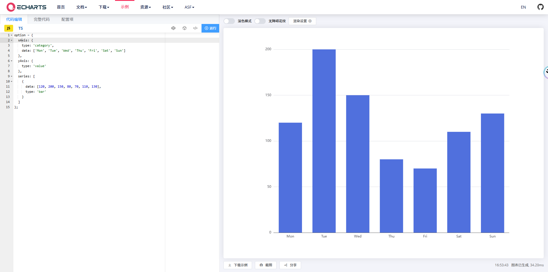
2、官方示例
二、准备工作
1、安装依赖包
npm install echarts --save2、示例版本
"echarts": "^5.4.3",三、使用步骤
1、在单页面引入 ' echarts '
import * as echarts from "echarts";注:上面的代码会引入 ECharts 中所有的图表和组件,如果你不想引入所有组件,也可以使用 ECharts 提供的按需引入的接口来打包必须的组件。详见官方文档:在项目中引入 ECharts - 入门篇 - Handbook - Apache ECharts
2、指定容器并设置容器宽高
<template>
  <div id="peakShapeMain"></div>
</template>

<script lang="ts" setup>
  import * as echarts from "echarts";

  initChart() {
    let chartDom = document.getElementById("peakShapeMain");
    let myChart = echarts.init(chartDom);
    let option;

    ...详见完整示例
  };
</script>

<style lang="scss" scoped>
#datasetMain {
  width: 400px;
  height: 300px;
}
</style>
3、数据处理(关键点)
1)尖峰状
series: [
  {
    type: 'pictorialBar',
    barCategoryGap: '20%', /* 设置柱子之间的间距 */
    symbol: 'path://M0,10 L10,10 C5.5,10 5.5,5 5,0 C4.5,5 4.5,10 0,10 z',
    ...详见完整示例
  },
],
https://echarts.apache.org/zh/option.html#series-pictorialBar.type
2)渐变色
series: [
  {
    itemStyle: {
      color: new echarts.graphic.LinearGradient(0, 0, 0, 1, [
        {
          offset: 0,
          color: '#00B2FF',
        },
        {
          offset: 0.5,
          color: '#00B2FF',
        },
        {
          offset: 1,
          color: '#041A44',
        },
      ]),
    },
  },
  ...详见完整示例
],
四、完整示例
<template>
  <div id="peakShapeMain"></div>
</template>

<script lang="ts" setup name="peakShape">
import * as echarts from "echarts";
import { onMounted, nextTick } from "vue";

const initChart = () => {
  let chartDom = document.getElementById("peakShapeMain");
  let myChart = echarts.init(chartDom);
  let option;

  const xdata = ['一组', '二组', '三组', '四组','五组', '六组'];
  const data = [150, 180, 210, 196, 203, 168];

  option = {
    tooltip: {
      confine: true,
      trigger: 'axis',
      backgroundColor: 'rgba(17, 25, 40, 0.9)',
      borderColor: 'rgba(255, 255, 255, 0.1)',
      borderWidth: 1,
      textStyle: {
        color: '#FFFFFF',
        fontSize: 12,
      },
    },
    grid: {
      top: '15%',
      left: '8%',
      right: '12%',
      bottom: '8%',
      containLabel: true,
    },
    xAxis: {
      data: xdata,
      triggerEvent: true,
      axisTick: {
        show: false
      },
      axisLine: {
        show: false
      },
      axisLabel: {
        show: true,
        rotate: 0,
        interval: 0,
        textStyle: {
          fontSize: 11,
          color: '#FFFFFF',
        },
      },
    },
    yAxis: {
      name: '单位:次',
      nameTextStyle: {
        color: '#FFFFFF',
        fontSize: 12,
        padding: [0, 30, 0, 0],
      },
      splitLine: {
        show: true,
        lineStyle: {
          color: '#182740',
          type: 'solid',
        },
      },
      axisTick: {
        show: false,
      },
      axisLine: {
        show: false,
      },
      axisLabel: {
        show: true,
        textStyle: {
          fontSize: 12,
          color: '#FFFFFF',
        },
      },
    },
    series: [
      {
        name: '迟到次数',
        type: 'pictorialBar',
        barCategoryGap: '20%', /* 设置柱子之间的间距 */
        symbol: 'path://M0,10 L10,10 C5.5,10 5.5,5 5,0 C4.5,5 4.5,10 0,10 z',
        itemStyle: {
          color: new echarts.graphic.LinearGradient(0, 0, 0, 1, [
            {
              offset: 0,
              color: '#00B2FF',
            },
            {
              offset: 0.5,
              color: '#00B2FF',
            },
            {
              offset: 1,
              color: '#041A44',
            },
          ]),
        },
        label: {
          show: true,
          position: 'top',
          textStyle: {
            color: '#FFFFFF',
            fontSize: 15,
          },
        },
        data,
      },
    ],
  }

  option && myChart.setOption(option);
}

onMounted(async() => {
  await nextTick()
  initChart()
})

</script>

<style scoped>
#peakShapeMain {
  width: 400px;
  height: 300px;
  background-color: #081326;
}
</style>
欢迎关注VX公众号:前端小知识营地

Agent 垂直技术社区,欢迎活跃、内容共建。
更多推荐
 5
5 0
0- 0


 已为社区贡献8条内容

所有评论(0)