React Native for OpenHarmony 实战:进制转换实现
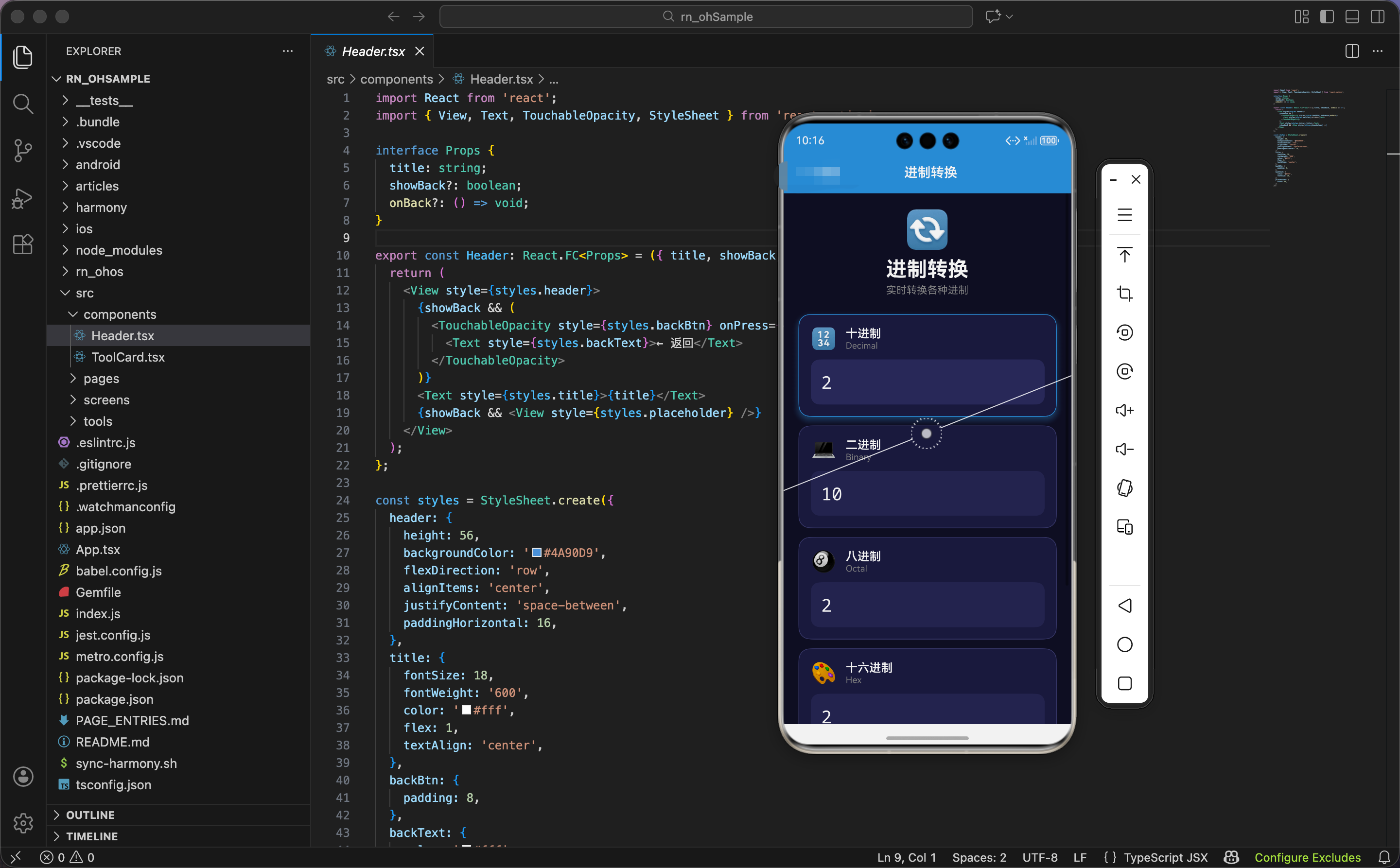
进制转换是程序员的基本功。二进制是计算机的语言,十六进制常用于表示颜色和内存地址,八进制在 Unix 文件权限中很常见。今天我们用 React Native 实现一个进制转换工具,支持二进制、八进制、十进制、十六进制之间的实时互转。
进制基础知识
在开始写代码之前,先简单回顾一下进制的概念:
- 二进制(Binary):只有 0 和 1 两个数字,是计算机底层使用的进制
- 八进制(Octal):使用 0-7 八个数字,Unix 系统的文件权限就是用八进制表示的
- 十进制(Decimal):我们日常使用的进制,0-9 十个数字
- 十六进制(Hexadecimal):使用 0-9 和 A-F,共 16 个字符,常用于表示颜色(如 #FF5500)和内存地址
JavaScript 内置了进制转换的方法,我们可以直接使用,不需要自己实现算法。
状态设计
import React, { useState, useRef, useEffect } from 'react';
import { View, Text, TextInput, StyleSheet, ScrollView, Animated } from 'react-native';

export const BaseConverter: React.FC = () => {
  const [decimal, setDecimal] = useState('');
  const [binary, setBinary] = useState('');
  const [octal, setOctal] = useState('');
  const [hex, setHex] = useState('');
  const [activeInput, setActiveInput] = useState('decimal');
这里我们为每种进制都创建了一个独立的状态变量。你可能会问:为什么不用一个对象来存储所有进制的值?
原因是这样的:当用户在某个输入框中输入时,我们需要更新其他三个输入框的值,但不能更新当前正在输入的那个。如果用一个对象存储,每次更新都会触发所有输入框的重新渲染,可能导致输入体验不流畅。用独立的状态变量,可以精确控制哪些需要更新。
activeInput 记录当前正在输入的是哪个进制,用于高亮显示当前输入框,也用于在更新时跳过当前输入框。
动画值定义
  const pulseAnim = useRef(new Animated.Value(1)).current;
  const glowAnim = useRef(new Animated.Value(0)).current;
  const cardAnims = useRef([
    new Animated.Value(0),
    new Animated.Value(0),
    new Animated.Value(0),
    new Animated.Value(0),
  ]).current;
动画值的设计:
pulseAnim:头部图标的脉冲效果,每次输入时触发,给用户"正在转换"的反馈glowAnim:发光动画,让界面更有活力cardAnims:四个卡片的入场动画,每个卡片有独立的动画值,可以实现依次入场的效果
为什么 cardAnims 用数组?因为我们有四个进制卡片,每个卡片需要独立控制动画。用数组可以通过索引访问对应的动画值,配合 map 遍历渲染时很方便。
鸿蒙 ArkTS 对比:状态定义
@Entry
@Component
struct BaseConverter {
  @State decimal: string = ''
  @State binary: string = ''
  @State octal: string = ''
  @State hex: string = ''
  @State activeInput: string = 'decimal'
  @State cardScales: number[] = [0, 0, 0, 0]
  @State pulseScale: number = 1
ArkTS 中的状态定义类似,但动画值直接用数字类型。cardScales 数组存储四个卡片的缩放值,通过 animateTo 函数驱动动画。
两种框架的状态管理思路是一样的,只是语法和动画实现方式不同。
入场动画和发光动画
  useEffect(() => {
    // 卡片入场动画
    cardAnims.forEach((anim, i) => {
      setTimeout(() => {
        Animated.spring(anim, { toValue: 1, friction: 5, useNativeDriver: true }).start();
      }, i * 100);
    });

    // 发光动画
    Animated.loop(
      Animated.sequence([
        Animated.timing(glowAnim, { toValue: 1, duration: 1500, useNativeDriver: false }),
        Animated.timing(glowAnim, { toValue: 0, duration: 1500, useNativeDriver: false }),
      ])
    ).start();
  }, []);
组件挂载时启动两组动画:
卡片入场动画:用 forEach 遍历四个动画值,每个动画延迟 100 毫秒启动。这样四个卡片会依次从上到下弹出,形成"瀑布"效果。setTimeout 的延迟时间是 i * 100,第一个卡片立即启动,第二个延迟 100ms,第三个延迟 200ms,以此类推。
发光动画:无限循环的呼吸效果,3 秒一个周期。这个动画会应用到当前激活的输入框上,让它有"发光"的感觉。
空依赖数组 [] 确保这些动画只在组件挂载时启动一次。
鸿蒙 ArkTS 对比:入场动画
aboutToAppear() {
  // 依次启动卡片动画
  for (let i = 0; i < 4; i++) {
    setTimeout(() => {
      animateTo({
        duration: 300,
        curve: Curve.EaseOut
      }, () => {
        this.cardScales[i] = 1
      })
    }, i * 100)
  }
}
ArkTS 中用 aboutToAppear 生命周期函数代替 useEffect,用 animateTo 代替 Animated.spring。逻辑是一样的,只是 API 不同。
核心转换逻辑
  const updateAll = (value: string, base: number, source: string) => {
    setActiveInput(source);

    // 脉冲动画
    Animated.sequence([
      Animated.timing(pulseAnim, { toValue: 1.05, duration: 100, useNativeDriver: true }),
      Animated.spring(pulseAnim, { toValue: 1, friction: 4, useNativeDriver: true }),
    ]).start();

    const num = parseInt(value, base);
    if (isNaN(num)) {
      if (source !== 'decimal') setDecimal('');
      if (source !== 'binary') setBinary('');
      if (source !== 'octal') setOctal('');
      if (source !== 'hex') setHex('');
      return;
    }
    if (source !== 'decimal') setDecimal(num.toString(10));
    if (source !== 'binary') setBinary(num.toString(2));
    if (source !== 'octal') setOctal(num.toString(8));
    if (source !== 'hex') setHex(num.toString(16).toUpperCase());
  };
这是整个组件最核心的函数,让我们逐行分析:
第一步:记录当前输入源setActiveInput(source) 记录用户正在输入的是哪个进制,用于高亮显示和跳过更新。
第二步:触发脉冲动画
每次输入都会触发头部图标的脉冲效果,先放大到 1.05 倍,再弹回原大小。这个动画很快(100ms),给用户即时反馈但不会打断输入。
第三步:解析输入值parseInt(value, base) 是 JavaScript 的内置函数,第二个参数指定进制。比如 parseInt('1010', 2) 会把二进制的 1010 解析成十进制的 10。
第四步:处理无效输入
如果用户输入了无效字符(比如在二进制中输入 2),parseInt 会返回 NaN。这时我们清空其他输入框,但保留当前输入框的内容,让用户可以继续修改。
第五步:更新其他进制num.toString(base) 把数字转换成指定进制的字符串。注意我们用 source !== 'xxx' 来跳过当前输入框,避免覆盖用户正在输入的内容。
十六进制用 toUpperCase() 转成大写,这是惯例,也更易读。
鸿蒙 ArkTS 对比:转换逻辑
updateAll(value: string, base: number, source: string) {
  this.activeInput = source

  // 触发脉冲动画
  animateTo({ duration: 100 }, () => {
    this.pulseScale = 1.05
  })
  setTimeout(() => {
    animateTo({ duration: 200, curve: Curve.EaseOut }, () => {
      this.pulseScale = 1
    })
  }, 100)

  let num = parseInt(value, base)
  if (isNaN(num)) {
    if (source !== 'decimal') this.decimal = ''
    if (source !== 'binary') this.binary = ''
    if (source !== 'octal') this.octal = ''
    if (source !== 'hex') this.hex = ''
    return
  }

  if (source !== 'decimal') this.decimal = num.toString(10)
  if (source !== 'binary') this.binary = num.toString(2)
  if (source !== 'octal') this.octal = num.toString(8)
  if (source !== 'hex') this.hex = num.toString(16).toUpperCase()
}
转换逻辑完全一样,parseInt 和 toString 是 JavaScript 标准方法,在 ArkTS 中同样可用。这就是跨平台开发的优势——核心业务逻辑可以直接复用。
进制数据配置
  const bases = [
    { key: 'decimal', label: '十进制', sublabel: 'Decimal', value: decimal, base: 10, icon: '🔢' },
    { key: 'binary', label: '二进制', sublabel: 'Binary', value: binary, base: 2, icon: '💻' },
    { key: 'octal', label: '八进制', sublabel: 'Octal', value: octal, base: 8, icon: '🎱' },
    { key: 'hex', label: '十六进制', sublabel: 'Hex', value: hex, base: 16, icon: '🎨' },
  ];
把四种进制的配置放在一个数组里,这样渲染时可以用 map 遍历,避免重复代码。每个配置项包含:
key:唯一标识,用于判断当前输入和 React 的 key 属性label:中文名称sublabel:英文名称,显示在中文下面value:对应的状态值base:进制数,用于parseInt和toStringicon:emoji 图标,让界面更直观
图标的选择也有讲究:🔢 表示数字(十进制),💻 表示计算机(二进制),🎱 的 8 暗示八进制,🎨 表示颜色(十六进制常用于颜色)。
界面渲染:头部
  return (
    <ScrollView style={styles.container}>
      <View style={styles.header}>
        <Animated.View style={{ transform: [{ scale: pulseAnim }] }}>
          <Text style={styles.headerIcon}>🔄</Text>
        </Animated.View>
        <Text style={styles.headerTitle}>进制转换</Text>
        <Text style={styles.headerSubtitle}>实时转换各种进制</Text>
      </View>
头部图标用 Animated.View 包裹,应用脉冲缩放效果。每次用户输入时,图标会轻微放大再缩回,给用户"正在转换"的视觉反馈。
🔄 图标表示"转换"的概念,和工具的功能相符。
进制卡片渲染
      {bases.map((item, index) => (
        <Animated.View
          key={item.key}
          style={[styles.card, {
            transform: [
              { scale: cardAnims[index] },
              { perspective: 1000 },
              { rotateX: cardAnims[index].interpolate({ inputRange: [0, 1], outputRange: ['10deg', '0deg'] }) },
            ],
            opacity: cardAnims[index],
            borderColor: activeInput === item.key ? '#4A90D9' : '#3a3a6a',
            shadowOpacity: activeInput === item.key ? 0.4 : 0,
          }]}
        >
卡片的动画效果很丰富,让我们逐个分析:
缩放动画:scale: cardAnims[index] 让卡片从 0 放大到 1,形成"弹出"效果。
透视效果:perspective: 1000 为 3D 变换提供透视,让旋转效果更真实。数值越小,透视效果越强烈;1000 是一个比较自然的值。
X 轴旋转:rotateX 从 10 度旋转到 0 度,配合缩放形成"翻转入场"的效果。卡片看起来像是从上方翻下来的。
透明度:opacity: cardAnims[index] 让卡片从透明渐变到不透明,配合缩放和旋转,入场效果更平滑。
动态边框:当前输入框的边框变成蓝色 #4A90D9,其他保持灰色 #3a3a6a。
动态阴影:当前输入框有蓝色阴影,其他没有阴影。这样用户一眼就能看出正在操作哪个输入框。
卡片内容
          <View style={styles.cardHeader}>
            <Text style={styles.cardIcon}>{item.icon}</Text>
            <View>
              <Text style={styles.cardLabel}>{item.label}</Text>
              <Text style={styles.cardSublabel}>{item.sublabel}</Text>
            </View>
          </View>
          <TextInput
            style={[styles.input, activeInput === item.key && styles.inputActive]}
            value={item.value}
            onChangeText={(v) => {
              if (item.key === 'decimal') { setDecimal(v); updateAll(v, 10, 'decimal'); }
              else if (item.key === 'binary') { setBinary(v); updateAll(v, 2, 'binary'); }
              else if (item.key === 'octal') { setOctal(v); updateAll(v, 8, 'octal'); }
              else { setHex(v); updateAll(v, 16, 'hex'); }
            }}
            placeholder="0"
            placeholderTextColor="#666"
            autoCapitalize="characters"
            keyboardType={item.key === 'decimal' ? 'numeric' : 'default'}
          />
        </Animated.View>
      ))}
每个卡片包含两部分:
卡片头部:图标 + 中英文名称。图标放在左边,名称垂直排列在右边。这种布局让信息层次分明。
输入框:onChangeText 回调中,先更新当前进制的状态,再调用 updateAll 更新其他进制。
autoCapitalize="characters" 让输入自动转成大写,这对十六进制很有用,用户输入 ‘a’ 会自动变成 ‘A’。
keyboardType 根据进制类型选择:十进制用数字键盘 numeric,其他进制用默认键盘(因为需要输入字母)。
鸿蒙 ArkTS 对比:卡片渲染
ForEach(this.bases, (item: BaseInfo, index: number) => {
  Column() {
    Row() {
      Text(item.icon)
        .fontSize(28)
        .margin({ right: 12 })

      Column() {
        Text(item.label)
          .fontSize(16)
          .fontWeight(FontWeight.Bold)
          .fontColor(Color.White)
        Text(item.sublabel)
          .fontSize(12)
          .fontColor('#888888')
      }
      .alignItems(HorizontalAlign.Start)
    }
    .width('100%')
    .margin({ bottom: 12 })

    TextInput({ placeholder: '0' })
      .fontSize(24)
      .fontColor(Color.White)
      .backgroundColor(this.activeInput === item.key ? '#2a2a5a' : '#252550')
      .borderRadius(12)
      .onChange((value: string) => {
        this.updateValue(item.key, value, item.base)
      })
  }
  .padding(16)
  .borderRadius(16)
  .backgroundColor('#1a1a3e')
  .border({
    width: 1,
    color: this.activeInput === item.key ? '#4A90D9' : '#3a3a6a'
  })
  .scale({ x: this.cardScales[index], y: this.cardScales[index] })
})
ArkTS 中用 ForEach 遍历数据,用 Column 和 Row 组件构建布局。样式通过链式调用设置,动态样式用三元表达式。
两种写法的结构类似,只是语法风格不同。
进制说明区域
      <View style={styles.tips}>
        <Text style={styles.tipsTitle}>💡 进制说明</Text>
        <View style={styles.tipsGrid}>
          {[
            { base: '二进制', chars: '0-1', color: '#4A90D9' },
            { base: '八进制', chars: '0-7', color: '#00b894' },
            { base: '十进制', chars: '0-9', color: '#e17055' },
            { base: '十六进制', chars: '0-9, A-F', color: '#6c5ce7' },
          ].map((item, i) => (
            <View key={i} style={styles.tipItem}>
              <View style={[styles.tipDot, { backgroundColor: item.color }]} />
              <Text style={styles.tipBase}>{item.base}</Text>
              <Text style={styles.tipChars}>{item.chars}</Text>
            </View>
          ))}
        </View>
      </View>
    </ScrollView>
  );
};
底部的说明区域告诉用户每种进制可以使用哪些字符。这对不熟悉进制的用户很有帮助,避免他们输入无效字符后不知道为什么没有结果。
每种进制用不同的颜色标识,和上面的卡片形成呼应。颜色圆点 + 进制名称 + 可用字符,信息清晰明了。
样式定义:容器和头部
const styles = StyleSheet.create({
  container: { flex: 1, backgroundColor: '#0f0f23', padding: 20 },
  header: { alignItems: 'center', marginBottom: 24 },
  headerIcon: { fontSize: 50, marginBottom: 8 },
  headerTitle: { fontSize: 28, fontWeight: '700', color: '#fff' },
  headerSubtitle: { fontSize: 14, color: '#888', marginTop: 4 },
暗色主题,背景色 #0f0f23 是一种深蓝黑色,比纯黑色更有层次感。头部居中显示,图标、标题、副标题垂直排列。
样式定义:卡片
  card: {
    backgroundColor: '#1a1a3e',
    padding: 16,
    borderRadius: 16,
    marginBottom: 12,
    borderWidth: 1,
    shadowColor: '#4A90D9',
    shadowOffset: { width: 0, height: 4 },
    shadowRadius: 10,
  },
  cardHeader: { flexDirection: 'row', alignItems: 'center', marginBottom: 12 },
  cardIcon: { fontSize: 28, marginRight: 12 },
  cardLabel: { fontSize: 16, fontWeight: '600', color: '#fff' },
  cardSublabel: { fontSize: 12, color: '#888' },
  input: {
    fontSize: 24,
    padding: 14,
    backgroundColor: '#252550',
    borderRadius: 12,
    color: '#fff',
    fontFamily: 'monospace',
  },
  inputActive: { backgroundColor: '#2a2a5a' },
卡片用圆角矩形,边框和阴影的颜色在代码中动态设置。输入框用等宽字体 fontFamily: 'monospace',这对显示数字和十六进制字符很重要,让每个字符占据相同宽度,数字对齐更整齐。
激活状态的输入框背景色稍微亮一点(#2a2a5a vs #252550),给用户视觉反馈。
样式定义:说明区域
  tips: {
    backgroundColor: '#1a1a3e',
    padding: 16,
    borderRadius: 16,
    marginTop: 8,
    borderWidth: 1,
    borderColor: '#3a3a6a',
  },
  tipsTitle: { fontSize: 16, fontWeight: '600', marginBottom: 16, color: '#fff' },
  tipsGrid: {},
  tipItem: { flexDirection: 'row', alignItems: 'center', paddingVertical: 8 },
  tipDot: { width: 10, height: 10, borderRadius: 5, marginRight: 12 },
  tipBase: { flex: 1, color: '#fff', fontSize: 14 },
  tipChars: { color: '#888', fontSize: 14 },
});
说明区域的样式和卡片保持一致,都是圆角矩形加边框。每行说明用 flexDirection: 'row' 水平排列,进制名称用 flex: 1 占据中间空间,可用字符靠右显示。
小结
这个进制转换工具展示了 React Native 中实时数据同步和多输入框联动的实现方式。通过 JavaScript 内置的 parseInt 和 toString 方法,进制转换变得非常简单。入场动画和脉冲效果让界面更有活力,说明区域帮助用户理解每种进制的特点。
在 OpenHarmony 平台上,这些功能都能正常工作。进制转换是纯数学运算,动画使用 React Native 的 Animated API,都是跨平台兼容的。
欢迎加入开源鸿蒙跨平台社区:https://openharmonycrossplatform.csdn.net

Agent 垂直技术社区,欢迎活跃、内容共建。
更多推荐


 20
20 0
0- 0


 已为社区贡献2条内容

所有评论(0)