Vue3 ECharts 使用条形图实现渐变色柱体且自定义y轴(左侧显示标签、右侧显示数值) + symbol - 附完整示例
·
ECharts:一个基于 JavaScript 的开源可视化图表库。
目录
效果
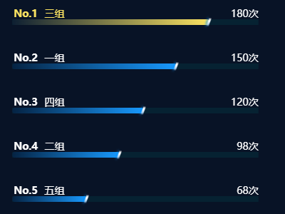
一、介绍
1、官方文档:Apache ECharts
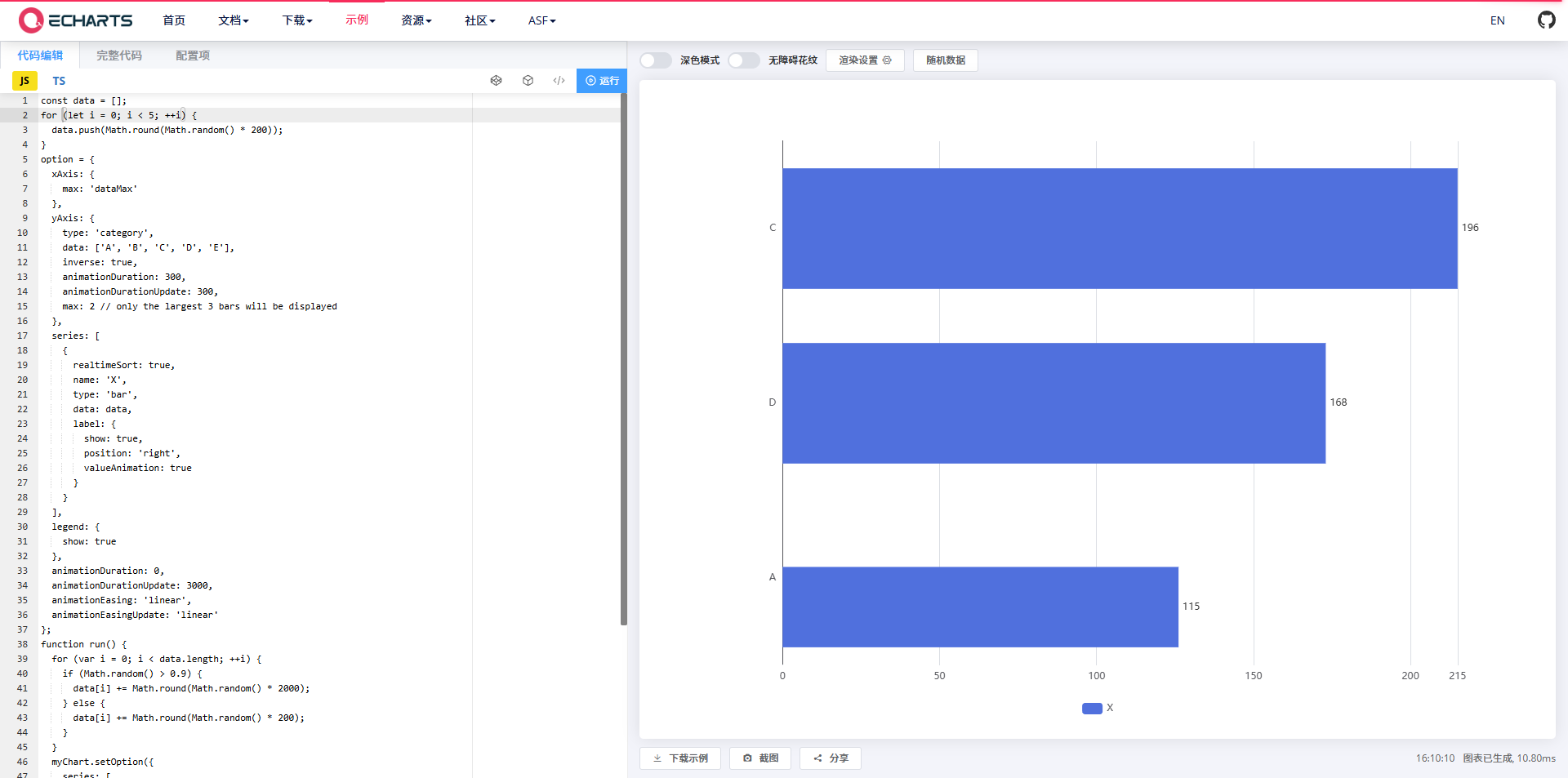
2、官方示例
二、准备工作
1、安装依赖包
npm install echarts --save2、示例版本
"echarts": "^5.4.3",三、使用步骤
1、在单页面引入 ' echarts '
import * as echarts from "echarts";注:上面的代码会引入 ECharts 中所有的图表和组件,如果你不想引入所有组件,也可以使用 ECharts 提供的按需引入的接口来打包必须的组件。详见官方文档:在项目中引入 ECharts - 入门篇 - Handbook - Apache ECharts
2、指定容器并设置容器宽高
<template>
  <div id="barDiagramMain"></div>
</template>

<script lang="ts" setup>
  import * as echarts from "echarts";

  initChart() {
    let chartDom = document.getElementById("barDiagramMain");
    let myChart = echarts.init(chartDom);
    let option;

    ...详见完整示例
  };
</script>

<style lang="scss" scoped>
#barDiagramMain{
  width: 400px;
  height: 300px;
}
</style>
3、数据处理(关键点)
1)y轴左侧自定义富文本样式
yAxis: [
  // 左侧标签
  {
    type: 'category',
    inverse: true,
    axisLabel: {
      show: true,
      position: 'top',
      margin: layoutParams.labelYOffset, // 标签Y轴偏移量
      color: '#fff',
      fontSize: layoutParams.fontSize,
      verticalAlign: 'bottom',
      align: 'left',
      lineHeight: layoutParams.barHeight, // 行高匹配柱体高度
      rich: {
        rank: {
          fontWeight: 'bold',
          width: 25,
          fontSize: layoutParams.fontSize
        },
        name: {
          padding: [0, 0, 0, 10],
          fontSize: layoutParams.fontSize
        },
        // NO.1的处理
        rankHighlight: {
          fontWeight: 'bold',
          width: 25,
          fontSize: layoutParams.fontSize,
          color: '#FBE361'
        },
        // NO.1的处理
        nameHighlight: {
          padding: [0, 0, 0, 10],
          fontSize: layoutParams.fontSize,
          color: '#FBE361'
        }
      },
      formatter: function (value: string) {
        const index = deviceData.findIndex(item => item.name === value);
        const rank = index + 1;
        // 索引为0时使用高亮样式,其余用默认样式
        return index === 0
          ? `{rankHighlight|No.${rank}}  {nameHighlight|${value}}`
          : `{rank|No.${rank}}  {name|${value}}`;
      }
    },
    ...详见完整示例
  }
]
注:
2)y轴右侧显示数值
yAxis: [
  ...详见完整示例
  // 右侧数值轴
  {
    type: 'category',
    inverse: true,
    axisTick: 'none',
    axisLine: 'none',
    axisLabel: {
      show: true,
      position: 'top',
      // 偏移量以适配柱体高度
      margin: -layoutParams.barHeight + 22,
      color: '#fff',
      fontSize: layoutParams.fontSize,
      verticalAlign: 'bottom',
      align: 'right',
      lineHeight: layoutParams.barHeight,
      formatter: function (value: number) {
        return `${value}次`;
      }
    },
    data: deviceData.map(item => item.value)
  }
],
3)柱体渐变色
series: [
  {
    name: '迟到次数',
    type: 'bar',
    barWidth: layoutParams.barWidth,
    barHeight: layoutParams.barHeight, // 使用柱体高度
    barCategoryGap: layoutParams.barGap, // 使用柱体间隔
    zlevel: 2,
    showBackground: true,
    backgroundStyle: {
      color: '#04444D50'
    },
    itemStyle: {
      borderRadius: [3, 3, 3, 3],
      color: (params: any) => getBarGradientColor(params.dataIndex)
    },
    label: {
      show: false
    },
    data: deviceData.map(item => item.value)
  },
  ...详见完整示例
]
4)自定义symbol
series: [
  ...详见完整示例
  {
    type: 'pictorialBar',
    symbol: (params: any) => params.dataIndex === 0
      ? `image://${noOne}`
      : `image://${noNormal}`,
    symbolSize: [12, 20],
    symbolOffset: [3, 0],
    symbolPosition: 'end',
    z: 12,
    zlevel: 12,
    itemStyle: {
      color: '#fff'
    },
    data: deviceData.map(item => item.value)
  }
]注:https://echarts.apache.org/zh/option.html#series-pictorialBar.symbol
四、完整示例
<template>
  <div id="barDiagramMain"></div>
</template>

<script lang="ts" setup name="barDiagram">
import * as echarts from "echarts";
import { ref, onMounted, nextTick } from "vue";
import noOne from '../../../assets/noOne.png';
import noNormalfrom '../../../assets/noNormal.png';

const layoutParams = {
  barWidth: 8, // 柱体宽度
  barHeight: 22, // 柱体高度
  barGap: '15%', // 柱体间隔比例
  fontSize: 14, // 字体大小
  topOffset: 0, // 图表顶部边距
  labelYOffset: -2, // 标签Y轴偏移量
  iconYOffset: -35 // 图标Y轴偏移量
};

// 渐变色函数
const getBarGradientColor = (index: number) => {
  const colors = [
    { start: '#0D1F32', end: '#FBE361' },
    { start: '#052343', end: '#1899FD' },
    { start: '#052343', end: '#1899FD' },
    { start: '#052343', end: '#1899FD' },
    { start: '#052343', end: '#1899FD' },
  ];

  const colorConfig = colors[Math.min(index, colors.length - 1)];
  return new echarts.graphic.LinearGradient(0, 0, 1, 0, [
    { offset: 0, color: colorConfig.start },
    { offset: 1, color: colorConfig.end }
  ]);
};

const deviceData = [
  { name:'三组', value: 180 },
  { name:'一组', value:150 },
  { name:'四组', value:120 },
  { name:'二组', value:98 },
  { name:"五组", value:68 }
]

const initChart = () => {
  let chartDom = document.getElementById("barDiagramMain");
  let myChart = echarts.init(chartDom);
  let option;

  const maxValue = Math.max(...deviceData.map((item) => item.value), 0);

  option = {
    backgroundColor: 'transparent',
    tooltip: {
      trigger: 'item',
      formatter: '{b}: {c}次'
    },
    grid: {
      left: -50,
      top: layoutParams.topOffset,
      bottom: -30,
      right: 0,
      containLabel: true
    },
    xAxis: {
      type: 'value',
      show: false,
      max: maxValue * 1.25
    },
    yAxis: [
      // 左侧标签
      {
        type: 'category',
        inverse: true,
        axisLabel: {
          show: true,
          position: 'top',
          margin: layoutParams.labelYOffset, // 标签Y轴偏移量
          color: '#fff',
          fontSize: layoutParams.fontSize,
          verticalAlign: 'bottom',
          align: 'left',
          lineHeight: layoutParams.barHeight, // 行高匹配柱体高度
          rich: {
            rank: {
              fontWeight: 'bold',
              width: 25,
              fontSize: layoutParams.fontSize
            },
            name: {
              padding: [0, 0, 0, 10],
              fontSize: layoutParams.fontSize
            },
            // NO.1的处理
            rankHighlight: {
              fontWeight: 'bold',
              width: 25,
              fontSize: layoutParams.fontSize,
              color: '#FBE361'
            },
            // NO.1的处理
            nameHighlight: {
              padding: [0, 0, 0, 10],
              fontSize: layoutParams.fontSize,
              color: '#FBE361'
            }
          },
          formatter: function (value: string) {
            const index = deviceData.findIndex(item => item.name === value);
            const rank = index + 1;
            // 索引为0时使用高亮样式,其余用默认样式
            return index === 0
              ? `{rankHighlight|No.${rank}}  {nameHighlight|${value}}`
              : `{rank|No.${rank}}  {name|${value}}`;
          }
        },
        splitLine: {
          show: false
        },
        axisTick: {
          show: false
        },
        axisLine: {
          show: false
        },
        data: deviceData.map(item => item.name)
      },
      // 右侧数值轴
      {
        type: 'category',
        inverse: true,
        axisTick: 'none',
        axisLine: 'none',
        axisLabel: {
          show: true,
          position: 'top',
          // 偏移量以适配柱体高度
          margin: -layoutParams.barHeight + 22,
          color: '#fff',
          fontSize: layoutParams.fontSize,
          verticalAlign: 'bottom',
          align: 'right',
          lineHeight: layoutParams.barHeight,
          formatter: function (value: number) {
            return `${value}次`;
          }
        },
        data: deviceData.map(item => item.value)
      }
    ],
    series: [
      {
        name: '迟到次数',
        type: 'bar',
        barWidth: layoutParams.barWidth,
        barHeight: layoutParams.barHeight, // 使用柱体高度
        barCategoryGap: layoutParams.barGap, // 使用柱体间隔
        zlevel: 2,
        showBackground: true,
        backgroundStyle: {
          color: '#04444D50'
        },
        itemStyle: {
          borderRadius: [3, 3, 3, 3],
          color: (params: any) => getBarGradientColor(params.dataIndex)
        },
        label: {
          show: false
        },
        data: deviceData.map(item => item.value)
      },
      {
        type: 'pictorialBar',
        symbol: (params: any) => params === maxValue
          ? `image://${noOne}`
          : `image://${noNormal}`,
        symbolSize: [12, 20],
        symbolOffset: [3, 0],
        symbolPosition: 'end',
        z: 12,
        zlevel: 12,
        itemStyle: {
          color: '#fff'
        },
        data: deviceData.map(item => item.value)
      }
    ]
  }

  option && myChart.setOption(option);
}

onMounted(async() => {
  await nextTick()
  initChart()
})

</script>

<style lang="scss" scoped>
#barDiagramMain {
  width: 400px;
  height: 300px;
  background-color: #081326;
}
</style>
欢迎关注VX公众号:前端小知识营地

Agent 垂直技术社区,欢迎活跃、内容共建。
更多推荐

 5
5 0
0- 0


 已为社区贡献8条内容

所有评论(0)