React Native for OpenHarmony 单选框组件:从设计思路到代码落地
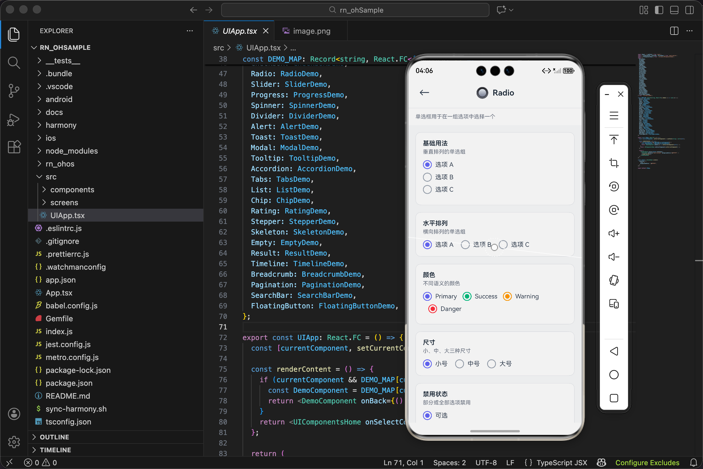
项目开源地址:https://atomgit.com/nutpi/rn_for_openharmony_element
单选框和复选框长得很像,但用途完全不同。复选框是"多选",可以选零个、一个或多个;单选框是"单选",必须且只能选一个。性别选择、支付方式、配送时间……这些"只能选一个"的场景都要用单选框。
这篇文章记录一下我封装 Radio 组件的过程,重点说说它和 Checkbox 的设计差异。
单选框的特殊之处
单选框有个特点:它不能单独存在,必须是一组。
想想看,如果只有一个单选框,选中了就没法取消(单选框点击选中的不会取消),那这个单选框有什么意义?所以单选框天生就是成组使用的。
这就决定了 Radio 组件的设计思路:不是封装单个单选框,而是封装一组单选框。
Checkbox 可以单独使用,所以它的接口是 checked + onPress,管理单个选项的状态。Radio 必须成组,所以它的接口是 value + onChange + options,管理整组的状态。
接口设计
interface RadioOption {
  value: string;
  label: string;
  disabled?: boolean;
}

interface RadioProps {
  value: string;
  onChange: (value: string) => void;
  options: RadioOption[];
  color?: ColorType;
  size?: SizeType;
  direction?: 'horizontal' | 'vertical';
  disabled?: boolean;
  style?: ViewStyle;
}
先看 RadioOption,这是单个选项的类型:
- value 是选项的值,用于标识这个选项。通常是字符串,比如
'male'、'female'。 - label 是显示的文字,用户看到的是这个。
- disabled 可以禁用单个选项,比如某个配送方式暂时不可用。
再看 RadioProps,这是整个组件的属性:
- value 是当前选中的值,对应某个 option 的 value。
- onChange 是选中值变化时的回调,参数是新选中的 value。
- options 是所有选项的数组。
这种设计的好处是状态集中管理。不管有多少个选项,外部只需要维护一个 value 状态。对比一下如果用 Checkbox 的方式来实现单选:
// 用 Checkbox 方式实现单选(不推荐)
const [selected, setSelected] = useState('a');

<Checkbox checked={selected === 'a'} onPress={() => setSelected('a')} label="选项A" />
<Checkbox checked={selected === 'b'} onPress={() => setSelected('b')} label="选项B" />
<Checkbox checked={selected === 'c'} onPress={() => setSelected('c')} label="选项C" />
// 用 Radio 方式实现单选(推荐)
const [selected, setSelected] = useState('a');

<Radio
  value={selected}
  onChange={setSelected}
  options={[
    { value: 'a', label: '选项A' },
    { value: 'b', label: '选项B' },
    { value: 'c', label: '选项C' },
  ]}
/>
Radio 的方式明显更简洁,而且 options 可以从接口获取,更灵活。
direction 属性的设计
direction?: 'horizontal' | 'vertical';
单选框组可以垂直排列或水平排列:
- vertical(默认):选项从上到下排列,适合选项文字较长或选项较多的情况。
- horizontal:选项从左到右排列,适合选项较少且文字较短的情况,比如"是/否"、“男/女”。
这个属性在 Checkbox 里没有,因为 Checkbox 通常是单独使用的,排列方式由外部控制。Radio 是成组的,排列方式应该由组件内部控制。
尺寸配置
const sizeMap: Record<SizeType, { outer: number; inner: number; fontSize: number }> = {
  sm: { outer: 16, inner: 8, fontSize: 12 },
  md: { outer: 20, inner: 10, fontSize: 14 },
  lg: { outer: 24, inner: 12, fontSize: 16 },
};
单选框的视觉结构是两个同心圆:外圈是边框,内圈是选中时的实心圆。
- outer 是外圈的直径
- inner 是内圈的直径,大约是外圈的一半
- fontSize 是旁边文字的大小
inner 设为 outer 的一半是有讲究的。太大的话内圈会贴着外圈,看不出是两个圆;太小的话内圈太小,不够醒目。一半的比例刚好,既能看出两个圆的层次,内圈又足够明显。
外圈的渲染
<View
  style={[
    styles.outer,
    {
      width: sizeMap[size].outer,
      height: sizeMap[size].outer,
      borderRadius: sizeMap[size].outer / 2,
      borderColor: isSelected ? colorValue : UITheme.colors.gray[400],
      opacity: isDisabled ? 0.5 : 1,
    },
  ]}
>
外圈是一个圆形边框:
- borderRadius 设为宽度的一半,让方形变成圆形。
- borderColor 根据选中状态变化:选中时是主题色,未选中时是灰色。这个颜色变化是重要的视觉反馈。
- opacity 在禁用状态下变成 0.5。
基础样式 styles.outer 定义了边框宽度和居中对齐:
outer: { borderWidth: 2, alignItems: 'center', justifyContent: 'center' },
borderWidth 用 2px,和 Checkbox 保持一致。alignItems 和 justifyContent 让内圈在外圈中居中。
内圈的渲染
{isSelected && (
  <View
    style={[
      styles.inner,
      {
        width: sizeMap[size].inner,
        height: sizeMap[size].inner,
        borderRadius: sizeMap[size].inner / 2,
        backgroundColor: colorValue,
      },
    ]}
  />
)}
内圈只在选中时显示:
- 用
{isSelected && ...}条件渲染,未选中时不渲染内圈。 - backgroundColor 是主题色,形成一个实心的彩色圆。
- borderRadius 同样是宽度的一半,保证是圆形。
内圈没有边框,就是一个纯色的圆。它和外圈的颜色一致,形成视觉上的呼应。
选项的渲染
{options.map((option) => {
  const isSelected = value === option.value;
  const isDisabled = disabled || option.disabled;

  return (
    <TouchableOpacity
      key={option.value}
      style={[styles.option, direction === 'horizontal' && styles.optionHorizontal]}
      onPress={() => !isDisabled && onChange(option.value)}
      activeOpacity={0.7}
      disabled={isDisabled}
    >
      {/* 外圈和内圈 */}
      <Text style={[styles.label, { fontSize: sizeMap[size].fontSize, opacity: isDisabled ? 0.5 : 1 }]}>
        {option.label}
      </Text>
    </TouchableOpacity>
  );
})}
遍历 options 渲染每个选项,每个选项包含圆圈和文字:
- isSelected 通过比较
value === option.value判断,这就是为什么 value 要用字符串而不是索引。 - isDisabled 要考虑两种情况:整个组禁用(
disabled)或单个选项禁用(option.disabled)。 - onPress 调用 onChange 并传入当前选项的 value。注意这里不是取反,而是直接传 value,因为单选框点击就是选中,不存在取消。
样式方面:
option: { flexDirection: 'row', alignItems: 'center', marginBottom: UITheme.spacing.sm },
optionHorizontal: { marginRight: UITheme.spacing.lg, marginBottom: 0 },
- option 是基础样式,水平排列圆圈和文字,底部有间距。
- optionHorizontal 是水平方向时的样式,把底部间距改成右侧间距。
容器的布局
<View style={[styles.container, direction === 'horizontal' && styles.horizontal, style]}>
  {/* 选项列表 */}
</View>
容器根据 direction 切换布局:
container: {},
horizontal: { flexDirection: 'row', flexWrap: 'wrap' },
- vertical 方向不需要特殊样式,View 默认就是垂直排列。
- horizontal 方向设置
flexDirection: 'row'水平排列,flexWrap: 'wrap'允许换行(选项太多时)。
完整代码
import React from 'react';
import { TouchableOpacity, View, Text, StyleSheet, ViewStyle } from 'react-native';
import { UITheme, ColorType, SizeType } from './theme';

interface RadioOption {
  value: string;
  label: string;
  disabled?: boolean;
}

interface RadioProps {
  value: string;
  onChange: (value: string) => void;
  options: RadioOption[];
  color?: ColorType;
  size?: SizeType;
  direction?: 'horizontal' | 'vertical';
  disabled?: boolean;
  style?: ViewStyle;
}

export const Radio: React.FC<RadioProps> = ({
  value,
  onChange,
  options,
  color = 'primary',
  size = 'md',
  direction = 'vertical',
  disabled = false,
  style,
}) => {
  const colorValue = UITheme.colors[color];
  const sizeMap: Record<SizeType, { outer: number; inner: number; fontSize: number }> = {
    sm: { outer: 16, inner: 8, fontSize: 12 },
    md: { outer: 20, inner: 10, fontSize: 14 },
    lg: { outer: 24, inner: 12, fontSize: 16 },
  };

  return (
    <View style={[styles.container, direction === 'horizontal' && styles.horizontal, style]}>
      {options.map((option) => {
        const isSelected = value === option.value;
        const isDisabled = disabled || option.disabled;

        return (
          <TouchableOpacity
            key={option.value}
            style={[styles.option, direction === 'horizontal' && styles.optionHorizontal]}
            onPress={() => !isDisabled && onChange(option.value)}
            activeOpacity={0.7}
            disabled={isDisabled}
          >
            <View
              style={[
                styles.outer,
                {
                  width: sizeMap[size].outer,
                  height: sizeMap[size].outer,
                  borderRadius: sizeMap[size].outer / 2,
                  borderColor: isSelected ? colorValue : UITheme.colors.gray[400],
                  opacity: isDisabled ? 0.5 : 1,
                },
              ]}
            >
              {isSelected && (
                <View
                  style={[
                    styles.inner,
                    {
                      width: sizeMap[size].inner,
                      height: sizeMap[size].inner,
                      borderRadius: sizeMap[size].inner / 2,
                      backgroundColor: colorValue,
                    },
                  ]}
                />
              )}
            </View>
            <Text
              style={[
                styles.label,
                { fontSize: sizeMap[size].fontSize, opacity: isDisabled ? 0.5 : 1 },
              ]}
            >
              {option.label}
            </Text>
          </TouchableOpacity>
        );
      })}
    </View>
  );
};

const styles = StyleSheet.create({
  container: {},
  horizontal: { flexDirection: 'row', flexWrap: 'wrap' },
  option: { flexDirection: 'row', alignItems: 'center', marginBottom: UITheme.spacing.sm },
  optionHorizontal: { marginRight: UITheme.spacing.lg, marginBottom: 0 },
  outer: { borderWidth: 2, alignItems: 'center', justifyContent: 'center' },
  inner: {},
  label: { marginLeft: UITheme.spacing.sm, color: UITheme.colors.gray[700] },
});
使用场景
性别选择:
const [gender, setGender] = useState('');

<Radio
  value={gender}
  onChange={setGender}
  options={[
    { value: 'male', label: '男' },
    { value: 'female', label: '女' },
  ]}
  direction="horizontal"
/>
性别选择用水平排列,因为只有两个选项,文字也短。初始值设为空字符串,表示还没选择。
支付方式:
const [payment, setPayment] = useState('alipay');

<Radio
  value={payment}
  onChange={setPayment}
  options={[
    { value: 'alipay', label: '支付宝' },
    { value: 'wechat', label: '微信支付' },
    { value: 'card', label: '银行卡', disabled: true },
  ]}
/>
支付方式用垂直排列,选项较多。银行卡选项禁用,可能是因为还没绑定银行卡。初始值设为 'alipay',默认选中支付宝。
配送时间:
const [deliveryTime, setDeliveryTime] = useState('anytime');

<Radio
  value={deliveryTime}
  onChange={setDeliveryTime}
  options={[
    { value: 'anytime', label: '任意时间' },
    { value: 'workday', label: '工作日(周一至周五)' },
    { value: 'weekend', label: '周末(周六至周日)' },
    { value: 'night', label: '晚间(18:00-22:00)' },
  ]}
  size="sm"
/>
配送时间选项较多,文字也较长,用垂直排列。用小号尺寸,因为这不是页面的主要内容。
问卷调查:
const questions = [
  {
    id: 1,
    title: '您对本次服务的满意度?',
    options: [
      { value: '5', label: '非常满意' },
      { value: '4', label: '满意' },
      { value: '3', label: '一般' },
      { value: '2', label: '不满意' },
      { value: '1', label: '非常不满意' },
    ],
  },
  // 更多问题...
];

const [answers, setAnswers] = useState<Record<number, string>>({});

<View>
  {questions.map(q => (
    <View key={q.id} style={{ marginBottom: 24 }}>
      <Text style={{ fontSize: 16, fontWeight: '600', marginBottom: 12 }}>{q.title}</Text>
      <Radio
        value={answers[q.id] || ''}
        onChange={(v) => setAnswers({ ...answers, [q.id]: v })}
        options={q.options}
      />
    </View>
  ))}
</View>
问卷调查场景展示了如何管理多组单选框的状态:
- 用一个对象
answers存储所有答案,key 是问题 id,value 是选中的值。 - 每个 Radio 的 onChange 更新对应问题的答案。
和表单库配合:
import { Controller, useForm } from 'react-hook-form';

const { control, handleSubmit } = useForm({
  defaultValues: { gender: '' }
});

<Controller
  control={control}
  name="gender"
  rules={{ required: '请选择性别' }}
  render={({ field: { onChange, value }, fieldState: { error } }) => (
    <View>
      <Radio
        value={value}
        onChange={onChange}
        options={[
          { value: 'male', label: '男' },
          { value: 'female', label: '女' },
        ]}
        direction="horizontal"
        color={error ? 'danger' : 'primary'}
      />
      {error && <Text style={{ color: 'red', marginTop: 4 }}>{error.message}</Text>}
    </View>
  )}
/>
和 React Hook Form 配合使用:
- Controller 包裹 Radio,让表单库管理状态
- field.onChange 直接传给 Radio 的 onChange
- rules.required 设置必填验证
- 验证失败时 Radio 变成红色,并显示错误信息
和 Checkbox 的对比
最后总结一下 Radio 和 Checkbox 的区别:
| 特性 | Radio | Checkbox |
|---|---|---|
| 选择数量 | 只能选一个 | 可以选多个 |
| 取消选择 | 不能取消,只能选其他 | 可以取消 |
| 组件粒度 | 一组选项是一个组件 | 单个选项是一个组件 |
| 状态类型 | 单个值(string) | 布尔值或数组 |
| 视觉形状 | 圆形 | 方形 |
选择用哪个,主要看业务需求:
- 必须选一个,用 Radio:性别、支付方式、配送时间
- 可以选多个或不选,用 Checkbox:兴趣标签、筛选条件、同意协议
欢迎加入开源鸿蒙跨平台社区:https://openharmonycrossplatform.csdn.net

Agent 垂直技术社区,欢迎活跃、内容共建。
更多推荐

 28
28 0
0- 0


 已为社区贡献12条内容

所有评论(0)